
To keep the Material Design coming to iOS, let’s look at making our NavigationBar more material.
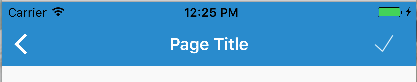
Here’s what a “standard” UINavigationBar looks like on iOS:
And here is what a Material Design Toolbar looks like on Android:
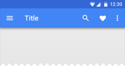
The goal here is to get something more similar to the Android Material Design look. The most notable differences are the drop shadow created by the toolbar onto the rest of the view as well as the distinct back button and other icons.
So, if you’re using Xamarin.Forms, you’ll need to create a custom renderer to get this job done. Let’s take a look at that:
MaterialNavigationRenderer.cs
[assembly: ExportRenderer(typeof(NavigationPage), typeof(MaterialNavigationRenderer))]
namespace YOUR_IOS_NAMESPACE
{
    ///
<summary>
    /// Custom renderer creating a material design navigation bar
    /// </summary>

    public class MaterialNavigationRenderer : NavigationRenderer
    {
        protected override void OnElementChanged(VisualElementChangedEventArgs e)
        {
            base.OnElementChanged(e);

            // Create the material drop shadow
            NavigationBar.Layer.ShadowColor = UIColor.Black.CGColor;
            NavigationBar.Layer.ShadowOffset = new CGSize(0, 0);
            NavigationBar.Layer.ShadowRadius = 3;
            NavigationBar.Layer.ShadowOpacity = 1;

            // Create the back arrow icon image
            var arrowImage = UIImage.FromBundle("Icons/ic_arrow_back_white.png");
            NavigationBar.BackIndicatorImage = arrowImage;
            NavigationBar.BackIndicatorTransitionMaskImage = arrowImage;

            // Set the back button title to empty since Material Design doesn't use it.
            if (NavigationItem?.BackBarButtonItem != null)
                NavigationItem.BackBarButtonItem.Title = " ";
            if (NavigationBar.BackItem != null)
            {
                NavigationBar.BackItem.Title = " ";
                NavigationBar.BackItem.BackBarButtonItem.Image = arrowImage;
            }
        }
    }
}
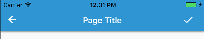
This will override our Renderer for all of our instances of a NavigationPage. To breakdown what is being done here, the renderer is initializing the native UINavigationBar, then updating the Layer of the UINavigationBar to create a drop shadow. After that, we instantiate the back arrow icon to replace the default iOS one. Lastly, we set the back button title to empty so that it doesn’t show up next to our new back button image.
The back button icon is taken from the official Material Design Icons from Google found here: https://material.io/icons/
The last thing we need to do is update our toolbar icon to fit the Material standards (thicker and bolder). To do this, we go back to the icons linked above and download the new check icon we want and substitute the ToolbarItem we have in our XAML.
Now we can see the results of our custom renderer and updated icon with our more Material Design looking toolbar:
Next Steps
Want to take it further? Try updating your custom renderer to move the Title text alignment to the left and use the Roboto font! Check out this blog post on how to bring Roboto to your iOS fonts: https://alexdunn.org/2017/05/03/xamarin-tips-bringing-material-design-fonts-to-ios/.
If you like what you see, don’t forget to follow me on twitter @Suave_Pirate, check out my GitHub, and subscribe to my blog to learn more mobile developer tips and tricks!
Interested in sponsoring developer content? Message @Suave_Pirate on twitter for details.
 Alex Dunn
That’s great work. How could you do in a PCL
I’m very green to xamarin.
LikeLike
So you can’t technically achieve this with only a PCL. However, copying the renderer and putting it in your iOS project would make your Xamarin.Forms Navigation Bar look like this. There’s no other code necessary!
LikeLike
How would I create a custom renderer if I was using Xamarin native iOS development rather than Xamarin.Forms? Is this something that is possible using Xamarin native development?
LikeLike
Renderers are a Forms paradigm. To achieve this in native iOS, subclass UINavigationBar and do what’s done here in the renderer (applying a shadow for elevation), then in your storyboard set the Class of your UINavigationBar that is within your UINavigationController to the Class you created!
LikeLike
Nice post! Could you post how to align the title text to the left? I’ve been searching all over, and I can only find making a Custom Renderer for Android that centers the title.
LikeLike
Let me take a whack at that some time
LikeLike