Xamarin.Tips – Fixing the Highlighting Drop In Your Xamarin.Forms Projects

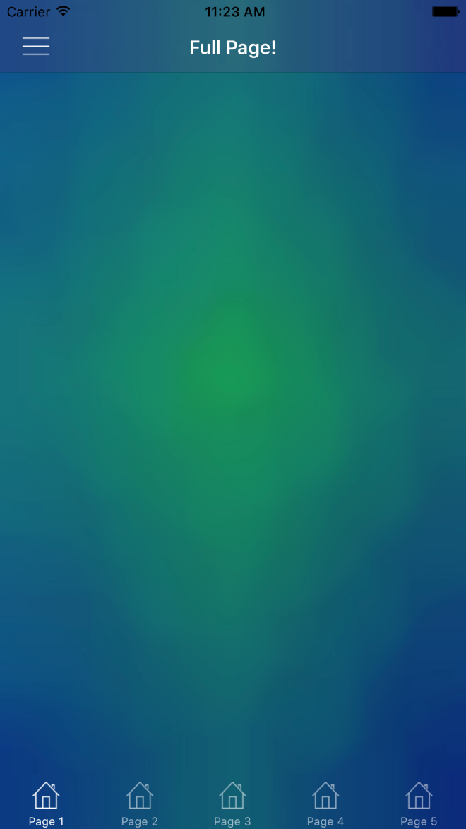
I’ve seen a few people run into this issue in both Visual Studio 2015 and 2017. For those of you who don’t know what I’m talking about, the issue is that code highlighting drops completely in newly opened files. I’ve personally seen it happen in both Xamarin.Forms PCLs and in Xamarin.Android projects. The reason you lose your highlighting is because the project fails to load properly, and your files will then open as “Miscellaneous Files”:
MiscFilesError

These should be opening up as part of the project and thus getting the references required for highlighting, so the goal here is to fix the project load and get these files to open as part of that project.

So here are a few steps that have worked for everyone who has reached out for help:

  1. Don’t panic! This will be quick.
  2. Try unloading the project and reloading it (Right click the project in the Solution Explorer > Unload Project, Right click > Reload Project)
  3. Still happening when you open files in that project? Keep reading.
  4. Check your Error List, there might be warnings to give you hints here.

In this post, we will look at resolving the issue for Xamarin.Forms PCL projects, and will look at fixes for Xamarin.Android projects in another article.

Xamarin.Forms PCL Issues

The most common issue here is that there is an issue in your XAML. For some reason, XAML errors/warnings can throw off the entire project load.

Here’s a quick look at what that might look like:

XamlErrors

  1. From your Error List view, find the XAML page culprit.
  2. Fix the error in your XAML file.
  3. Close all files in the project that is having issues.
  4. In the Solution Explorer, click the refresh button at the top.SolutionRefresh
  5. Re-open the files that were breaking, and you should see everything is back to normal.

Didn’t solve your problem? Let’s look at some of the conventional fixes for this then:

Refresh Your Intellisense Cache

Your Intellisense cache could be corrupt, so try clearing it. Close all your open files then:

Edit > IntelliSense > Refresh Local Cache 

Or Ctrl + Shift + R

Clearing Your Local Data

Close Visual Studio Completely, then go to %appdata%\Microsoft\VisualStudio{your_version_number}\ReflectedSchemas and delete all the content.

Reset your Visual Studio Settings

In Visual Studio, go to Tools > Import and Export Settings and hit Reset all settings.

Restart Visual Studio.

Fix All Errors and Warnings In the Error List

Similarly to how we talked about fixing your XAML error, try making sure all of your errors and warnings are fixed. Some other common issues that can cause the project to load with errors include:

  1. Circular References
  2. Missing project references
  3. Failed nuget downloads
  4. Duplicate files
  5. Broken/wrong typed partial classes


Looking for solving this problem for your Android projects? Stay tuned for another post about some of the Android specific issues that might be causing project load fails.


If you like what you see, don’t forget to follow me on twitter @Suave_Pirate, check out my GitHub, and subscribe to my blog to learn more mobile developer tips and tricks!

Interested in sponsoring developer content? Message @Suave_Pirate on twitter for details.

Xamarin.Controls – Android ArcLayout

Here’s a quick and fun new control to play with. It’s called the ArcLayout, and if the name isn’t descriptive enough, it allows you to layout your Views in the layout based on arcs, degrees, radii, etc. rather than using existing LinearLayouts, RelativeLayouts, or FrameLayouts.

The control is originally from OgacleJapan and you can find his native Android repository here: https://github.com/ogaclejapan/ArcLayout.

I’ve simply provided a Xamarin Android Binding Project to wrap it which you can find here: https://github.com/SuavePirate/ArcLayout. I haven’t created a nuget package for it yet, since the binding project could use some clean up first. However, here is an easy way to get started using it right away.

  1. Clone the Xamarin Binding Library (it includes the native project .jar/.aar in it, so you can clone and start right away).
  2. Copy the project to your solution, and add it as a reference in your Xamarin Android project.
  3. Start adding it to your layouts!
<com.ogaclejapan.arclayout.ArcLayout         
         android:id="@id/arc_layout"
         android:layout_width="match_parent"
         android:layout_height="match_parent"
         app:arc_origin="bottom"
         app:arc_color="#4D000000"
         app:arc_radius="168dp"
         app:arc_axisRadius="120dp"
         app:arc_freeAngle="false"
         app:arc_reverseAngle="false">

    <Button
         android:layout_width="48dp"
         android:layout_height="48dp"
         android:gravity="center"
         android:text="A"
         android:textColor="#FFFFFF"
         android:background="#03A9F4"
         app:arc_origin="center"/>

    <Button
         android:layout_width="48dp"
         android:layout_height="48dp"
         android:gravity="center"
         android:text="B"
         android:textColor="#FFFFFF" 
         android:background="#00BCD4"
         app:arc_origin="center"/>

    <Button
         android:layout_width="48dp"
         android:layout_height="48dp"
         android:gravity="center"
         android:text="C"
         android:textColor="#FFFFFF"
         android:background="#009688"
         app:arc_origin="center"/>

</com.ogaclejapan.arclayout.ArcLayout>

Now we can dissect the new attributes and properties we get from ArcLayout:
attrs

Properties of the ArcLayout

attr description
arc_origin Center of the arc on layout. All of patterns that can be specified, see the demo app.
arc_color Arc Shaped color
arc_radius Radius of the layout
arc_axisRadius Radius the axis of the child views
arc_freeAngle If set to true, each child view can set the free angle, default false
arc_reverseAngle If set to true, reverse the order of the child, default false. Note: If arc_freeAngle set to true does not work


Properties of the ArcLayout Child Views

arc_origin Set the origin point of arc_axisRadius as well as layout_gravity, default center
arc_angle If arc_freeAngle set to true, layout the specified angle

Here’s a good example to get you started including a full circle layout and two semicircles:

arc_layout_full_example.axml

<?xml version="1.0" encoding="utf-8"?>
<RelativeLayout xmlns:android="http://schemas.android.com/apk/res/android"
                     xmlns:app="http://schemas.android.com/apk/res-auto"
                 android:id="@+id/MainLayout"
     android:layout_width="match_parent"
     android:layout_height="match_parent">
  <com.ogaclejapan.arclayout.ArcLayout
         android:id="@+id/arc_layout_top"
         android:layout_width="match_parent"
         android:layout_height="match_parent"
         app:arc_origin="top"
         app:arc_color="#321321"
         app:arc_radius="168dp"
         app:arc_axisRadius="120dp"
         app:arc_freeAngle="false"
         app:arc_reverseAngle="false">

    <Button
         android:layout_width="48dp"
         android:layout_height="48dp"
         android:gravity="center"
         android:text="A"
         android:textColor="#FFFFFF"
         android:background="#03A9F4"
         app:arc_origin="center"/>

    <Button
         android:layout_width="48dp"
         android:layout_height="48dp"
         android:gravity="center"
         android:text="B"
         android:textColor="#FFFFFF"
         android:background="#00BCD4"
         app:arc_origin="center"/>

    <Button
         android:layout_width="48dp"
         android:layout_height="48dp"
         android:gravity="center"
         android:text="C"
         android:textColor="#FFFFFF"
         android:background="#009688"
         app:arc_origin="center"/>

</com.ogaclejapan.arclayout.ArcLayout>
<com.ogaclejapan.arclayout.ArcLayout
         android:id="@+id/arc_layout"
         android:layout_width="match_parent"
         android:layout_height="match_parent"
         app:arc_origin="bottom"
         app:arc_color="#03a9f4"
         app:arc_radius="168dp"
         app:arc_axisRadius="120dp"
         app:arc_freeAngle="false"
         app:arc_reverseAngle="false">

    <Button
         android:layout_width="48dp"
         android:layout_height="48dp"
         android:gravity="center"
         android:text="A"
         android:textColor="#FFFFFF"
         android:background="#03A9F4"
         app:arc_origin="center"/>

    <Button
         android:layout_width="48dp"
         android:layout_height="48dp"
         android:gravity="center"
         android:text="B"
         android:textColor="#FFFFFF"
         android:background="#00BCD4"
         app:arc_origin="center"/>

    <Button
         android:layout_width="48dp"
         android:layout_height="48dp"
         android:gravity="center"
         android:text="C"
         android:textColor="#FFFFFF"
         android:background="#009688"
         app:arc_origin="center"/>

</com.ogaclejapan.arclayout.ArcLayout>
<com.ogaclejapan.arclayout.ArcLayout
         android:id="@+id/arc_layout_center"
         android:layout_width="match_parent"
         android:layout_height="match_parent"
         app:arc_origin="center"
         app:arc_color="#4D123123"
         app:arc_radius="50dp"
         app:arc_axisRadius="50dp"
         app:arc_freeAngle="false"
         app:arc_reverseAngle="false">

    <Button
         android:layout_width="48dp"
         android:layout_height="48dp"
         android:gravity="center"
         android:text="A"
         android:textColor="#FFFFFF"
         android:background="#03A9F4"
         app:arc_origin="center"/>

    <Button
         android:layout_width="48dp"
         android:layout_height="48dp"
         android:gravity="center"
         android:text="B"
         android:textColor="#FFFFFF"
         android:background="#00BCD4"
         app:arc_origin="center"/>

    <Button
         android:layout_width="48dp"
         android:layout_height="48dp"
         android:gravity="center"
         android:text="C"
         android:textColor="#FFFFFF"
         android:background="#009688"
         app:arc_origin="center"/>

    <Button
         android:layout_width="48dp"
         android:layout_height="48dp"
         android:gravity="center"
         android:text="D"
         android:textColor="#FFFFFF"
         android:background="#009688"
         app:arc_origin="center"/>
</com.ogaclejapan.arclayout.ArcLayout>
</RelativeLayout>

arclayout

Feel free to contribute to the Xamarin Android Bindings Library repository mentioned above, I’m happy to field pull requests that can help clean it up for a real release.

If you like what you see, don’t forget to follow me on twitter @Suave_Pirate, check out my GitHub, and subscribe to my blog to learn more mobile developer tips and tricks!

Interested in sponsoring developer content? Message @Suave_Pirate on twitter for details.

Xamarin.Tips – Android Bar Background Images in Xamarin.Forms

In a previous post, we talked about the iOS side of setting background images for both NavigationBars and TabBars. Beyond that, we looked at setting them so that we can simulate having transparent bars that show a background image behind the entire Page. That looked like this:

Simulator Screen Shot Apr 7, 2017, 11.23.33 AM

So now let’s do the same thing in Android!

Android

So Android handles images very differently compared to iOS, and also gives us a few easy ways to do what we want here. Rather than having to create custom renderers, we need to create Drawables for our images, and apply them in our Android Layouts for our Toolbar and TabBar. This approach is going to be more similar to Morgan Skinner’s approach for iOS here: http://www.morganskinner.com/2015/01/xamarin-formsusing-background-images-on.html

So we will need to crop our image where our Toolbar and Tabbar will be. If you are planning to also support landscape views, be sure to also crop the image separately for landscape and include those images in your appropriate drawables folders such as drawables-land-hdpi.

Another thing to consider is that, unlike in iOS, Android tabs are placed below the toolbar rather than at the bottom of the entire view. Because of this, you made need to use a different background for your pages that have a TabBar versus the pages that don’t. Here are some examples of how you might need to crop your images:

Portrait with no tabs

crop_portrait

Portrait with tabs

crop_portrait_tabs

Landscape with no tabs

crop_landscape

Landscape with tabs

crop_landscape_tabs

Be sure that you name the individual images the same, but place them in the appropriate resource folder as explained before. In this example we will call them:

  • toolbar_background.png
  • tabbar_background.png
  • page_background.png
  • tab_page_background.png

Unlike our iOS implementation, we do NOT need any custom renderers. Instead, we will set the background drawable of our layout files for our bars, and then in our xaml page, add an image to be the background.

Toolbar.axml

<?xml version="1.0" encoding="utf-8"?>
<android.support.v7.widget.Toolbar 
    xmlns:android="http://schemas.android.com/apk/res/android"
    xmlns:app="http://schemas.android.com/apk/res-auto"
    android:id="@+id/toolbar"
    android:layout_width="match_parent"
    android:layout_height="?attr/actionBarSize"
    android:minHeight="?attr/actionBarSize"
    android:background="@drawable/toolbar_background"
    android:theme="@style/ThemeOverlay.AppCompat.Dark.ActionBar"
    app:popupTheme="@style/ThemeOverlay.AppCompat.Light"
    app:layout_scrollFlags="scroll|enterAlways" /> 

Tabbar.axml

<?xml version="1.0" encoding="utf-8"?>
<android.support.design.widget.TabLayout         
    xmlns:android="http://schemas.android.com/apk/res/android"              
    xmlns:app="http://schemas.android.com/apk/res-auto"              
    android:id="@+id/sliding_tabs"     
    android:layout_width="match_parent"        
    android:layout_height="wrap_content"          
    android:background="@drawable/tabbar_background"          
    android:theme="@style/ThemeOverlay.AppCompat.Dark.ActionBar"          
    app:tabIndicatorColor="@android:color/white"
    app:tabGravity="fill"      
    app:tabMode="fixed" />

Then be sure to set the resources before starting Xamarin.Forms in your MainActivity:

MainActivity.cs

    public class MainActivity : global::Xamarin.Forms.Platform.Android.FormsAppCompatActivity
    {
        protected override void OnCreate(Bundle bundle)
        {
            TabLayoutResource = Resource.Layout.Tabbar;
            ToolbarResource = Resource.Layout.Toolbar;

            base.OnCreate(bundle);

            global::Xamarin.Forms.Forms.Init(this, bundle);
            LoadApplication(new App());

        }
    }

With all those things set, you can now use your background images on pages with or without tabs:

ContentPageWithTabs.xaml

<ContentPage ...>
    <Grid ...>
        <Image Source="tab_page_background.png" .../>
        <!-- The rest of your content on top of the image -->
    </Grid>
</ContentPage>

ContentPageWithNoTabs.xaml

<ContentPage ...>
    <Grid ...>
        <Image Source="page_background.png" .../>
        <!-- The rest of your content on top of the image -->
    </Grid>
</ContentPage>


You can see an example result here (with a rushed crop job):

Screenshot_2017-04-18-14-20-08


If you like what you see, don’t forget to follow me on twitter @Suave_Pirate, check out my GitHub, and subscribe to my blog to learn more mobile developer tips and tricks!

Interested in sponsoring developer content? Message @Suave_Pirate on twitter for details.

Xamarin.Tips – MVVM Light Set Expressions Explained

I recently published a post about creating some Visual Studio code snippets for shorcutting the overhead of writing bindable properties and commands with MvvmLight. Xamarin.Tips – Visual Studio Code Templates/Snippets for MVVM Light

This post sparked some people who may or may not have used  Mvvm Light in the past to ask me about how it works underneath, and specifically the Set call made. For example:

private string _myText;

public string MyText
{
    get
    {
        return _myText;
    }
    set
    {
        // This is where the questions are.
        Set(() => MyText, ref _myText, value);
    }
}

I figured I would make another post to dissect this and explain what it is and how it is used!


First off, why are we doing this at all? What does this really do for us?

We use MvvmLight in order to create two-way or one-way bindings to our views whether that is in WPF, UWP, or Xamarin.Forms. The way these bindings are handled is by implementing INotifyPropertyChanged. When we implement INotifyPropertyChanged, we create a public event called PropertyChanged. PropertyChanged takes a custom EventArgs that includes the name of the property that was changed as a string. You would invoke that like this:

PropertyChanged?.Invoke(new PropertyChangedEventArgs("MyText"));

We can then have an event handler attached to this:

myViewModel.PropertyChanged += (sender, args) =>
{
    Console.WriteLine(args.PropertyName); // "MyText"
};

However, platforms such as WPF, UWP, and Xamarin give us the ability to use XAML to create these bindings like this (in Xamarin.Forms):

<Label Text="{Binding MyText}"/>

Setting bindings like this creates event handlers in the background if the BindingContext (or DataContext if you’re in UWP/WPF) implements INotifyPropertyChanged.

So now we can create auto-updating views with our bindings and calling PropertyChanged, but that’s a pain to do for every single property. That’s where libraries like MvvmLight come into play. They help handle a lot of the manual calls and ugly code. So now let’s look at what MvvmLight is really doing under the covers.

First, we need to look at the ViewModelBase class that MvvmLight ships and that contains the Set method we are talking about. ViewModelBase inherits from ObservableObject (another class MvvmLight), and ObservableObject is what is implementing INotifyPropertyChanged! We found it!

So how are ViewModelBase.Set and ObservableObject.Set making their way to calling PropertyChanged?

Let’s dissect the three parameters for the Set method used in the templates I created:

Set(() => MyText, ref _myText, value);
  1. The first is of type Expression<Func>. It is an expression that is returning the property that is calling it? This is where the fun stuff is really happening, so more on that later.
  2. The second is the underlying field that needs to be updated, passed in as a reference type rather than by value.
  3. The third is the new value that it is being set to.

The last two seem to make sense right away: what field are we updating, and what is the value we are setting it to? We need to pass the field in as a ref so that when we update it, it updates in the original model that passed it in rather than simply passing the value of the field into the method.

So what is that Expression?

The only thing left in order to call PropertyChanged is the name of the property being updated, so that must be what the property expression is for. Without decompiling the MvvmLight dlls and looking at the source code, we can infer how we might be able to pull the property name out of that Expression.

First, we need to get the Body of the Expression as a System.Linq.Expression.MemberExpression. The MemberExpression has a Member property which we can then pull property info from. We can cast that Member as a System.Reflection.PropertyInfo, and with that PropertyInfo, we can take the name of the property.

Expression<Func<string>> myTextExpression = () => MyText;
var body = myTextExpression.Body as MemberExpression;
var member = body.Member as PropertyInfo;
var finalPropertyName = member.Name; // we have it!

Then the final step is to finally invoke PropertyChanged with that property name.

I do also want to point out that although I use this particular Set method from MvvmLight, the ObservableObject and ViewModelBase do come with multiple overloads of Set that might work better for your preferred practices. For example, you can call Set without the property expression, and just pass the name of the property in directly. For example:

private string _myText;

public string MyText
{
    get
    {
        return _myText;
    }
    set
    {
        Set("MyText", ref _myText, value); 
    }
}

OR to be even more optimized, you can use nameof to get the name of the property without having to have string-literals floating around in your code:

private string _myText;

public string MyText
{
    get
    {
        return _myText;
    }
    set
    {
        Set(nameof(MyText), ref _myText, value); 
    }
}

Here are all the overloads available to use:

ViewModelBase.cs

protected bool Set<T>(Expression<Func<T>> propertyExpression, ref T field, T newValue, bool broadcast);
protected bool Set<T>(string propertyName, ref T field, T newValue = default(T), bool broadcast = false);
protected bool Set<T>(ref T field, T newValue = default(T), bool broadcast = false, [CallerMemberName] string propertyName = null);

ObservableObject.cs

// THIS IS THE ONE WE WERE USING
protected bool Set<T>(Expression<Func<T>> propertyExpression, ref T field, T newValue);
protected bool Set<T>(string propertyName, ref T field, T newValue);
protected bool Set<T>(ref T field, T newValue, [CallerMemberName] string propertyName = null);

If you happen to have any other questions about how this works, or about breaking down Expressions like we did, feel free to drop a comment on this post, or mention me on Twitter @Suave_Pirate.


And as always:


If you like what you see, don’t forget to follow me on twitter @Suave_Pirate, check out my GitHub, and subscribe to my blog to learn more mobile developer tips and tricks!

Interested in sponsoring your developer content? Message me on twitter @Suave_Pirate for details.

Xamarin.Tips – Removing the Bottom Border of Your iOS Navigation Bars

iOS UINavigationBars by default ship with a bottom border. If you want to remove it, all you need to do is update the ShadowImage of your UINavigationBar. Setting it to new UIImage() will do the trick. This might not be a universal solution. If you are doing more custom work or for certain layouts, you might need to take some additional steps including setting ClipsToBounds to true and setting the BackgroundImage of the UINavigationBar to a new UIImage() as well.

Here’s all of that together:

...
NavigationBar.ShadowImage = new UIImage();
NavigationBar.ClipsToBounds = true(); // optional
NavigationBar.BackgroundImage = new UIImage(); // optional
...

Of course, we are also going to talk about applying this in Xamarin.Forms!

If you want to apply this globally, you can create a custom renderer for NavigationPage. If you only want it in some situations, then you will need to create a new subclass of ContentPage and create a custom renderer for that page that will apply the same changes as below for our universal solution:

CustomNavigationRenderer.cs

[assembly: ExportRenderer(typeof(NavigationPage), typeof(CustomNavigationRenderer))]
namespace YOUR_IOS_NAMESPACE
{
    public class CustomNavigationRenderer : NavigationRenderer
    {
        public override void ViewDidLoad()
        {
            base.ViewDidLoad();

            NavigationBar.ShadowImage = new UIImage();
            NavigationBar.ClipsToBounds = true(); // optional
            NavigationBar.BackgroundImage = new UIImage(); // optional
        }

    }
}

One other way to do this is by using the Appearance API and apply it universally!

...
UINavigationBar.Appearance.ShadowImage = new UIImage();
...

Lastly, here’s is how this would look in Swift if you’ve landed here but aren’t using Xamarin and C#:

UINavigationBar.appearance().setBackgroundImage(
    UIImage(),
    forBarPosition: .Any,
    barMetrics: .Default)

UINavigationBar.appearance().shadowImage = UIImage()

or if you are for some reason in love with Obj-C:

[[UINavigationBar appearance] setBackgroundImage:[[UIImage alloc] init]
                                  forBarPosition:UIBarPositionAny
                                      barMetrics:UIBarMetricsDefault];

[[UINavigationBar appearance] setShadowImage:[[UIImage alloc] init]];


transnavbar


If you like what you see, don’t forget to follow me on twitter @Suave_Pirate, check out my GitHub, and subscribe to my blog to learn more mobile developer tips and tricks!

Xamarin.Tips – iOS Bar Background Images in Xamarin.Forms

Xamarin.Forms doesn’t ship with any way to provide images as your background of either NavigationBars or TabBars. So in order to do this, we will have to build some custom renderers.

iOS

Morgan skinner has a great post here about an approach that he took to apply background images to his NavigationBars: http://www.morganskinner.com/2015/01/xamarin-formsusing-background-images-on.html

The give you the synopsis, you take your entire background image, crop it, and apply the cropped piece as the background of the bar in your renderer.

Here’s a look at how he cropped his image:
Original Marked Up_thumb[5]

I want to take a different approach here and do this programmatically so that you can be EXACT in the background of the bar so that it can match the background of your image.

Although we are approaching this as if you are applying the background image to be the same as your page background image, the same principle applies if you just want to set any image.

Here’s a renderer to use for a NavigationBar:

BackgroundImageNavigationRenderer.cs

[assembly: ExportRenderer(typeof(NavigationPage), typeof(BackgroundImageNavigationRenderer))]
namespace YOUR_IOS_NAMESPACE
{
    public class BackgroundImageNavigationRenderer : NavigationRenderer
    {
        public override void ViewDidLoad()
        {
            base.ViewDidLoad();

            View.BackgroundColor = UIColor.Clear;
            NavigationBar.BackgroundColor = UIColor.Clear;
            var image = UIImage.FromBundle("YOUR_PAGE_BACKGROUND_IMAGE.png");
            image = image.Crop(0,
                (int)(image.CGImage.Height - NavigationBar.Frame.Height),
                (int)image.CGImage.Width,
                (int)NavigationBar.Frame.Height);
            image = image.Scale(new CGSize(NavigationBar.Frame.Width, NavigationBar.Frame.Height));
            NavigationBar.BarTintColor = UIColor.FromPatternImage(image);
            NavigationBar.ShadowImage = new UIImage();
        }

    }
}

Breaking it down, we are taking the image that we use as the background for our entire page, then opening cropping it to the size of the NavigationBar itself.

I’ve also created an extension method called Crop so that we can reuse it here and for our UITabBar:

ImageExtensions.cs

    public static class ImageExtensions
    {
        public static UIImage Crop(this UIImage image, int x, int y, int width, int height)
        {
            var imgSize = image.Size;

            UIGraphics.BeginImageContext(new SizeF(width, height));
            var imgToCrop = UIGraphics.GetCurrentContext();

            var croppingRectangle = new CGRect(0, 0, width, height);
            imgToCrop.ClipToRect(croppingRectangle);

            var drawRectangle = new CGRect(-x, -y, imgSize.Width, imgSize.Height);

            image.Draw(drawRectangle);
            var croppedImg = UIGraphics.GetImageFromCurrentImageContext();

            UIGraphics.EndImageContext();
            return croppedImg;
        }

    }

Now, if you are not doing this to have a full background image, and just want some image for your UINavigationBar only, you can do so like this:

BackgroundImageNavigationRenderer.cs

[assembly: ExportRenderer(typeof(NavigationPage), typeof(BackgroundImageNavigationRenderer))]
namespace YOUR_IOS_NAMESPACE
{
    public class BackgroundImageNavigationRenderer : NavigationRenderer
    {
        public override void ViewDidLoad()
        {
            base.ViewDidLoad();

            View.BackgroundColor = UIColor.Clear;
            NavigationBar.BackgroundColor = UIColor.Clear;
            var image = UIImage.FromBundle("YOUR_BAR_BACKGROUND_IMAGE.png");

            image = image.Scale(new CGSize(NavigationBar.Frame.Width, NavigationBar.Frame.Height));
            NavigationBar.BarTintColor = UIColor.FromPatternImage(image);
            NavigationBar.ShadowImage = new UIImage();
        }

    }
}

Essentially just cutting out the cropping process.

Also note that I set the NavigationBar.ShadowImage to a new UIImage();. Doing this gets rid of the line below your UINavigationBar. If you don’t want to remove the line, just don’t set the ShadowImage.

Now that we’ve done this for our UINavigationBar, we can apply the same thing to our UITabBars. So let’s create another custom renderer for that!

BackgroundImageTabbedPageRenderer.cs


[assembly: ExportRenderer(typeof(TabbedPage), typeof(BackgroundImageTabbedPageRenderer))]
namespace YOUR_IOS_NAMESPACE
{
    public class BackgroundImageTabbedPageRenderer : TabbedRenderer
    {
        public override void ViewWillLayoutSubviews()
        {
            base.ViewWillLayoutSubviews();

            var image = UIImage.FromBundle("YOUR_PAGE_BACKGROUND_IMAGE.jpg");
            image =image.Crop(0,
                (int)(image.CGImage.Height - TabBar.Frame.Height),
                (int)image.CGImage.Width,
                (int)TabBar.Frame.Height);
            image = image.Scale(new CGSize(TabBar.Frame.Width, TabBar.Frame.Height));
            TabBar.BackgroundImage = image;
            TabBar.UnselectedItemTintColor = UIColor.FromRGBA(255, 255, 255, 150);
            TabBar.ShadowImage = new UIImage();
        }

    }
}

just as we did with our UINavigationBar, we crop the page background image to the location and dimensions of our UITabBar, and set the background image there. The same thing also applies with removing the ShadowImage.

And if you are not using a full background image, and just want an image for your bar, take this:

BackgroundImageTabbedPageRenderer.cs


[assembly: ExportRenderer(typeof(TabbedPage), typeof(BackgroundImageTabbedPageRenderer))]
namespace YOUR_IOS_NAMESPACE
{
    public class BackgroundImageTabbedPageRenderer : TabbedRenderer
    {
        public override void ViewWillLayoutSubviews()
        {
            base.ViewWillLayoutSubviews();

            var image = UIImage.FromBundle("YOUR_PAGE_BACKGROUND_IMAGE.jpg");

            image = image.Scale(new CGSize(TabBar.Frame.Width, TabBar.Frame.Height));
            TabBar.BackgroundImage = image;
            TabBar.UnselectedItemTintColor = UIColor.FromRGBA(255, 255, 255, 150);
            TabBar.ShadowImage = new UIImage();
        }

    }
}

And now you can use full page images over your NavigationBars and TabBars, or just set an image as the background for your bars!


Simulator Screen Shot Apr 7, 2017, 11.23.33 AM

If you like what you see, don’t forget to follow me on twitter @Suave_Pirate, check out my GitHub, and subscribe to my blog to learn more mobile developer tips and tricks!

Xamarin.Tips – Sending Authorized SignalR Requests

In my last post, I talked about creating a CookieProvider for handling OAuth Bearer Tokens from an HTTP Cookie. Now that we have this capability, we can make a secure connection to SignalR using a Cookie store rather than adding our tokens to the Authorization HTTP Header.

By using cookies instead of the HTTP Header, we can now use a full Websocket connection rather than being forced into long polling. Using websockets increases speed of messages received and messages sent.

So here’s the quick bit of code for making a secure SignalR Websocket connection:

SignalRConnectionService.cs

    public class SignalRConnectionService
    {
        private HubConnection _connection;
        public IHubProxy AppHubProxy { get; set; }

        public SignalRConnectionService()
        {
            _connection = new HubConnection(YOUR_SIGNALR_URL);
            AppHubProxy = _connection.CreateHubProxy("AppHub");
        }

        public async Task StartAsync()
        {
            try
            {
                if(_connection.State != ConnectionState.Disconnected)
                {
                    _connection.Stop();
                }
                _connection.CookieContainer = new CookieContainer();
                _connection.CookieContainer.Add(new Uri(THE_BASE_URL_OF_YOUR_SERVER), new Cookie("BearerToken", YOUR_ACCESS_TOKEN));
                await _connection.Start();
               
        }
        public void Stop()
        {
            _connection.Stop();
        }
    }

Now we have the full speed of websockets enabled in our Xamarin, Mac, and Windows applications!

If you like what you see, don’t forget to follow me on twitter @Suave_Pirate, check out my GitHub, and subscribe to my blog to learn more mobile developer tips and tricks!

ASP.NET.Tips – Consuming Bearer Tokens as a Cookie

A while ago, I talked about creating a super basic OAuth Bearer and Refresh Token System in your ASP.NET web applications: Adding a Simple Refresh Token to OAuth Bearer Tokens

Now, almost two years later, we will expand on this by creating a Cookie provider that consumes your bearer tokens to make Authorization easier. One reason to consider doing this is if you are using SignalR or any other socket service with your OAuth tokens. You can add your Bearer token in your Authorization header of your requests to SignalR, however, doing this will force your client to use LongPolling rather than actually using WebSockets as it is intended.

So, let’s create our provider:

OAuthCookieProvider.cs

 public class OAuthCookieProvider : OAuthBearerAuthenticationProvider
    {
        public override Task RequestToken(OAuthRequestTokenContext context)
        {
            if (context == null) throw new ArgumentException("context");
            var tokenCookie = context.OwinContext.Request.Cookies["BearerToken"];
            if (!string.IsNullOrEmpty(tokenCookie))
            {
                context.Token = tokenCookie;
                return Task.FromResult<object>(null);
            }
            return base.RequestToken(context);
        }
    }

And now let’s get that registered with Owin:

Startup.cs

...
public void Configuration(IAppBuilder app)
{
    app.UseOAuthBearerAuthentication(new OAuthBearerAuthenticationOptions
    {
        Provider = new OAuthCookieProvider()
    });
}
...

Now we can send requests with our HTTP cookie with the key of BearerToken and make it through the built in Authorize attribute without having to write anything custom.

Next, we will look at taking advantage of this CookieProvider in a .NET Signalr Client to use the full power and speed of web socket connections.

If you like what you see, don’t forget to follow me on twitter @Suave_Pirate, check out my GitHub, and subscribe to my blog to learn more mobile developer tips and tricks!

Xamarin.Controls – Xamarin.Forms PinView

In  previous post, I talked about creating a BorderlessEntry view using a Custom Renderer (or an alternative Effect). We are going to use said control in this post, so you can find it here: Xamarin.Forms Borderless Entry
On top of this control, we are also going to use a custom behavior mentioned in a blog post here: Xamarin.Tips – Restrict the Length of Your Entry Text

Now let’s talk about giving your users the ability to create a PIN to secure their account in your app while giving them a nice experience. The solution is the PinView!

We are going to build this as a custom component in Xamarin.Forms:

PinView.xaml

<ContentView xmlns="http://xamarin.com/schemas/2014/forms"               xmlns:x="http://schemas.microsoft.com/winfx/2009/xaml"               xmlns:behaviors="clr-namespace:YOUR_NAMESPACE.Behaviors;assembly=YOUR_NAMESPACE"              xmlns:views="clr-namespace:YOUR_NAMESPACE;assembly=YOUR_NAMESPACE"              x:Class="YOUR_NAMESPACE.PinView">
    <ContentView.Resources>
        <ResourceDictionary>
<Style x:Key="PinEntry" TargetType="Entry">
                <Setter Property="Keyboard" Value="Numeric"/>
                <Setter Property="IsPassword" Value="True"/>
                <Setter Property="WidthRequest" Value="50"/>
                <Setter Property="HeightRequest" Value="50"/>
                <Setter Property="Margin" Value="8,0"/>
                <Setter Property="HorizontalTextAlignment" Value="Center"/>
            </Style>
<Style x:Key="BottomBar" TargetType="BoxView">
                <Setter Property="HeightRequest" Value="2"/>
                <Setter Property="BackgroundColor" Value="White"/>
                <Setter Property="WidthRequest" Value="50"/>
                <Setter Property="VerticalOptions" Value="Start"/>
                <Setter Property="Margin" Value="0"/>
            </Style>

        </ResourceDictionary>
    </ContentView.Resources>
  <ContentView.Content>
        <StackLayout Orientation="Horizontal" HorizontalOptions="FillAndExpand">
            <StackLayout Orientation="Vertical">
                <views:BorderlessEntry x:Name="Pin1" Style="{StaticResource PinEntry}" TextColor="White">
                    <Entry.Behaviors>
                        <behaviors:EntryLengthValidatorBehavior MaxLength="1"/>
                    </Entry.Behaviors>
                </views:BorderlessEntry>
                <BoxView Style="{StaticResource BottomBar}"/>
            </StackLayout>

            <StackLayout Orientation="Vertical">
                <views:BorderlessEntry x:Name="Pin2" Style="{StaticResource PinEntry}" TextColor="White">
                    <Entry.Behaviors>
                        <behaviors:EntryLengthValidatorBehavior MaxLength="1"/>
                    </Entry.Behaviors>
                </views:BorderlessEntry>
                <BoxView Style="{StaticResource BottomBar}"/>
            </StackLayout>
            <StackLayout Orientation="Vertical">
                <views:BorderlessEntry x:Name="Pin3" Style="{StaticResource PinEntry}" TextColor="White">
                    <Entry.Behaviors>
                        <behaviors:EntryLengthValidatorBehavior MaxLength="1"/>
                    </Entry.Behaviors>
                </views:BorderlessEntry>
                <BoxView Style="{StaticResource BottomBar}"/>
            </StackLayout>
            <StackLayout Orientation="Vertical">
                <views:BorderlessEntry x:Name="Pin4" Style="{StaticResource PinEntry}" TextColor="White">
                    <Entry.Behaviors>
                        <behaviors:EntryLengthValidatorBehavior MaxLength="1"/>
                    </Entry.Behaviors>
                </views:BorderlessEntry>
                <BoxView Style="{StaticResource BottomBar}"/>
            </StackLayout>
        </StackLayout>
  </ContentView.Content>
</ContentView>

Lastly, we add some behaviors to our code-behind:

PinView.xaml.cs

 public partial class PinView : ContentView
    {
        public static BindableProperty PinProperty = BindableProperty.Create("Pin", typeof(string), typeof(PinView), defaultBindingMode: BindingMode.OneWayToSource);
        public string Pin
        {
            get
            {
                return (string)GetValue(PinProperty);
            }
            set
            {
                SetValue(PinProperty, value);
            }
        }
        public PinView()
        {
            InitializeComponent();
            Pin = string.Empty;
            Pin1.TextChanged += Pin1_TextChanged;
            Pin2.TextChanged += Pin2_TextChanged;
            Pin3.TextChanged += Pin3_TextChanged;
            Pin4.TextChanged += Pin4_TextChanged;
        }

        private void Pin4_TextChanged(object sender, TextChangedEventArgs e)
        {
            if (Pin4.Text.Length > 0)
                Pin4.Unfocus();
            else
                Pin3.Focus();
            Pin = Pin1.Text + Pin2.Text + Pin3.Text + Pin4.Text;
        }

        private void Pin3_TextChanged(object sender, TextChangedEventArgs e)
        {
            if (Pin3.Text.Length > 0)
                Pin4.Focus();
            else
                Pin2.Focus();
            Pin = Pin1.Text + Pin2.Text + Pin3.Text + Pin4.Text;
        }

        private void Pin2_TextChanged(object sender, TextChangedEventArgs e)
        {
            if (Pin2.Text.Length > 0)
                Pin3.Focus();
            else
                Pin1.Focus();
            Pin = Pin1.Text + Pin2.Text + Pin3.Text + Pin4.Text;
        }

        private void Pin1_TextChanged(object sender, TextChangedEventArgs e)
        {
            if (Pin1.Text.Length > 0)
                Pin2.Focus();
            Pin = Pin1.Text + Pin2.Text + Pin3.Text + Pin4.Text;
        }
    }

If we dig into the behavior, we set up our TextChanged events so that when each separate Entry is updated, we move the focus to the next Entry. If we clear the text of one of the Entries, we move to the Entry before it, and when we write text into the Entry, we move to the next one.

We also use the Behavior mentioned to restrict the user from entering more than 1 character in each Entry!

If you like what you see, don’t forget to follow me on twitter @Suave_Pirate, check out my GitHub, and subscribe to my blog to learn more mobile developer tips and tricks!

Xamarin.Tips – Restrict the Length of Your Entry Text

Here’s a quick one on how to restrict the number of characters a user can enter in an Entry. Basically, we are going to create a custom Behavior and then apply it to our Entry.

EntryLengthValidatorBehavior.cs

 /// <summary>
    /// Behavior that restricts the length of an entry
    /// </summary>
    public class EntryLengthValidatorBehavior : Behavior<Entry>
    {
        public int MaxLength { get; set; }

        protected override void OnAttachedTo(Entry bindable)
        {
            base.OnAttachedTo(bindable);
            bindable.TextChanged += OnEntryTextChanged;
        }

        protected override void OnDetachingFrom(Entry bindable)
        {
            base.OnDetachingFrom(bindable);
            bindable.TextChanged -= OnEntryTextChanged;
        }

        void OnEntryTextChanged(object sender, TextChangedEventArgs e)
        {
            var entry = (Entry)sender;

            if (entry.Text.Length > this.MaxLength)
            {
                string entryText = entry.Text;
                entry.TextChanged -= OnEntryTextChanged;
                entry.Text = e.OldTextValue;
                entry.TextChanged += OnEntryTextChanged;
            }
        }
    }

Now we can apply it in our Xaml:

<Entry x:Name="Pin1" TextColor="White">
    <Entry.Behaviors>
        <behaviors:EntryLengthValidatorBehavior MaxLength="4"/>
    </Entry.Behaviors>
</Entry>

If you like what you see, don’t forget to follow me on twitter @Suave_Pirate, check out my GitHub, and subscribe to my blog to learn more mobile developer tips and tricks!