Xamarin.Tip – Dynamic Elevation Frames

How about some more Material Design based controls for Xamarin.Forms?

A while back I wrote about creating more “Material” Frames in your Xamarin.Forms apps using a custom renderer for iOS: Xamarin.Tip – Making Your iOS Frame Shadows More Material

And also wrote about the MaterialButton control I created that added dynamic Elevation properties for both iOS and Android:
Xamarin.Tip – Adding Dynamic Elevation to Your Xamarin.Forms Buttons

And I’ve been getting requests to talk about how to do it with the Frame control in Xamarin.Forms. Spoiler Alert: It’s basically the exact same thing as the MaterialButton…..

Let’s start by creating a custom Frame class in our Xamarin.Forms project:

MaterialFrame.cs

public class MaterialFrame : Frame
{
    public static BindableProperty ElevationProperty = BindableProperty.Create(nameof(Elevation), typeof(float), typeof(MaterialButton), 4.0f);

    public float Elevation
    {
        get
        {
            return (float)GetValue(ElevationProperty);
        }
        set
        {
            SetValue(ElevationProperty, value);
        }
    }
}

We add our bindable Elevation property with a default value of 4.

Now we just need simple custom renderers for our iOS and Android implementations.

Starting with iOS:

MaterialFrameRenderer_iOS.cs

public class MaterialFrameRenderer : FrameRenderer
{
    public static void Initialize()
    {
        // empty, but used for beating the linker
    }
    protected override void OnElementChanged(ElementChangedEventArgs<Frame> e)
    {
        base.OnElementChanged(e);

        if (e.NewElement == null)
            return;
        UpdateShadow();
    }

    protected override void OnElementPropertyChanged(object sender, PropertyChangedEventArgs e)
    {
        base.OnElementPropertyChanged(sender, e);
        if(e.PropertyName == "Elevation")
        {
            UpdateShadow();
        }
    }

    private void UpdateShadow()
    {

        var materialFrame = (MaterialFrame)Element;

        // Update shadow to match better material design standards of elevation
        Layer.ShadowRadius = materialFrame.Elevation;
        Layer.ShadowColor = UIColor.Gray.CGColor;
        Layer.ShadowOffset = new CGSize(2, 2);
        Layer.ShadowOpacity = 0.80f;
        Layer.ShadowPath = UIBezierPath.FromRect(Layer.Bounds).CGPath;
        Layer.MasksToBounds = false;

    }
}

And now the simple Android renderer that can use the built in Elevation properties

MaterialFrameRenderer_Android.cs

public class MaterialFrameRenderer : Xamarin.Forms.Platform.Android.AppCompat.FrameRenderer
{
    protected override void OnElementChanged(ElementChangedEventArgs<Frame> e)
    {
        base.OnElementChanged(e);
        if (e.NewElement == null)
            return;

        UpdateElevation();
    }


    private void UpdateElevation()
    {
        var materialFrame= (MaterialFrame)Element;

        // we need to reset the StateListAnimator to override the setting of Elevation on touch down and release.
        Control.StateListAnimator = new Android.Animation.StateListAnimator();

        // set the elevation manually
        ViewCompat.SetElevation(this, materialFrame.Elevation);
        ViewCompat.SetElevation(Control, materialFrame.Elevation);
    }

    protected override void OnElementPropertyChanged(object sender, PropertyChangedEventArgs e)
    {
        base.OnElementPropertyChanged(sender, e);
        if(e.PropertyName == "Elevation")
        {
            UpdateElevation();
        }
    }
}

Now with both our renderers, we can reference our MaterialFrame component in our content!

<ContentPage ...>
    <StackLayout>
        <components:MaterialFrame Elevation="6" />
        <components:MaterialFrame Elevation="{Binding SomeNumber}"/>
    </StackLayout>
</ContentPage>

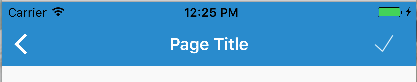
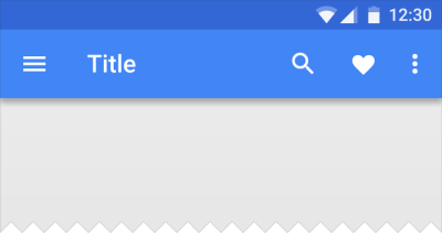
And that’s it! Now you can control the elevation of your frames for both iOS and Android in Xamarin.Forms:
iOSMaterialFrameAndLabel


If you like what you see, don’t forget to follow me on twitter @Suave_Pirate, check out my GitHub, and subscribe to my blog to learn more mobile developer tips and tricks!

Interested in sponsoring developer content? Message @Suave_Pirate on twitter for details.

Android.Basics – Adding a Bottom Navigation View

Changing my pace of steady Xamarin content to go to my roots of native mobile development. This time, we’ll look at implementing the latest control provided by Google and Material Design – The BottomNavigationView.

Resources

Aren’t These Just Tabs?

I mean… yeah, but… it’s new and cool! Google finally realized that stretching to the top of the app can be annoying.
Screen Shot 2017-06-27 at 5.56.48 PM.png

This new control is also a little different from the TabLayout we all know in love from Material Design and Android development in that it is limited to 5 maximum tab items and does not support scrolling. It’s meant to act as top level or sibling level navigation as long as all items are of equal importance in the context of the application/current view. It is also nice to give some variety to our applications navigation scheme; larger apps with many tabbed views can become overwhelming, so tossing something new is relieving to our users.

Code

There are 3 major components to setting up a view with a BottomNavigationView.

  1. First, we need to create a menu resource for our navigation items.
  2. Then we need to create, style, and set up our BottomNavigationView in our layout.
  3. Lastly, add listeners for when an item is selected in our BottomNavigationView and make sure it fits the experience expectation defined in Material Design.

Create a Menu

In our example, we will be building an application for viewing adoptable puppies. Each navigation item will be a different set of these puppies by categorizing them. Let’s create a menu for “all”, “big”, “small”, “trained”, and “active” as categories for our puppies:

res/menu/bottom_bar_menu.xml

<menu xmlns:android="http://schemas.android.com/apk/res/android">
    <item android:id="@+id/all_puppies"         android:title="@string/action_all"         android:icon="@drawable/ic_home_white_24dp" />

    <item android:id="@+id/big_puppies"         android:title="@string/action_big"         android:icon="@drawable/ic_dog_white_24dp" />

    <item android:id="@+id/small_puppies"         android:title="@string/action_small"         android:icon="@drawable/ic_small_dog_white_24dp" />

    <item android:id="@+id/trained_puppies"         android:title="@string/action_trained"         android:icon="@drawable/ic_trained_white_24dp" />

    <item android:id="@+id/active_puppies"         android:title="@string/action_active"         android:icon="@drawable/ic_active_white_24dp" />
</menu>

With our menu, we can create our layout.

Updating the Layout

In our example, we are moving from a TabLayout with a ViewPager. However, the Material Design documentation for the BottomNavigationView states that it should NOT be used with side-swiping actions such as a ViewPager. Let’s replace that ViewPager with a FrameLayout that will be used to swap our active Fragment and also remove the TabLayout that is being replaced by the BottomNavigationView:

res/layout/activity_main.xml

<?xml version="1.0" encoding="utf-8"?>
<android.support.design.widget.CoordinatorLayout xmlns:android="http://schemas.android.com/apk/res/android"     xmlns:app="http://schemas.android.com/apk/res-auto"     xmlns:tools="http://schemas.android.com/tools"     android:id="@+id/main_content"     android:layout_width="match_parent"     android:layout_height="match_parent"     android:fitsSystemWindows="true"     tools:context="com.suavepirate.bottomnavigationpuppies.activities.MainActivity">

    <android.support.design.widget.AppBarLayout         android:id="@+id/appbar"         android:layout_width="match_parent"         android:layout_height="wrap_content"         android:paddingTop="@dimen/appbar_padding_top"         android:theme="@style/AppTheme.AppBarOverlay">

        <android.support.v7.widget.Toolbar             android:id="@+id/toolbar"             android:layout_width="match_parent"             android:layout_height="?attr/actionBarSize"             android:background="?attr/colorPrimary"             app:layout_scrollFlags="scroll|enterAlways"             app:popupTheme="@style/AppTheme.PopupOverlay">

        </android.support.v7.widget.Toolbar>
    </android.support.design.widget.AppBarLayout>

<FrameLayout     android:id="@+id/container"     android:layout_width="match_parent"     android:layout_height="match_parent"     app:layout_behavior="@string/appbar_scrolling_view_behavior" ></FrameLayout>
<android.support.design.widget.BottomNavigationView     android:id="@+id/bottombar"     android:layout_width="match_parent"     android:layout_height="56dp"     android:layout_gravity="bottom|fill_horizontal|start"     app:menu="@menu/bottom_bar_menu"     android:background="@android:color/white"     app:elevation="8dp"/>
</android.support.design.widget.CoordinatorLayout>

It’s important to layout the BottomNavigationView at the bottom of the page as well as give it a solid background and elevation. Also, notice how we apply our menu we created to the view by setting app:menu="@menu/bottom_bar_men".

With our layout set, let’s wire up listeners to update the current Fragment based on the selected navigation item.

Setting Up Listeners

In our MainActivity.java we can implement the BottomNavigationView.OnNavigationItemSelectedListener interface and override the onNavigationItemSelected method:

MainActivity.java

// imports

public class MainActivity extends AppCompatActivity implements BottomNavigationView.OnNavigationItemSelectedListener {
    private PageAdapter mSectionsPagerAdapter;
    private FrameLayout mContainer;
    private BottomNavigationView mBottomBar;

    @Override
    protected void onCreate(Bundle savedInstanceState) {
        super.onCreate(savedInstanceState);
        setContentView(R.layout.activity_main);

        Toolbar toolbar = (Toolbar) findViewById(R.id.toolbar);
        setSupportActionBar(toolbar);
        // Create the adapter that will return a fragment for each of puppy types
        mSectionsPagerAdapter = new PageAdapter(getSupportFragmentManager(), this);

        // Set up the ViewPager with the sections adapter.
        mContainer = (FrameLayout) findViewById(R.id.container);

        // set up the first Fragment
        FragmentTransaction ft = getSupportFragmentManager().beginTransaction();
        ft.add(R.id.container, mSectionsPagerAdapter.getItem(0), "CURRENT_PAGE");
        ft.commit();

        // set up the bottom bar and listener
        mBottomBar = (BottomNavigationView)findViewById(R.id.bottombar);
        mBottomBar.setOnNavigationItemSelectedListener(this);

    }

    // Handles when an item is selected to update the fragment container
    @Override
    public boolean onNavigationItemSelected(@NonNull MenuItem item) {
        FragmentTransaction ft = getSupportFragmentManager().beginTransaction();
        ft.setCustomAnimations(android.R.anim.fade_in, android.R.anim.fade_out);

        switch(item.getItemId()){
            case R.id.all_puppies: ft.replace(R.id.container, mSectionsPagerAdapter.getItem(0));
                break;
            case R.id.big_puppies: ft.replace(R.id.container, mSectionsPagerAdapter.getItem(1));
                break;
            case R.id.small_puppies: ft.replace(R.id.container, mSectionsPagerAdapter.getItem(2));
                break;
            case R.id.trained_puppies: ft.replace(R.id.container, mSectionsPagerAdapter.getItem(3));
                break;
            case R.id.active_puppies: ft.replace(R.id.container, mSectionsPagerAdapter.getItem(4));
                break;
        }
        ft.commit();
        return true;
    }
}

Now with all of this, we are able to switch the current Fragment with a fade in and out animation when the selected navigation item is updated. That means our BottomNavigationView is implemented and ready to go!

Screenshot_1497932698

If you like what you see, don’t forget to follow me on twitter @Suave_Pirate, check out my GitHub, and subscribe to my blog to learn more mobile developer tips and tricks!

Interested in sponsoring developer content? Message @Suave_Pirate on twitter for details.

Xamarin.Tip – iOS Material Design Navigation Bar

To keep the Material Design coming to iOS, let’s look at making our NavigationBar more material.

Here’s what a “standard” UINavigationBar looks like on iOS:

Screen Shot 2017-05-16 at 12.25.17 PM

And here is what a Material Design Toolbar looks like on Android:
layout_structure_appbar_structure4

The goal here is to get something more similar to the Android Material Design look. The most notable differences are the drop shadow created by the toolbar onto the rest of the view as well as the distinct back button and other icons.

So, if you’re using Xamarin.Forms, you’ll need to create a custom renderer to get this job done. Let’s take a look at that:

MaterialNavigationRenderer.cs


[assembly: ExportRenderer(typeof(NavigationPage), typeof(MaterialNavigationRenderer))]
namespace YOUR_IOS_NAMESPACE
{
    ///
<summary>
    /// Custom renderer creating a material design navigation bar
    /// </summary>

    public class MaterialNavigationRenderer : NavigationRenderer
    {
        protected override void OnElementChanged(VisualElementChangedEventArgs e)
        {
            base.OnElementChanged(e);

            // Create the material drop shadow
            NavigationBar.Layer.ShadowColor = UIColor.Black.CGColor;
            NavigationBar.Layer.ShadowOffset = new CGSize(0, 0);
            NavigationBar.Layer.ShadowRadius = 3;
            NavigationBar.Layer.ShadowOpacity = 1;

            // Create the back arrow icon image
            var arrowImage = UIImage.FromBundle("Icons/ic_arrow_back_white.png");
            NavigationBar.BackIndicatorImage = arrowImage;
            NavigationBar.BackIndicatorTransitionMaskImage = arrowImage;

            // Set the back button title to empty since Material Design doesn't use it.
            if (NavigationItem?.BackBarButtonItem != null)
                NavigationItem.BackBarButtonItem.Title = " ";
            if (NavigationBar.BackItem != null)
            {
                NavigationBar.BackItem.Title = " ";
                NavigationBar.BackItem.BackBarButtonItem.Image = arrowImage;
            }
        }
    }
}

This will override our Renderer for all of our instances of a NavigationPage. To breakdown what is being done here, the renderer is initializing the native UINavigationBar, then updating the Layer of the UINavigationBar to create a drop shadow. After that, we instantiate the back arrow icon to replace the default iOS one. Lastly, we set the back button title to empty so that it doesn’t show up next to our new back button image.

The back button icon is taken from the official Material Design Icons from Google found here: https://material.io/icons/

The last thing we need to do is update our toolbar icon to fit the Material standards (thicker and bolder). To do this, we go back to the icons linked above and download the new check icon we want and substitute the ToolbarItem we have in our XAML.

Now we can see the results of our custom renderer and updated icon with our more Material Design looking toolbar:

Screen Shot 2017-05-16 at 12.31.37 PM


Next Steps

Want to take it further? Try updating your custom renderer to move the Title text alignment to the left and use the Roboto font! Check out this blog post on how to bring Roboto to your iOS fonts: https://alexdunn.org/2017/05/03/xamarin-tips-bringing-material-design-fonts-to-ios/.

If you like what you see, don’t forget to follow me on twitter @Suave_Pirate, check out my GitHub, and subscribe to my blog to learn more mobile developer tips and tricks!

Interested in sponsoring developer content? Message @Suave_Pirate on twitter for details.

Xamarin.Tips – Bringing Material Design Fonts to iOS

We might as well continue this trend of bringing Material Design to our iOS apps. Be sure to check out my previous posts on Material Frames in Xamarin.Forms iOS and Material Design Buttons in iOS (Native and Xamarin.Forms). Let’s talk about fonts now.

Material Design states that the preferred fonts to use are Roboto and Noto: https://material.io/guidelines/style/typography.html. These fonts ship in Android natively from Android 5.0+ (API Level 2.1) or when using the Android App Compat packages. However, these are not part of the OS in iOS, so if we want to fit a more Material Design standard, we need to bring those into our own apps.

Downloading and Installing the Fonts

First things first, we need to download both of these fonts from Google’s open web fonts.

  1. Roboto: https://fonts.google.com/specimen/Roboto
  2. Noto: https://fonts.google.com/specimen/Noto+Sans

You’ll need to make sure you don’t just download the Regular font files for both of these, but also each of the weights you’ll want to use in your app.

Now that you have all your .ttf files, you’ll need to bring them into your project. Place them in a folder at iOS Project > Resources > Font. Also make sure that each of their BuildActions are set to BundleResources. Do this by going to the Properties of each file and use the Build Action dropdown.
RobotoFontsInVS.PNG

The last step in getting them property installed is to update your Info.plist file to include the fonts. After this step, we’ll be able to start using it.

In Visual Studio, open your Info.plist file with the Generic PList Editor. When you do that, it should look something like this:
infoplistdefault

Scroll down to the bottom and add a new Property. You can use the dropdown to find it, or type it out yourself, but it needs to be Fonts provided by application. Set the type of this new item to Array, then start adding subitems for each of the fonts. For each font, you will need to set the type to String and the value to the path to your font from the Resources folder. So in our case, that will be something like Fonts/Roboto-Black.ttf.

Do this for each of your font files, and it should looks something like this:

infoplistfonts

Now we have our fonts installed into our iOS application, we can start using them!

Using the Font in Xamarin.iOS Native

Now that our application is aware of our font, we can apply it to any UILabel we instantiate in our code:

ExampleViewController.cs

var label = new UILabel(new RectangleF(0,0, width, height /2));
label .Text = "This is a label using Roboto";
label .Font = UIFont.FromName("Roboto-Regular", 20f);
this.Add(label);

Alternatively, we can use the Appearance APIs to apply it to all of our UILabels across our app:

AppDelegate.cs

public class AppDelegate : UIApplicationDelegate
{
    public override bool FinishedLaunching(UIApplication app, NSDictionary options)
    {
        ...

        UILabel.Appearance.Font = UIFont.FromName("Roboto-Regular", 20f);
        ...
        return true;
    }
}

Using the Font in Xamarin.Forms iOS

Of course, we also might need to use this font in Xamarin.Forms! Just like in native iOS, we need to apply our font, by name to any given label we want, or we can use Styles to apply it everywhere.

ExamplePage.xaml

<ContentPage ...>
    <Label FontFamily="Roboto-Regular" FontSize="20" Text="Xamarin.Forms Roboto on iOS"/>
</ContentPage>

or:

App.xaml

<Application ...>
    <Application.Resources>
        <ResourceDictionary>
<Style TargetType="Label">
                <Setter Property="FontFamily" Value="Roboto-Regular"/>
                ...
            </Style>

        </ResourceDictionary>
    </Application.Resources>
</Application>

Results

Now we have our nicer looking fonts from Material Design applied to our iOS apps. Look at this comparison of some default iOS Frames and Fonts versus our new Materialized look and feel:

Old (Defaults)
iOSDefaultFrameAndLabel

New (Custom Frame and Roboto-Regular Font)
iOSMaterialFrameAndLabel

Are there any other controls you’d like to see Materialized on iOS? Let me know in the comments!

If you like what you see, don’t forget to follow me on twitter @Suave_Pirate, check out my GitHub, and subscribe to my blog to learn more mobile developer tips and tricks!

Interested in sponsoring developer content? Message @Suave_Pirate on twitter for details.