Xamarin.Control – Xamarin.Forms MaterialEntry

Back by popular demand, bringing more Material Design controls to you Xamarin.Forms app! This time we will look at implementing the standards in Material Design’s text fields by building a MaterialEntry control. You can find the source code and example app here: https://github.com/SuavePirate/MaterialEntry but you can build your own by following this post.

Let’s build our Xamarin.Forms control to work the same on not only Android where Material Design is baked in, but also to run on iOS AND UWP. In the end, we should be able to use our floating label, set an accent color that expands on the label and underline when focused while being able to bind these properties through MVVM.

Simulator Screen Shot Jul 14, 2017, 3.42.03 PM

The first thing we need to do is create a BorderlessEntry that removes the border from our entry on all 3 platforms. I’ve done this in a previous blog post here: Xamarin.Forms Borderless Entry, so we won’t be implementing it here. This code is also in the GitHub link above.

With our BorderlessEntry we can now create our custom control WITHOUT ANY MORE CUSTOM RENDERERS!

Let’s set up the layout structure in our XAML file, and then wire up the animation logic in our code behind.

MaterialEntry.xaml

<?xml version="1.0" encoding="UTF-8"?>
<ContentView xmlns="http://xamarin.com/schemas/2014/forms"               xmlns:x="http://schemas.microsoft.com/winfx/2009/xaml"              xmlns:local="clr-namespace:SuaveControls.MaterialEntry"              x:Class="SuaveControls.MaterialEntry.MaterialEntry">
  <ContentView.Content>
        <Grid ColumnSpacing="16" Margin="0,8">
            <Grid.RowDefinitions>
                <RowDefinition Height="Auto"/>
                <RowDefinition Height="1"/>
            </Grid.RowDefinitions>
            <Label x:Name="HiddenLabel" FontSize="10" IsVisible="False" Margin="0"/>
            <local:BorderlessEntry x:Name="EntryField" Text="{Binding Text, Mode=TwoWay}" Margin="0,12,0,0"/>
            <BoxView x:Name="BottomBorder" BackgroundColor="Gray"  Grid.Row="1" HeightRequest="1" Margin="0" HorizontalOptions="FillAndExpand"/>
            <BoxView x:Name="HiddenBottomBorder" BackgroundColor="Gray" Grid.Row="1" HeightRequest="1" Margin="0" WidthRequest="0" HorizontalOptions="Center"/>
        </Grid>
    </ContentView.Content>
</ContentView>

We set up our BorderlessEntry that will act as our formal point for entering text. We also add a label that is initially hidden and laid out on top of the BorderlessEntry. This is the label we will be using to animate the floating action that Material Design uses based while we fade out the placeholder text. The last bit is two BoxViews that act as the bottom line below the Entry. One is the unfocused which has a standard gray color, while the other has a width of 0 and will have a background color of our selected AccentColor. This will have an animated width expansion when the BorderlessEntry is focused.

Now let’s look at the animation and bindings in the code behind:

MaterialEntry.xaml.cs

public partial class MaterialEntry : ContentView
    {
        public static void Init() { }
        public static BindableProperty TextProperty = BindableProperty.Create(nameof(Text), typeof(string), typeof(MaterialEntry), defaultBindingMode: BindingMode.TwoWay);
        public static BindableProperty PlaceholderProperty = BindableProperty.Create(nameof(Placeholder), typeof(string), typeof(MaterialEntry), defaultBindingMode: BindingMode.TwoWay, propertyChanged: (bindable, oldVal, newval) =>
        {
            var matEntry = (MaterialEntry)bindable;
            matEntry.EntryField.Placeholder = (string)newval;
            matEntry.HiddenLabel.Text = (string)newval;
        });

        public static BindableProperty IsPasswordProperty = BindableProperty.Create(nameof(IsPassword), typeof(bool), typeof(MaterialEntry), defaultValue: false, propertyChanged: (bindable, oldVal, newVal) =>
        {
            var matEntry = (MaterialEntry)bindable;
            matEntry.EntryField.IsPassword = (bool)newVal;
        });
        public static BindableProperty KeyboardProperty = BindableProperty.Create(nameof(Keyboard), typeof(Keyboard), typeof(MaterialEntry), defaultValue: Keyboard.Default, propertyChanged: (bindable, oldVal, newVal) =>
        {
            var matEntry = (MaterialEntry)bindable;
            matEntry.EntryField.Keyboard = (Keyboard)newVal;
        });
        public static BindableProperty AccentColorProperty = BindableProperty.Create(nameof(AccentColor), typeof(Color), typeof(MaterialEntry), defaultValue: Color.Accent);
        public Color AccentColor
        {
            get
            {
                return (Color)GetValue(AccentColorProperty);
            }
            set
            {
                SetValue(AccentColorProperty, value);
            }
        }
        public Keyboard Keyboard
        {
            get
            {
                return (Keyboard)GetValue(KeyboardProperty);
            }
            set
            {
                SetValue(KeyboardProperty, value);
            }
        }

        public bool IsPassword
        {
            get
            {
                return (bool)GetValue(IsPasswordProperty);
            }
            set
            {
                SetValue(IsPasswordProperty, value);
            }
        }

        public string Text
        {
            get
            {
                return (string)GetValue(TextProperty);
            }
            set
            {
                SetValue(TextProperty, value);
            }
        }
        public string Placeholder
        {
            get
            {
                return (string)GetValue(PlaceholderProperty);
            }
            set
            {
                SetValue(PlaceholderProperty, value);
            }
        }
        public MaterialEntry()
        {
            InitializeComponent();
            EntryField.BindingContext = this;
            EntryField.Focused += async (s, a) =>
            {
                HiddenBottomBorder.BackgroundColor = AccentColor;
                HiddenLabel.TextColor = AccentColor;
                HiddenLabel.IsVisible = true;
                if (string.IsNullOrEmpty(EntryField.Text))
                {
                    // animate both at the same time
                    await Task.WhenAll(
                        HiddenBottomBorder.LayoutTo(new Rectangle(BottomBorder.X, BottomBorder.Y, BottomBorder.Width, BottomBorder.Height), 200),
                        HiddenLabel.FadeTo(1, 60),
                        HiddenLabel.TranslateTo(HiddenLabel.TranslationX, EntryField.Y - EntryField.Height + 4, 200, Easing.BounceIn)
                     );
                    EntryField.Placeholder = null;
                }
                else
                {
                    await HiddenBottomBorder.LayoutTo(new Rectangle(BottomBorder.X, BottomBorder.Y, BottomBorder.Width, BottomBorder.Height), 200);
                }
            };
            EntryField.Unfocused += async (s, a) =>
            {
                HiddenLabel.TextColor = Color.Gray;
                if (string.IsNullOrEmpty(EntryField.Text))
                {
                    // animate both at the same time
                    await Task.WhenAll(
                        HiddenBottomBorder.LayoutTo(new Rectangle(BottomBorder.X, BottomBorder.Y, 0, BottomBorder.Height), 200),
                        HiddenLabel.FadeTo(0, 180),
                        HiddenLabel.TranslateTo(HiddenLabel.TranslationX, EntryField.Y, 200, Easing.BounceIn)
                     );
                    EntryField.Placeholder = Placeholder;
                }
                else
                {
                    await HiddenBottomBorder.LayoutTo(new Rectangle(BottomBorder.X, BottomBorder.Y, 0, BottomBorder.Height), 200);
                }
            };
        }
    }

We first set up the BindableProperties and public properties to enable the binding of the AccentColor, Text, Placeholder, and Keyboard. These BindableProperties also handle their own PropertyChanged events to update the view elements dynamically.

After that, we handle our constructor and wire up our Focused and Unfocused events on our BorderlessEntry. In the Focused event, we set the colors of the hidden bar, and the floating label to the accent color. We then start the animations of expanding the hidden bar, and the fade in and float up of the floating label.

On the Unfocused event, we do the inverse of setting the floating label color back to the unfocused color, check if there is text, if there is not – float the label back down, and then animate the collapse of the colored bar.

With all these things together, we get a nicely animated text field that has a floating label and expanding bottom bar with a given accent color!

ios_Material_Entry2

If you like what you see, don’t forget to follow me on twitter @Suave_Pirate, check out my GitHub, and subscribe to my blog to learn more mobile developer tips and tricks!

Interested in sponsoring developer content? Message @Suave_Pirate on twitter for details.

Xamarin.Tip – Adding Dynamic Elevation to Your Xamarin.Forms Buttons

Before Reading

In a previous post, I talked about bringing Material Design to your iOS applications in Xamarin.Forms and adding drop shadows to them. You might want to read that here first: Xamarin.Tips – Creating a Material Design Button in iOS

In another post, we learned how to override the Android Button Elevations. We will be doing this in this post in order to set a dynamic elevation. You can read that here: Xamarin.Tips – Overriding Android Button Shadows/Elevation

Now in this post, we will combine these two concepts with a new custom Xamarin.Forms component called MaterialButton that will have a new Elevation property to control the elevation and shadow of the underlying button control.

The source code and an example can be found here: https://github.com/SuavePirate/MaterialButton

Using the existing code

You can of course use the code I wrote and put on GitHub for this. In order to use it, simply:

  1. Clone the repository at  https://github.com/SuavePirate/MaterialButton
  2. Include all 3 `src` projects in your Solution
  3. Reference the Shared project in all Xamarin.Forms and platform projects
  4. Reference the Android project in your Android projects
  5. Reference the iOS project in your iOS projects
  6. Use the control as below (see example projects to demo)

Reference the control in your XAML:

MainPage.xaml

<ContentPage xmlns="http://xamarin.com/schemas/2014/forms"              xmlns:x="http://schemas.microsoft.com/winfx/2009/xaml"              xmlns:local="clr-namespace:MaterialButtonExample"              xmlns:suave="clr-namespace:SuaveControls.MaterialButton.Shared;assembly=SuaveControls.MaterialButton.Shared"              x:Class="MaterialButtonExample.MainPage">

	<suave:MaterialButton x:Name="MyButton"                            BackgroundColor="#03A9F4"                            TextColor="White"                            Text="Click to raise elevation"                            Elevation="1"                            VerticalOptions="Center"                            HorizontalOptions="Center"                           WidthRequest="300"                           Clicked="MyButton_Clicked"/>

</ContentPage>

MainPage.xaml.cs

namespace MaterialButtonExample
{
    public partial class MainPage : ContentPage
    {
        public MainPage()
        {
            InitializeComponent();
        }

        private void MyButton_Clicked(object sender, EventArgs e)
        {
            MyButton.Elevation++;
        }
    }
}

In your iOS AppDelegate you’ll also need to call the Initialize method to ensure that the Custom renderer does not get excluded during linking:

AppDelegate.cs

namespace MaterialButtonExample.iOS
{
    [Register("AppDelegate")]
    public partial class AppDelegate : global::Xamarin.Forms.Platform.iOS.FormsApplicationDelegate
    {

        public override bool FinishedLaunching(UIApplication app, NSDictionary options)
        {
            global::Xamarin.Forms.Forms.Init();
            MaterialButtonRenderer.Initialize();
            LoadApplication(new App());

            return base.FinishedLaunching(app, options);
        }
    }
}

Now you can see your results!

Creating Your Own Material Design Button

First things first, let’s create our new Xamarin.Forms control before we implement our custom renderers:

MaterialButton.cs

namespace SuaveControls.MaterialButton.Shared
{
    public class MaterialButton : Button
    {
        public static BindableProperty ElevationProperty = BindableProperty.Create(nameof(Elevation), typeof(float), typeof(MaterialButton), 4.0f);

        public float Elevation
        {
            get
            {
                return (float)GetValue(ElevationProperty);
            }
            set
            {
                SetValue(ElevationProperty, value);
            }
        }
    }
}

Now let’s implement our iOS and Android custom renderers.

iOS:
MaterialButtonRenderer


[assembly: ExportRenderer(typeof(MaterialButton), typeof(MaterialButtonRenderer))]
namespace SuaveControls.MaterialButton.iOS
{
    public class MaterialButtonRenderer : ButtonRenderer
    {
        public static void Initialize()
        {
            // empty, but used for beating the linker
        }
        protected override void OnElementChanged(ElementChangedEventArgs<Button> e)
        {
            base.OnElementChanged(e);

            if (e.NewElement == null)
                return;

        }

        public override void Draw(CGRect rect)
        {
            base.Draw(rect);
            UpdateShadow();
        }

        protected override void OnElementPropertyChanged(object sender, PropertyChangedEventArgs e)
        {
            base.OnElementPropertyChanged(sender, e);
            if(e.PropertyName == "Elevation")
            {
                UpdateShadow();
            }
        }

        private void UpdateShadow()
        {

            var materialButton = (Shared.MaterialButton)Element;

            // Update shadow to match better material design standards of elevation
            Layer.ShadowRadius = materialButton.Elevation;
            Layer.ShadowColor = UIColor.Gray.CGColor;
            Layer.ShadowOffset = new CGSize(2, 2);
            Layer.ShadowOpacity = 0.80f;
            Layer.ShadowPath = UIBezierPath.FromRect(Layer.Bounds).CGPath;
            Layer.MasksToBounds = false;

        }
    }
}

Notice how we use the UpdateShadow method to use the Elevation property to set the ShadowRadius of our UIButton's Layer.

It’s important to also make the UpdateShadow call in the OnElementPropertyChanged so that we can dynamically change the Elevation property in our Xamarin.Forms control and see it reflected in the underlying UIButton.

Now let’s do it on Android:

MaterialButtonRenderer

[assembly: ExportRenderer(typeof(MaterialButton), typeof(MaterialButtonRenderer))]
namespace SuaveControls.MaterialButton.Droid
{
    public class MaterialButtonRenderer : Xamarin.Forms.Platform.Android.AppCompat.ButtonRenderer
    {
        ///
<summary>
        /// Set up the elevation from load
        /// </summary>

        /// <param name="e"></param>
        protected override void OnElementChanged(ElementChangedEventArgs<Xamarin.Forms.Button> e)
        {
            base.OnElementChanged(e);
            if (e.NewElement == null)
                return;

            var materialButton = (Shared.MaterialButton)Element;

            // we need to reset the StateListAnimator to override the setting of Elevation on touch down and release.
            Control.StateListAnimator = new Android.Animation.StateListAnimator();

            // set the elevation manually
            ViewCompat.SetElevation(this, materialButton.Elevation);
            ViewCompat.SetElevation(Control, materialButton.Elevation);
        }

        public override void Draw(Canvas canvas)
        {
            var materialButton = (Shared.MaterialButton)Element;
            Control.Elevation = materialButton.Elevation;
            base.Draw(canvas);
        }

        ///
<summary>
        /// Update the elevation when updated from Xamarin.Forms
        /// </summary>

        /// <param name="sender"></param>
        /// <param name="e"></param>
        protected override void OnElementPropertyChanged(object sender, PropertyChangedEventArgs e)
        {
            base.OnElementPropertyChanged(sender, e);
            if(e.PropertyName == "Elevation")
            {
                var materialButton = (Shared.MaterialButton)Element;
                ViewCompat.SetElevation(this, materialButton.Elevation);
                ViewCompat.SetElevation(Control, materialButton.Elevation);
                UpdateLayout();
            }
        }
    }
}

Just as mentioned in the iOS implementation, we need to make sure that we implement our changes in both the OnElementChanged method as well as the OnElementPropertyChanged event to ensure we are able to update our Elevation with MVVM.

Now we can use our control in our pages!

MainPage.xaml

<ContentPage xmlns="http://xamarin.com/schemas/2014/forms"              xmlns:x="http://schemas.microsoft.com/winfx/2009/xaml"              xmlns:local="clr-namespace:MaterialButtonExample"              xmlns:suave="clr-namespace:SuaveControls.MaterialButton.Shared;assembly=SuaveControls.MaterialButton.Shared"              x:Class="MaterialButtonExample.MainPage">

	<suave:MaterialButton x:Name="MyButton"                            BackgroundColor="#03A9F4"                            TextColor="White"                            Text="Click to raise elevation"                            Elevation="1"                            VerticalOptions="Center"                            HorizontalOptions="Center"                           WidthRequest="300"                           Clicked="MyButton_Clicked"/>

</ContentPage>

MainPage.xaml.cs

namespace MaterialButtonExample
{
    public partial class MainPage : ContentPage
    {
        public MainPage()
        {
            InitializeComponent();
        }

        private void MyButton_Clicked(object sender, EventArgs e)
        {
            MyButton.Elevation++;
        }
    }
}

In your iOS AppDelegate you’ll also need to call the Initialize method to ensure that the Custom renderer does not get excluded during linking:

AppDelegate.cs

namespace MaterialButtonExample.iOS
{
    [Register("AppDelegate")]
    public partial class AppDelegate : global::Xamarin.Forms.Platform.iOS.FormsApplicationDelegate
    {

        public override bool FinishedLaunching(UIApplication app, NSDictionary options)
        {
            global::Xamarin.Forms.Forms.Init();
            MaterialButtonRenderer.Initialize();
            LoadApplication(new App());

            return base.FinishedLaunching(app, options);
        }
    }
}

Now you can see your results!

If you like what you see, don’t forget to follow me on twitter @Suave_Pirate, check out my GitHub, and subscribe to my blog to learn more mobile developer tips and tricks!

Interested in sponsoring developer content? Message @Suave_Pirate on twitter for details.

Xamarin.Tip – MvvmLight Code Snippets for Visual Studio for Mac

I previously made a post about some Mvvm Light shortcuts / code snippets in Visual Studio, but what about Visual Studio for Mac?

Code snippets in Visual Studio for Mac work a little differently, but here is how to add your own:

  1. Go to Visual Studio > Preferences > Text Editor > Code Snippets
  2. Click on the Add button
  3. Set the language for your snippet, the shortcut, and other optional options
  4. Write the template for your snippet
  5. Confirm and use

Here are two easy ones that have made my life easier for a Bindable Property and Relay Command:

propb:

private $type$ $fieldName$;

public $type$ $name$
{
    get
    {
        return $fieldName$;
    }
    set
    {
        Set(() => $name$, ref $fieldName$, value);
    }
}

Screen Shot 2017-05-25 at 4.38.45 PM

rcmd:

private ICommand $fieldName$;

public ICommand $name$ => $fieldName$ ??
    ($fieldName$ = new RelayCommand(() => ));

Screen Shot 2017-05-25 at 4.39.19 PM.png

It’s as easy as that. Now go out there and start writing less code!

If you like what you see, don’t forget to follow me on twitter @Suave_Pirate, check out my GitHub, and subscribe to my blog to learn more mobile developer tips and tricks!

Interested in sponsoring developer content? Message @Suave_Pirate on twitter for details.

Xamarin.Tip – iOS Material Design Navigation Bar

To keep the Material Design coming to iOS, let’s look at making our NavigationBar more material.

Here’s what a “standard” UINavigationBar looks like on iOS:

Screen Shot 2017-05-16 at 12.25.17 PM

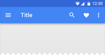
And here is what a Material Design Toolbar looks like on Android:
layout_structure_appbar_structure4

The goal here is to get something more similar to the Android Material Design look. The most notable differences are the drop shadow created by the toolbar onto the rest of the view as well as the distinct back button and other icons.

So, if you’re using Xamarin.Forms, you’ll need to create a custom renderer to get this job done. Let’s take a look at that:

MaterialNavigationRenderer.cs


[assembly: ExportRenderer(typeof(NavigationPage), typeof(MaterialNavigationRenderer))]
namespace YOUR_IOS_NAMESPACE
{
    ///
<summary>
    /// Custom renderer creating a material design navigation bar
    /// </summary>

    public class MaterialNavigationRenderer : NavigationRenderer
    {
        protected override void OnElementChanged(VisualElementChangedEventArgs e)
        {
            base.OnElementChanged(e);

            // Create the material drop shadow
            NavigationBar.Layer.ShadowColor = UIColor.Black.CGColor;
            NavigationBar.Layer.ShadowOffset = new CGSize(0, 0);
            NavigationBar.Layer.ShadowRadius = 3;
            NavigationBar.Layer.ShadowOpacity = 1;

            // Create the back arrow icon image
            var arrowImage = UIImage.FromBundle("Icons/ic_arrow_back_white.png");
            NavigationBar.BackIndicatorImage = arrowImage;
            NavigationBar.BackIndicatorTransitionMaskImage = arrowImage;

            // Set the back button title to empty since Material Design doesn't use it.
            if (NavigationItem?.BackBarButtonItem != null)
                NavigationItem.BackBarButtonItem.Title = " ";
            if (NavigationBar.BackItem != null)
            {
                NavigationBar.BackItem.Title = " ";
                NavigationBar.BackItem.BackBarButtonItem.Image = arrowImage;
            }
        }
    }
}

This will override our Renderer for all of our instances of a NavigationPage. To breakdown what is being done here, the renderer is initializing the native UINavigationBar, then updating the Layer of the UINavigationBar to create a drop shadow. After that, we instantiate the back arrow icon to replace the default iOS one. Lastly, we set the back button title to empty so that it doesn’t show up next to our new back button image.

The back button icon is taken from the official Material Design Icons from Google found here: https://material.io/icons/

The last thing we need to do is update our toolbar icon to fit the Material standards (thicker and bolder). To do this, we go back to the icons linked above and download the new check icon we want and substitute the ToolbarItem we have in our XAML.

Now we can see the results of our custom renderer and updated icon with our more Material Design looking toolbar:

Screen Shot 2017-05-16 at 12.31.37 PM


Next Steps

Want to take it further? Try updating your custom renderer to move the Title text alignment to the left and use the Roboto font! Check out this blog post on how to bring Roboto to your iOS fonts: https://alexdunn.org/2017/05/03/xamarin-tips-bringing-material-design-fonts-to-ios/.

If you like what you see, don’t forget to follow me on twitter @Suave_Pirate, check out my GitHub, and subscribe to my blog to learn more mobile developer tips and tricks!

Interested in sponsoring developer content? Message @Suave_Pirate on twitter for details.

Xamarin.Tip – Binding a Picker to an Enum

So a recent Xamarin.Forms update released the new Bindable Picker, which allows you to bind an IList of objects to the picker (which will be ToString()‘ed). However, I’ve often find myself needing to create a form for a model that has enum properties. Previously, in order to do this, I would have to create a custom List or string from my enum and map it manually, then read from the SelectedItem bound to another string property, then when I need the actual value I’d have to map it back to the enum it “represents”.

It might have looked something like this:

MyViewModel.cs

...
private DogBreed _breedEnum; // this is our enum of: BorderCollie, LabradorRetriever, PitBull, etc.

public List<string> BreedNames
{
    get
    {
        return new List<string> { "Border Collie", "Labrador Retriever", "Pit Bull" };
    }
}

private string _selectedBreed;
public string SelectedBreed
{
    get
    {
        return _selectedBreed;
    }
    set
    {
        Set(ref _selectedBreed, value); // this is using MvvmLight
    }
}

public void DoSomethingWithTheBreed()
{
    switch(SelectedBreed)
    {
        case "Border Collie": _breedEnum = DogBreed.BorderCollie;
            break;
        case "Labrador Retriever": _breedEnum = DogBreed.LabradorRetriever;
            break;
        case "Pit Bull": _breedEnum = DogBreed.PitBull;
            break;
        //...
    }

    DoSomething(_breedEnum);
}
...

And our XAML

<Picker ItemsSource="{Binding BreedNames}" SelectedItem="{Binding SelectedBreed}"/>

As you can see, this is pretty gross…

Here’s a quick little strategy I use to make the binding process a little easier with my enums. It’s broken into just 3 quick parts:

  1. Create a extension methods to get a readable string from our `enum`
  2. Create a `Converter` to convert the `SelectedIndex` to the `enum` field
  3. Wire up the fields and XAML

Let’s create our enum extension methods to get a readable string for the UI:
StringExtensions.cs

    public static class StringExtensions
    {
        public static string SplitCamelCase(this string str)
        {
            return Regex.Replace(
                Regex.Replace(
                    str,
                    @"(\P{Ll})(\P{Ll}\p{Ll})",
                    "$1 $2"
                ),
                @"(\p{Ll})(\P{Ll})",
                "$1 $2"
            );
        }
    }

This SplitCamelCase method will take a string that is camel cased and split it out into separate words such as `”ThisIsMyValue”.SplitCamelCase(); // “This Is My Value”

Now that we have the ability to get a readable string from the enum values, let’s create our ViewModel properties we will need.

MyViewModel.cs

...
private DogBreed _selectedBreed;
public DogBreed SelectedBreed
{
    get
    {
        return _selectedBreed;
    }
    set
    {
        Set(ref _selectedBreed, value);
    }
}

public List<string> BreedNames
{
    get
    {
        return Enum.GetNames(typeof(DogBreed)).Select(b => b.SplitCamelCase()).ToList();
    }
}

public void DoSomethingWithBreed()
{
    DoSomething(SelectedBreed);
}
...

So much cleaner already. Now we need to create a Converter that our XAML can use to actually set the SelectedBreed property of our ViewModel.

IntEnumConverter.cs

    public class IntEnumConverter : IValueConverter
    {
        public object Convert(object value, Type targetType, object parameter, CultureInfo culture)
        {
            if (value is Enum)
            {
                return (int)value;
            }
            return 0;
        }

        public object ConvertBack(object value, Type targetType, object parameter, CultureInfo culture)
        {
            if(value is int)
            {
                return Enum.ToObject(targetType, value);
            }
            return 0;
        }
    }

Last thing to do is use our IntEnumConverter and our properties to create our view in XAML:

MyView.xaml

<ContentPage.Resources>
    <ResourceDictionary>
        <converters:IntEnumConverter x:Key="IntEnum"/>
    </ResourceDictionary>
</ContentPage.Resources>
<Picker ItemsSource="{Binding BreedNames}" SelectedIndex="{Binding SelectedBreed, Converter=IntEnum}"/>

Here’s what we have!

Now you have the means to bind any of your Pickers quite easily to any of your custom enum fields!

“Woah! How did you get that Material Design Looking Picker on iOS”… Stay tuned!

If you like what you see, don’t forget to follow me on twitter @Suave_Pirate, check out my GitHub, and subscribe to my blog to learn more mobile developer tips and tricks!

Interested in sponsoring developer content? Message @Suave_Pirate on twitter for details.

Xamarin.Tips – Overriding Android Button Shadows/Elevation

Since Material Design’s implementation in the Android OS, some controls that ship with either the new styles, or with the App Compat packages place some under-the-cover restrictions on what you can do with the control by default. In this example, we will look at updating the App Compat Button Shadows and Elevation that ship with the control.

According to Material Design’s standards, “raised buttons” (versus flat buttons and floating action buttons) should have a resting elevation of 2dp, and an pressed/hover elevation of 8dp.

whatismaterial_3d_elevation_component02

This principle is also implemented in the App Compat Button. However, if you try to update the Elevation of your Button, you’ll notice that it won’t stay that way on the redraw, but will go right back to the 4dp it is by default.


supportButton.Elevation = 9; // set it directly
ViewCompat.SetElevation(supportButton, 9); // set using app compat method

...

Console.WriteLine(supportButton.Elevation); // will return 4...

So why is this? And how is Android creating the pressed animation automatically to increase the elevation? It certainly isn’t any code we’ve written. The answer is in the StateListAnimator property of the Button. The StateListAnimator is responsible for setting properties of the Button during certain states such as Enabled, Disabled, Focused, Pressed, etc. and is what is overriding the manual set of Button.Elevation.

You can override this in a few different ways to claim back full control. First, if you want to handle your different different states manually in your code, you can set the StateListAnimator to a new instance, or null, then set the Elevation to what you want.

In Code

supportButton.StateListAnimator = new StateListAnimator();
ViewCompat.SetElevation(supportButton, 9);

...

Console.WriteLine(supportButton.Elevation); // 9!

The most reusable way to do this is to subclass Button and set the StateListAnimator in the constructor:

CustomElevatingButton.cs

public class CustomElevatingButton : Android.Support.V7.Widget.AppCompatButton
{
    public CustomElevatingButton(Context context): base(context)
    {
        StateListAnimator = new StateListAnimator();
    }
}

Using Styles

Alternatively, you can set it using styles for your Button:

styles.xml

<?xml version="1.0" encoding="UTF-8"?>
<resources>
    <style name="AppTheme" parent="AppTheme.Base">
    </style>
    <style name="AppTheme.Base" parent="Theme.AppCompat.Light.NoActionBar">
        <item name="android:buttonStyle">@style/NoShadowButton</item>
    </style>
    <style name="NoShadowButton" parent="android:style/Widget.Button">
        <item name="android:stateListAnimator">@null</item>
    </style>
</resources>

You can also do it per-button:

 styles.xml

<?xml version="1.0" encoding="UTF-8"?>
<resources>
    <style name="AppTheme" parent="AppTheme.Base">
    </style>
    <style name="AppTheme.Base" parent="Theme.AppCompat.Light.NoActionBar">
        ...
    </style>
    <style name="NoShadowButton" parent="android:style/Widget.Button">
        <item name="android:stateListAnimator">@null</item>
    </style>
</resources>

some_layout.axml

...
<Button style="@style/NoShadowButton" ... />
...

In Xamarin.Forms

We can do the same thing in Xamarin.Forms with either a custom renderer or a custom Effect. In this example, we will create a universal Xamarin.Forms.Button custom renderer to set an explicit height:

ElevatedButtonRenderer

public class ElevatedButtonRenderer : Xamarin.Forms.Platform.Android.AppCompat.ButtonRenderer
{
    public override void OnElementChanged(ElementChangedEventArgs<Button> e)
    {
        StateListAnimator = null; // clear the state list animator
        Elevation = 9; // set the elevation
    }
}

Creating Your Own StateListAnimator

Of course, instead of clearing the StateListAnimator and handling your elevation manually, you could create your own to handle the states and animations however you want. Google has documentation included in the discussion about animations here. Here’s an example of creating and applying your own:

anim/reverse_state_list_animator.xml

<!-- animate the elevation property of a view when pressed -->
<selector xmlns:android="http://schemas.android.com/apk/res/android">
  <item android:state_pressed="true">
    <set>
      <objectAnimator android:propertyName="elevation"
        android:duration="@android:integer/config_shortAnimTime"
        android:valueTo="0dp"
        android:valueType="floatType"/>
        <!-- you could have other objectAnimator elements
             here for "x" and "y", or other properties -->
    </set>
  </item>
  <item android:state_enabled="true"
    android:state_pressed="false"
    android:state_focused="true">
    <set>
      <objectAnimator android:propertyName="elevation"
        android:duration="100"
        android:valueTo="2dp"
        android:valueType="floatType"/>
    </set>
  </item>
</selector>

This animation will do the reverse of the Material Design Standard, and will take the Button elevation from 2dp to 0dp when pressed.

Now we just need to apply this animation resource to our Button style either universally or on a specific button:

<?xml version="1.0" encoding="UTF-8"?>
<resources>
    <style name="AppTheme" parent="AppTheme.Base">
    </style>
    <style name="AppTheme.Base" parent="Theme.AppCompat.Light.NoActionBar">
        <item name="android:buttonStyle">@style/NoShadowButton</item>
    </style>
    <style name="NoShadowButton" parent="android:style/Widget.Button">
        <item name="android:stateListAnimator">@anim/reverse_state_list_animator</item>
    </style>
</resources>

Now pressing any button within the AppTheme will reverse the elevation property and go more “into” the view rather than elevating.

If you like what you see, don’t forget to follow me on twitter @Suave_Pirate, check out my GitHub, and subscribe to my blog to learn more mobile developer tips and tricks!

Interested in sponsoring developer content? Message @Suave_Pirate on twitter for details.

Xamarin.Tips – Creating a Material Design Button in iOS

As per requests after my last post on creating a more Material looking Xamarin.Forms Frame on iOS, I’ll start talking about bringing a more material design feel to other controls in iOS. This time we’ll look at getting a more material Button control, first to be usable without Xamarin.Forms, then in a custom renderer that we can use everywhere and apply to all our Buttons.

Keep in mind, this does not hit upon all the pieces of a Material Design Button that you might see in Android. For example, it does not show a ripple on tap, and does not raise the elevation on tap. Those topics will come in a different blog post!

Let’s get down to it with a custom UIButton that applies a material-ish shadow to our button.

MaterialButton.cs

    public class MaterialButton : UIButton
    {
        public override void Draw(CGRect rect)
        {
            base.Draw(rect);

            // don't do it on transparent bg buttons
            if (BackgroundColor.CGColor.Alpha == 0)
                return;

            // Update shadow to match better material design standards of elevation
            Layer.ShadowRadius = 2.0f;
            Layer.ShadowColor = UIColor.Gray.CGColor;
            Layer.ShadowOffset = new CGSize(2, 2);
            Layer.ShadowOpacity = 0.80f;
            Layer.ShadowPath = UIBezierPath.FromRect(Layer.Bounds).CGPath;
            Layer.MasksToBounds = false;
        }
    }

You can see that we basically just apply a specific shadow to our base Layer of the control.

Now, let’s interpret this into a custom renderer for Xamarin.Forms:

MaterialButtonRenderer.cs

[assembly: ExportRenderer(typeof(Button), typeof(MaterialButtonRenderer))]
namespace YOUR_IOS_NAMESPACE
{
    public class MaterialButtonRenderer : ButtonRenderer
    {
        public override void Draw(CGRect rect)
        {
            base.Draw(rect);

            // don't do it on transparent bg buttons
            if (Element.BackgroundColor.A == 0)
                return;

            // Update shadow to match better material design standards of elevation
            Layer.ShadowRadius = 2.0f;
            Layer.ShadowColor = UIColor.Gray.CGColor;
            Layer.ShadowOffset = new CGSize(2, 2);
            Layer.ShadowOpacity = 0.80f;
            Layer.ShadowPath = UIBezierPath.FromRect(Layer.Bounds).CGPath;
            Layer.MasksToBounds = false;

        }
    }
}

This will apply the shadow to any regular Button Element. If you want to create a whole new Element that will allow you to use it in specific places, you could either create an Effect, or you can create a new class that subclasses Xamarin.Forms.Button, and then update the renderer to fit that class:

MaterialButton.xaml.cs

public partial class MaterialButton : Button
{
    // we don't need to do anything special here since we do all the custom work in the iOS Renderer
}

and of course our updated renderer

MaterialButtonRenderer.cs

[assembly: ExportRenderer(typeof(MaterialButton), typeof(MaterialButtonRenderer))]
namespace YOUR_IOS_NAMESPACE
{
    public class MaterialButtonRenderer : ButtonRenderer
    {
        public override void Draw(CGRect rect)
        {
            base.Draw(rect);

            // don't do it on transparent bg buttons
            if (Element.BackgroundColor.A == 0)
                return;

            // Update shadow to match better material design standards of elevation
            Layer.ShadowRadius = 2.0f;
            Layer.ShadowColor = UIColor.Gray.CGColor;
            Layer.ShadowOffset = new CGSize(2, 2);
            Layer.ShadowOpacity = 0.80f;
            Layer.ShadowPath = UIBezierPath.FromRect(Layer.Bounds).CGPath;
            Layer.MasksToBounds = false;

        }
    }
}

Now your control should go from this:

iOSRegularButton

To this:

iOSMaterialButton

Make sure to stay tuned for more Material Design styled controls brought to iOS, and adding some advanced features like rippled clicks and elevation changes/settings.

If you like what you see, don’t forget to follow me on twitter @Suave_Pirate, check out my GitHub, and subscribe to my blog to learn more mobile developer tips and tricks!

Interested in sponsoring developer content? Message @Suave_Pirate on twitter for details.

Xamarin.Tips – Making Your iOS Frame Shadows More Material

If you’ve used the Xamarin.Forms Frame element on iOS and have HasShadow set to true, then you might notice that on iOS, the shadow is quite abrasive and overwhelming.

We can update just the iOS FrameRenderer to create some better shadows, so we can go from this:

DefaultiOSFrameShadow

to this:

iOSMaterialShadow

In order to override all Frame elements, we will need to create our custom renderer and also set it to export to the default Frame. If you do not want it to apply to all Frames, then you can create a custom control that inherits from frame and then apply the renderer to that new element type. We’ll example both here:

MaterialFrameRenderer.cs


[assembly: ExportRenderer(typeof(Frame), typeof(MaterialFrameRenderer))]
namespace YOU_IOS_NAMESPACE
{
    /// <summary>
    /// Renderer to update all frames with better shadows matching material design standards
    /// </summary>

    public class MaterialFrameRenderer : FrameRenderer
    {
        public override void Draw(CGRect rect)
        {
            base.Draw(rect);

            // Update shadow to match better material design standards of elevation
            Layer.ShadowRadius = 2.0f;
            Layer.ShadowColor = UIColor.Gray.CGColor;
            Layer.ShadowOffset = new CGSize(2, 2);
            Layer.ShadowOpacity = 0.80f;
            Layer.ShadowPath = UIBezierPath.FromRect(Layer.Bounds).CGPath;
            Layer.MasksToBounds = false;
        }
    }
}

That’s all you need in your iOS project in order to apply it everywhere. Now, if you want to apply it to a new custom Element, we can create it and apply it like so:

MaterialFrame.xaml.cs


namespace YOUR_PCL_NAMESPACE
{
    public class MaterialFrame : Frame
    {
        // no other code needs to go here unless you want more customizable properties.
    }
}

Then create your renderer and export it for you new Element:

MaterialFrameRenderer.cs


[assembly: ExportRenderer(typeof(MaterialFrame), typeof(MaterialFrameRenderer))]
namespace YOU_IOS_NAMESPACE
{
    /// <summary>
    /// Renderer to update all frames with better shadows matching material design standards
    /// </summary>

    public class MaterialFrameRenderer : FrameRenderer
    {
        public override void Draw(CGRect rect)
        {
            base.Draw(rect);

            // Update shadow to match better material design standards of elevation
            Layer.ShadowRadius = 2.0f;
            Layer.ShadowColor = UIColor.Gray.CGColor;
            Layer.ShadowOffset = new CGSize(2, 2);
            Layer.ShadowOpacity = 0.80f;
            Layer.ShadowPath = UIBezierPath.FromRect(Layer.Bounds).CGPath;
            Layer.MasksToBounds = false;
        }
    }
}

And now your frames can look much nicer~

iOSMaterialShadow


If you like what you see, don’t forget to follow me on twitter @Suave_Pirate, check out my GitHub, and subscribe to my blog to learn more mobile developer tips and tricks!

Interested in sponsoring developer content? Message @Suave_Pirate on twitter for details.

Xamarin.Tips – Create Your Own Star Wars Intro Text!

Here’s a fun one – let’s make a Xamarin.Forms page that looks like the Star Wars intro scrolling text! I also put the source up here: https://github.com/SuavePirate/StarWarsPage

Here’s the XAML for the page:

StarWarsPage.xaml

<?xml version="1.0" encoding="utf-8" ?>
<ContentPage xmlns="http://xamarin.com/schemas/2014/forms"              xmlns:x="http://schemas.microsoft.com/winfx/2009/xaml"              xmlns:local="clr-namespace:StarWarsPage"              x:Class="StarWarsPage.MainPage">
    <Grid>
        <Image Source="starwarsintrobg.jpg" Aspect="AspectFill" HorizontalOptions="Fill" VerticalOptions="Fill"/>
        <ScrollView x:Name="TextScrollView" Orientation="Vertical" RotationX="24" Padding="16,800">
            <Label x:Name="Text" Text="{StaticResource StarWarsText}" TextColor="Yellow" FontAttributes="Bold" FontSize="30" HorizontalOptions="Fill"/>
        </ScrollView>
    </Grid>
    <ContentPage.Resources>
        <ResourceDictionary>
            <x:String x:Key="StarWarsText">
                It is a period of civil war.
Rebel spaceships, striking
from a hidden base, have won
their first victory against
the evil Galactic Empire.

During the battle, Rebel
spies managed to steal secret
plans to the Empire's
ultimate weapon, the DEATH
STAR, an armored space
station with enough power
to destroy an entire planet.

Pursued by the Empire's
sinister agents, Princess
Leia races home aboard her
starship, custodian of the
stolen plans that can save her
people and restore
freedom to the galaxy....

            </x:String>
        </ResourceDictionary>
    </ContentPage.Resources>
</ContentPage>

The important part here is the RotationX value on the ScrollView. This is going to set the backwards tilt of the scroll. To break down the other parts that make this up – We have a static String resource to use as the text for the intro. In this case I’m using the crawl text from A New Hope. We also wrap the whole thing in a Grid so that we can set up the background Image element.

Now we get a cool view that the user can scroll through at their own reading pace!

StarWars

If you like what you see, don’t forget to follow me on twitter @Suave_Pirate, check out my GitHub, and subscribe to my blog to learn more mobile developer tips and tricks!

Xamarin.Tips – Xamarin.Forms iOS ListView Refresh Spinner Color

Here’s a quick freebie. If you want to change the color of your ListView Refreshing spinner, we can do that with a quick custom renderer!

Here it is as a renderer:

ColoredRefreshListViewRenderer.cs

    ///<summary>
    /// Custom renderer for all list views to use the custom loader color
    /// </summary>

    public class ColoredRefreshListViewRenderer : ListViewRenderer
    {
        ///<summary>
        /// Set the loader color to your custom color
        /// </summary>
        protected override void OnElementChanged(ElementChangedEventArgs<ListView> e)
        {
            base.OnElementChanged(e);
            var vc = ((UITableViewController)ViewController);

            // Set the color!
            if (vc?.RefreshControl != null)
                vc.RefreshControl.TintColor = UIColor.FromRGB(135, 200, 21);
        }
    }

Now we get something looking awesome like this:
 

loading_apple_green

If you like what you see, don’t forget to follow me on twitter @Suave_Pirate, check out my GitHub, and subscribe to my blog to learn more mobile developer tips and tricks!