Xamarin.Tip – iOS Pill Button (with Storyboard Support)

Here’s another simple but useful control for Xamarin.iOS – the PillButton. The name describes it pretty well, it’s a button shaped like a pill or capsule and allows for managing the border color within your storyboard files by exposing an outlet for the color.

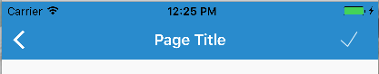
In the end, we want something that looks like this:
Screen Shot 2018-03-14 at 2.45.59 PM

Let’s create a simple PillButton class:

PillButton.cs

    /// <summary>
    /// Pill button. A button in a capsule shape
    /// </summary>
    [Register("PillButton"), DesignTimeVisible(true)]
    public class PillButton : UIButton
    {
        [DisplayName("Border Color"), Export("BorderColor"), Browsable(true)]
        public UIColor BorderColor { get; set; } = UIColor.Clear;

        public PillButton(IntPtr handle)
            : base(handle)
        {

        }

        public PillButton(CGRect frame)
            : base(frame)
        {
            SetupBorder();
        }

        public override void AwakeFromNib()
        {
            base.AwakeFromNib();
            SetupBorder();
        }

        /// <summary>
        /// Sets up the border radius and the color
        /// </summary>
        protected void SetupBorder()
        {
            Layer.BorderColor = BorderColor.CGColor;
            Layer.BorderWidth = 2;
            Layer.CornerRadius = Frame.Height / 2;
            Layer.MasksToBounds = true;
        }
    }

Let’s breakdown how this works:

  • We setup the border to use the Border color property and apply it to the layer
  • Apply the CornerRadius as 1/2 the height of the final frame
  • Call this SetupBorder() method from the constructor as well as in AwakeFromNib() which is called by the storyboard renderer.
  • We also need to decorate our class with a Register and DesignTimeVisible attribute in order for it to be usable in the storyboard
  • Lastly we need to decorate our BorderColor property with [DisplayName("Border Color"), Export("BorderColor"), Browsable(true)] so it can be used in the storyboard as well.

Now in our storyboard files, we can drag and drop a UIButton on the ViewController, then set the class to our PillButton, and once we do we can see the property exposed for the BorderColor:
Screen Shot 2018-03-14 at 2.47.41 PM

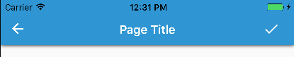
Also, we can even see these applied in our storyboard so that it really does look like it will in the app:

Screen Shot 2018-03-14 at 2.47.17 PM

And that’s it! The moral of the story is to not be afraid to subclass controls to make your life easier when re-using them. It’s a normal practice in iOS development, and that practice comes right on over to our Xamarin.iOS development!


If you like what you see, don’t forget to follow me on twitter @Suave_Pirate, check out my GitHub, and subscribe to my blog to learn more mobile developer tips and tricks!

Interested in sponsoring developer content? Message @Suave_Pirate on twitter for details.

Xamarin.Tip – Bindable iOS UIRefreshControl

Here’s another super simple tip that has made my life easier with a basic control for iOS – the BindableRefreshControl. The premise is to wrap the BeginRefreshing() and EndRefreshing() calls into a bindable property that can be applied with a one-way binding from a ViewModel.

To premise this a bit, the existing UIRefreshControl from iOS has the two methods mentioned above as well as a Refreshing bool property that is readonly. The need for wrapping this in a property came from wanting to bind my native ViewControllers to a ViewModel and a property such as IsLoading.

So here’s the control:

BindableRefreshControl.cs

    /// <summary>
    /// Bindable refresh control.
    /// Adds a refresh event to bind to.
    /// </summary>
    public class BindableRefreshControl : UIRefreshControl
    {
        private bool _isRefreshing;
        public bool IsRefreshing
        {
            get
            {
                return _isRefreshing;
            }
            set
            {
                _isRefreshing = value;
                if (value)
                    BeginRefreshing();
                else
                    EndRefreshing();
            }
        }
    }

Yeah that’s literally it.

However, I now can use it like this (using MvvmLight):

MainViewModel.cs

public class MainViewModel : ViewModelBase
{
    private bool _isLoading;
    public bool IsLoading
    {
        get
        {
            return _isLoading;
        }
        set
        {
            Set(ref _isLoading, value);
        }
    }
}

And in the ViewController:
MainViewController.cs

public class MainViewController : UIViewController
{
    private BindableRefreshControl _refreshControl;
    private MainViewModel _viewModel;
    protected override void ViewDidLoad() 
    {
        _viewModel = new MainViewModel();
        _refreshControl = new BindableRefreshControl();
        ...
        ...
        this.SetBinding(() => _viewModel.IsLoading,
                        () => _refreshControl.IsRefreshing));
    }
}

And like that, your native iOS spinners can be easily bound to your view model properties!


If you like what you see, don’t forget to follow me on twitter @Suave_Pirate, check out my GitHub, and subscribe to my blog to learn more mobile developer tips and tricks!

Interested in sponsoring developer content? Message @Suave_Pirate on twitter for details.

Xamarin.Tip – Borderless Editor

I previously put out a post on removing the border of a Xamarin.Forms Entry which was then used to create a custom PinView as well as a MaterialEntry that follows the material design standards for text fields. Check those out here:

In this post, we’ll apply some of the same principles to create a BorderlessEditor. It’s going to use a simple custom renderer, although this could and should be done using an Effect if being used on its own. However, this BorderlessEditor will be the foundation for future controls.

You can find this code as part of my library in progress to create Material Design Form controls for Xamarin.Forms – https://github.com/SuavePirate/SuaveControls.MaterialFormControls.

Let’s get started with our custom control by first creating a custom subclass of Xamarin.Forms.Editor followed by a custom renderer class for iOS, Android, and UWP that kills the border.

BorderlessEditor.cs

namespace SuaveControls.MaterialForms
{
    public class BorderlessEditor : Editor
    {
    }
}

Nothing special here since we are using the default behavior of the Editor.

Android

Now let’s create an Android custom renderer.

BorderlessEditorRenderer.cs – Android

[assembly: ExportRenderer(typeof(BorderlessEditor), typeof(BorderlessEditorRenderer))]
namespace SuaveControls.MaterialForms.Android.Renderers
{
    public class BorderlessEditorRenderer : EditorRenderer
    {
        public static void Init() { }
        protected override void OnElementChanged(ElementChangedEventArgs<Editor> e)
        {
            base.OnElementChanged(e);
            if (e.OldElement == null)
            {
                Control.Background = null;

                var layoutParams = new MarginLayoutParams(Control.LayoutParameters);
                layoutParams.SetMargins(0, 0, 0, 0);
                LayoutParameters = layoutParams;
                Control.LayoutParameters = layoutParams;
                Control.SetPadding(0, 0, 0, 0);
                SetPadding(0, 0, 0, 0);
            }
        }
    }
}

We simple kill the default padding and margins while setting the Background property to null. This Background is what creates the drawable underline for the AppCompat Editor.

iOS

Follow with an iOS renderer.

BorderlessEditorRenderer.cs – iOS

[assembly: ExportRenderer(typeof(BorderlessEditor), typeof(BorderlessEditorRenderer))]
namespace SuaveControls.MaterialForms.iOS.Renderers
{
    public class BorderlessEditorRenderer : EditorRenderer
    {
        public static void Init() { }
        protected override void OnElementPropertyChanged(object sender, PropertyChangedEventArgs e)
        {
            base.OnElementPropertyChanged(sender, e);

            Control.Layer.BorderWidth = 0;
        }
    }
}

All we do here is set the BorderWidth to 0.

UWP

Lastly a renderer for UWP

BorderlessEditorRenderer.cs – UWP


[assembly: ExportRenderer(typeof(BorderlessEditor), typeof(BorderlessEditorRenderer))]

namespace SuaveControls.MaterialForms.UWP.Renderers
{
    public class BorderlessEditorRenderer : EditorRenderer
    {
        public static void Init() { }
        protected override void OnElementChanged(ElementChangedEventArgs<Editor> e)
        {
            base.OnElementChanged(e);

            if (Control != null)
            {
                Control.BorderThickness = new Windows.UI.Xaml.Thickness(0);
                Control.Margin = new Windows.UI.Xaml.Thickness(0);
                Control.Padding = new Windows.UI.Xaml.Thickness(0);
            }
        }
    }
}

Similar to how we did it on Android, we set both the Margin and Padding to 0 and also set the BorderThickness to a 0’d Thickness.

Using the BorderlessEditor

Now you can use the BorderlessEditor in your XAML or C# code:

MainPage.xaml

<?xml version="1.0" encoding="utf-8" ?>
<ContentPage xmlns="http://xamarin.com/schemas/2014/forms"
             xmlns:x="http://schemas.microsoft.com/winfx/2009/xaml"
             xmlns:local="clr-namespace:ExampleMaterialApp"
             xmlns:suave="clr-namespace:SuaveControls.MaterialForms;assembly=SuaveControls.MaterialForms"
             x:Class="ExampleMaterialApp.MainPage">

    <ScrollView>
        <StackLayout Spacing="16" Margin="16" BackgroundColor="Blue">
            <Label Text="Borderless Editor!" Margin="32" HorizontalOptions="Center" HorizontalTextAlignment="Center"/>
            <suave:BorderlessEditor BackgroundColor="Black" TextColor="White" HeightRequest="300" Margin="32"/>

        </StackLayout>
    </ScrollView>

</ContentPage>

Check out those results on iOS:

If you like what you see, don’t forget to follow me on twitter @Suave_Pirate, check out my GitHub, and subscribe to my blog to learn more mobile developer tips and tricks!

Interested in sponsoring developer content? Message @Suave_Pirate on twitter for details.

Xamarin.Tip – Borderless TimePicker

I previously put out a post on removing the border of a Xamarin.Forms Entry which was then used to create a custom PinView as well as a MaterialEntry that follows the material design standards for text fields. I also added a post just like this one that talks about creating a BorderlessPicker. Check those out here:

In this post, we’ll do exactly what we did with the BorderlessPicker, but apply it to the Xamarin.Forms.TimePicker control to remove the border. This would ideally be done using an Effect, however we will be using this control in a later post to create a MaterialTimePicker to fit the Material Design standards for form inputs, so we will create custom renderers for Android, iOS, and UWP.

You can find this code as part of my library in progress to create Material Design Form controls for Xamarin.Forms – https://github.com/SuavePirate/SuaveControls.MaterialFormControls.

Let’s get started with our custom control by first creating a custom subclass of Xamarin.Forms.TimePicker followed by a custom renderer class for iOS, Android, and UWP that kills the border.

BorderlessTimePicker.cs

namespace SuaveControls.MaterialForms
{
    public class BorderlessTimePicker : TimePicker
    {
    }
}

Nothing special here since we are using the default behavior of the TimePicker.

Android

Now let’s create an Android custom renderer.

BorderlessTimePickerRenderer.cs – Android

[assembly: ExportRenderer(typeof(BorderlessTimePicker), typeof(BorderlessTimePickerRenderer))]
namespace SuaveControls.MaterialForms.Android.Renderers
{
    public class BorderlessTimePickerRenderer : TimePickerRenderer
    {
        public static void Init() { }
        protected override void OnElementChanged(ElementChangedEventArgs<TimePicker> e)
        {
            base.OnElementChanged(e);
            if (e.OldElement == null)
            {
                Control.Background = null;

                var layoutParams = new MarginLayoutParams(Control.LayoutParameters);
                layoutParams.SetMargins(0, 0, 0, 0);
                LayoutParameters = layoutParams;
                Control.LayoutParameters = layoutParams;
                Control.SetPadding(0, 0, 0, 0);
                SetPadding(0, 0, 0, 0);
            }
        }
    }
}

We simple kill the default padding and margins while setting the Background property to null. This Background is what creates the drawable underline for the AppCompat TimePicker.

iOS

Follow with an iOS renderer.

BorderlessTimePickerRenderer.cs – iOS

[assembly: ExportRenderer(typeof(BorderlessTimePicker), typeof(BorderlessTimePickerRenderer))]
namespace SuaveControls.MaterialForms.iOS.Renderers
{
    public class BorderlessTimePickerRenderer : TimePickerRenderer
    {
        public static void Init() { }
        protected override void OnElementPropertyChanged(object sender, PropertyChangedEventArgs e)
        {
            base.OnElementPropertyChanged(sender, e);

            Control.Layer.BorderWidth = 0;
            Control.BorderStyle = UITextBorderStyle.None;
        }
    }
}

All we do here is set the BorderWidth to 0 and the BorderStyle to UITextBorderStyle.None.

UWP

Lastly a renderer for UWP

BorderlessTimePickerRenderer.cs – UWP


[assembly: ExportRenderer(typeof(BorderlessTimePicker), typeof(BorderlessTimePickerRenderer))]

namespace SuaveControls.MaterialForms.UWP.Renderers
{
    public class BorderlessTimePickerRenderer : TimePickerRenderer
    {
        public static void Init() { }
        protected override void OnElementChanged(ElementChangedEventArgs<TimePicker> e)
        {
            base.OnElementChanged(e);

            if (Control != null)
            {
                Control.BorderThickness = new Windows.UI.Xaml.Thickness(0);
                Control.Margin = new Windows.UI.Xaml.Thickness(0);
                Control.Padding = new Windows.UI.Xaml.Thickness(0);
            }
        }
    }
}

Similar to how we did it on Android, we set both the Margin and Padding to 0 and also set the BorderThickness to a 0’d Thickness.

Using the BorderlessTimePicker

Now you can use the BorderlessTimePicker in your XAML or C# code:

MainPage.xaml

<?xml version="1.0" encoding="utf-8" ?>
<ContentPage xmlns="http://xamarin.com/schemas/2014/forms"
             xmlns:x="http://schemas.microsoft.com/winfx/2009/xaml"
             xmlns:local="clr-namespace:ExampleMaterialApp"
             xmlns:suave="clr-namespace:SuaveControls.MaterialForms;assembly=SuaveControls.MaterialForms"
             x:Class="ExampleMaterialApp.MainPage">

    <ScrollView>
        <StackLayout Spacing="16" Margin="16">
            <Label Text="Borderless TimePicker!" Margin="32" HorizontalOptions="Center" HorizontalTextAlignment="Center"/>
            <suave:BorderlessTimePicker/>

        </StackLayout>
    </ScrollView>

</ContentPage>

Check out those results on iOS:

If you like what you see, don’t forget to follow me on twitter @Suave_Pirate, check out my GitHub, and subscribe to my blog to learn more mobile developer tips and tricks!

Interested in sponsoring developer content? Message @Suave_Pirate on twitter for details.

Xamarin.Tip – Borderless DatePicker

I previously put out a post on removing the border of a Xamarin.Forms Entry which was then used to create a custom PinView as well as a MaterialEntry that follows the material design standards for text fields. I also added a post just like this one that talks about creating a BorderlessPicker. Check those out here:

In this post, we’ll do exactly what we did with the BorderlessPicker, but apply it to the Xamarin.Forms.DatePicker control to remove the border. This would ideally be done using an Effect, however we will be using this control in a later post to create a MaterialDatePicker to fit the Material Design standards for form inputs, so we will create custom renderers for Android, iOS, and UWP.

You can find this code as part of my library in progress to create Material Design Form controls for Xamarin.Forms – https://github.com/SuavePirate/SuaveControls.MaterialFormControls.

Let’s get started with our custom control by first creating a custom subclass of Xamarin.Forms.DatePicker followed by a custom renderer class for iOS, Android, and UWP that kills the border.

BorderlessDatePicker.cs

namespace SuaveControls.MaterialForms
{
    public class BorderlessDatePicker : DatePicker
    {
    }
}

Nothing special here since we are using the default behavior of the DatePicker.

Android

Now let’s create an Android custom renderer.

BorderlessDatePickerRenderer.cs – Android

[assembly: ExportRenderer(typeof(BorderlessDatePicker), typeof(BorderlessDatePickerRenderer))]
namespace SuaveControls.MaterialForms.Android.Renderers
{
    public class BorderlessDatePickerRenderer : DatePickerRenderer
    {
        public static void Init() { }
        protected override void OnElementChanged(ElementChangedEventArgs<DatePicker> e)
        {
            base.OnElementChanged(e);
            if (e.OldElement == null)
            {
                Control.Background = null;

                var layoutParams = new MarginLayoutParams(Control.LayoutParameters);
                layoutParams.SetMargins(0, 0, 0, 0);
                LayoutParameters = layoutParams;
                Control.LayoutParameters = layoutParams;
                Control.SetPadding(0, 0, 0, 0);
                SetPadding(0, 0, 0, 0);
            }
        }
    }
}

We simple kill the default padding and margins while setting the Background property to null. This Background is what creates the drawable underline for the AppCompat DatePicker.

iOS

Follow with an iOS renderer.

BorderlessDatePickerRenderer.cs – iOS

[assembly: ExportRenderer(typeof(BorderlessDatePicker), typeof(BorderlessDatePickerRenderer))]
namespace SuaveControls.MaterialForms.iOS.Renderers
{
    public class BorderlessDatePickerRenderer : DatePickerRenderer
    {
        public static void Init() { }
        protected override void OnElementPropertyChanged(object sender, PropertyChangedEventArgs e)
        {
            base.OnElementPropertyChanged(sender, e);

            Control.Layer.BorderWidth = 0;
            Control.BorderStyle = UITextBorderStyle.None;
        }
    }
}

All we do here is set the BorderWidth to 0 and the BorderStyle to UITextBorderStyle.None.

UWP

Lastly a renderer for UWP

BorderlessDatePickerRenderer.cs – UWP


[assembly: ExportRenderer(typeof(BorderlessDatePicker), typeof(BorderlessDatePickerRenderer))]

namespace SuaveControls.MaterialForms.UWP.Renderers
{
    public class BorderlessDatePickerRenderer : DatePickerRenderer
    {
        public static void Init() { }
        protected override void OnElementChanged(ElementChangedEventArgs<DatePicker> e)
        {
            base.OnElementChanged(e);

            if (Control != null)
            {
                Control.BorderThickness = new Windows.UI.Xaml.Thickness(0);
                Control.Margin = new Windows.UI.Xaml.Thickness(0);
                Control.Padding = new Windows.UI.Xaml.Thickness(0);
            }
        }
    }
}

Similar to how we did it on Android, we set both the Margin and Padding to 0 and also set the BorderThickness to a 0’d Thickness.

Using the BorderlessDatePicker

Now you can use the BorderlessDatePicker in your XAML or C# code:

MainPage.xaml

<?xml version="1.0" encoding="utf-8" ?>
<ContentPage xmlns="http://xamarin.com/schemas/2014/forms"
             xmlns:x="http://schemas.microsoft.com/winfx/2009/xaml"
             xmlns:local="clr-namespace:ExampleMaterialApp"
             xmlns:suave="clr-namespace:SuaveControls.MaterialForms;assembly=SuaveControls.MaterialForms"
             x:Class="ExampleMaterialApp.MainPage">

    <ScrollView>
        <StackLayout Spacing="16" Margin="16">
            <Label Text="Borderless DatePicker!" Margin="32" HorizontalOptions="Center" HorizontalTextAlignment="Center"/>
            <suave:BorderlessDatePicker/>

        </StackLayout>
    </ScrollView>

</ContentPage>

Check out those results on iOS:

If you like what you see, don’t forget to follow me on twitter @Suave_Pirate, check out my GitHub, and subscribe to my blog to learn more mobile developer tips and tricks!

Interested in sponsoring developer content? Message @Suave_Pirate on twitter for details.

Xamarin.Tip – Borderless Picker

I previously put out a post on removing the border of a Xamarin.Forms Entry which was then used to create a custom PinView as well as a MaterialEntry that follows the material design standards for text fields. Check those out here:

In this post, we’ll apply some of the same principles to create a BorderlessPicker. It’s going to use a simple custom renderer, although this could and should be done using an Effect if being used on its own. However, this BorderlessPicker will be the foundation for future controls we will create such as the MaterialPicker that applies Material Design standards to the Xamarin.Forms Picker control on Android, iOS, and UWP.

You can find this code as part of my library in progress to create Material Design Form controls for Xamarin.Forms – https://github.com/SuavePirate/SuaveControls.MaterialFormControls.

Let’s get started with our custom control by first creating a custom subclass of Xamarin.Forms.Picker followed by a custom renderer class for iOS, Android, and UWP that kills the border.

BorderlessPicker.cs

namespace SuaveControls.MaterialForms
{
    public class BorderlessPicker : Picker
    {
    }
}

Nothing special here since we are using the default behavior of the Picker.

Android

Now let’s create an Android custom renderer.

BorderlessPickerRenderer.cs – Android

[assembly: ExportRenderer(typeof(BorderlessPicker), typeof(BorderlessPickerRenderer))]
namespace SuaveControls.MaterialForms.Android.Renderers
{
    public class BorderlessPickerRenderer : PickerRenderer
    {
        public static void Init() { }
        protected override void OnElementChanged(ElementChangedEventArgs<Picker> e)
        {
            base.OnElementChanged(e);
            if (e.OldElement == null)
            {
                Control.Background = null;

                var layoutParams = new MarginLayoutParams(Control.LayoutParameters);
                layoutParams.SetMargins(0, 0, 0, 0);
                LayoutParameters = layoutParams;
                Control.LayoutParameters = layoutParams;
                Control.SetPadding(0, 0, 0, 0);
                SetPadding(0, 0, 0, 0);
            }
        }
    }
}

We simple kill the default padding and margins while setting the Background property to null. This Background is what creates the drawable underline for the AppCompat Picker.

iOS

Follow with an iOS renderer.

BorderlessPickerRenderer.cs – iOS

[assembly: ExportRenderer(typeof(BorderlessPicker), typeof(BorderlessPickerRenderer))]
namespace SuaveControls.MaterialForms.iOS.Renderers
{
    public class BorderlessPickerRenderer : PickerRenderer
    {
        public static void Init() { }
        protected override void OnElementPropertyChanged(object sender, PropertyChangedEventArgs e)
        {
            base.OnElementPropertyChanged(sender, e);

            Control.Layer.BorderWidth = 0;
            Control.BorderStyle = UITextBorderStyle.None;
        }
    }
}

All we do here is set the BorderWidth to 0 and the BorderStyle to UITextBorderStyle.None.

UWP

Lastly a renderer for UWP

BorderlessPickerRenderer.cs – UWP


[assembly: ExportRenderer(typeof(BorderlessPicker), typeof(BorderlessPickerRenderer))]

namespace SuaveControls.MaterialForms.UWP.Renderers
{
    public class BorderlessPickerRenderer : PickerRenderer
    {
        public static void Init() { }
        protected override void OnElementChanged(ElementChangedEventArgs<Picker> e)
        {
            base.OnElementChanged(e);

            if (Control != null)
            {
                Control.BorderThickness = new Windows.UI.Xaml.Thickness(0);
                Control.Margin = new Windows.UI.Xaml.Thickness(0);
                Control.Padding = new Windows.UI.Xaml.Thickness(0);
            }
        }
    }
}

Similar to how we did it on Android, we set both the Margin and Padding to 0 and also set the BorderThickness to a 0’d Thickness.

Using the BorderlessPicker

Now you can use the BorderlessPicker in your XAML or C# code:

MainPage.xaml

<?xml version="1.0" encoding="utf-8" ?>
<ContentPage xmlns="http://xamarin.com/schemas/2014/forms"
             xmlns:x="http://schemas.microsoft.com/winfx/2009/xaml"
             xmlns:local="clr-namespace:ExampleMaterialApp"
             xmlns:suave="clr-namespace:SuaveControls.MaterialForms;assembly=SuaveControls.MaterialForms"
             x:Class="ExampleMaterialApp.MainPage">

    <ScrollView>
        <StackLayout Spacing="16" Margin="16">
            <Label Text="Borderless Picker!" Margin="32" HorizontalOptions="Center" HorizontalTextAlignment="Center"/>
            <suave:BorderlessPicker x:Name="PickerDemo" Title="Options"/>

        </StackLayout>
    </ScrollView>

</ContentPage>

MainPage.xaml.cs

    public partial class MainPage : ContentPage
    {
        public MainPage()
        {
            InitializeComponent();

            PickerDemo.ItemsSource = new List<string>
            {
                "Option 1",
                "Option 2",
                "Option 3",
                "Option 4"
            };
        }
    }

Check out those results on iOS:

If you like what you see, don’t forget to follow me on twitter @Suave_Pirate, check out my GitHub, and subscribe to my blog to learn more mobile developer tips and tricks!

Interested in sponsoring developer content? Message @Suave_Pirate on twitter for details.

Xamarin.Tip – MvvmLight Code Snippets for Visual Studio for Mac

I previously made a post about some Mvvm Light shortcuts / code snippets in Visual Studio, but what about Visual Studio for Mac?

Code snippets in Visual Studio for Mac work a little differently, but here is how to add your own:

  1. Go to Visual Studio > Preferences > Text Editor > Code Snippets
  2. Click on the Add button
  3. Set the language for your snippet, the shortcut, and other optional options
  4. Write the template for your snippet
  5. Confirm and use

Here are two easy ones that have made my life easier for a Bindable Property and Relay Command:

propb:

private $type$ $fieldName$;

public $type$ $name$
{
    get
    {
        return $fieldName$;
    }
    set
    {
        Set(() => $name$, ref $fieldName$, value);
    }
}

Screen Shot 2017-05-25 at 4.38.45 PM

rcmd:

private ICommand $fieldName$;

public ICommand $name$ => $fieldName$ ??
    ($fieldName$ = new RelayCommand(() => ));

Screen Shot 2017-05-25 at 4.39.19 PM.png

It’s as easy as that. Now go out there and start writing less code!

If you like what you see, don’t forget to follow me on twitter @Suave_Pirate, check out my GitHub, and subscribe to my blog to learn more mobile developer tips and tricks!

Interested in sponsoring developer content? Message @Suave_Pirate on twitter for details.

Xamarin.Tip – iOS Material Design Navigation Bar

To keep the Material Design coming to iOS, let’s look at making our NavigationBar more material.

Here’s what a “standard” UINavigationBar looks like on iOS:

Screen Shot 2017-05-16 at 12.25.17 PM

And here is what a Material Design Toolbar looks like on Android:
layout_structure_appbar_structure4

The goal here is to get something more similar to the Android Material Design look. The most notable differences are the drop shadow created by the toolbar onto the rest of the view as well as the distinct back button and other icons.

So, if you’re using Xamarin.Forms, you’ll need to create a custom renderer to get this job done. Let’s take a look at that:

MaterialNavigationRenderer.cs


[assembly: ExportRenderer(typeof(NavigationPage), typeof(MaterialNavigationRenderer))]
namespace YOUR_IOS_NAMESPACE
{
    ///
<summary>
    /// Custom renderer creating a material design navigation bar
    /// </summary>

    public class MaterialNavigationRenderer : NavigationRenderer
    {
        protected override void OnElementChanged(VisualElementChangedEventArgs e)
        {
            base.OnElementChanged(e);

            // Create the material drop shadow
            NavigationBar.Layer.ShadowColor = UIColor.Black.CGColor;
            NavigationBar.Layer.ShadowOffset = new CGSize(0, 0);
            NavigationBar.Layer.ShadowRadius = 3;
            NavigationBar.Layer.ShadowOpacity = 1;

            // Create the back arrow icon image
            var arrowImage = UIImage.FromBundle("Icons/ic_arrow_back_white.png");
            NavigationBar.BackIndicatorImage = arrowImage;
            NavigationBar.BackIndicatorTransitionMaskImage = arrowImage;

            // Set the back button title to empty since Material Design doesn't use it.
            if (NavigationItem?.BackBarButtonItem != null)
                NavigationItem.BackBarButtonItem.Title = " ";
            if (NavigationBar.BackItem != null)
            {
                NavigationBar.BackItem.Title = " ";
                NavigationBar.BackItem.BackBarButtonItem.Image = arrowImage;
            }
        }
    }
}

This will override our Renderer for all of our instances of a NavigationPage. To breakdown what is being done here, the renderer is initializing the native UINavigationBar, then updating the Layer of the UINavigationBar to create a drop shadow. After that, we instantiate the back arrow icon to replace the default iOS one. Lastly, we set the back button title to empty so that it doesn’t show up next to our new back button image.

The back button icon is taken from the official Material Design Icons from Google found here: https://material.io/icons/

The last thing we need to do is update our toolbar icon to fit the Material standards (thicker and bolder). To do this, we go back to the icons linked above and download the new check icon we want and substitute the ToolbarItem we have in our XAML.

Now we can see the results of our custom renderer and updated icon with our more Material Design looking toolbar:

Screen Shot 2017-05-16 at 12.31.37 PM


Next Steps

Want to take it further? Try updating your custom renderer to move the Title text alignment to the left and use the Roboto font! Check out this blog post on how to bring Roboto to your iOS fonts: https://alexdunn.org/2017/05/03/xamarin-tips-bringing-material-design-fonts-to-ios/.

If you like what you see, don’t forget to follow me on twitter @Suave_Pirate, check out my GitHub, and subscribe to my blog to learn more mobile developer tips and tricks!

Interested in sponsoring developer content? Message @Suave_Pirate on twitter for details.

Xamarin.Tip – Binding a Picker to an Enum

So a recent Xamarin.Forms update released the new Bindable Picker, which allows you to bind an IList of objects to the picker (which will be ToString()‘ed). However, I’ve often find myself needing to create a form for a model that has enum properties. Previously, in order to do this, I would have to create a custom List or string from my enum and map it manually, then read from the SelectedItem bound to another string property, then when I need the actual value I’d have to map it back to the enum it “represents”.

It might have looked something like this:

MyViewModel.cs

...
private DogBreed _breedEnum; // this is our enum of: BorderCollie, LabradorRetriever, PitBull, etc.

public List<string> BreedNames
{
    get
    {
        return new List<string> { "Border Collie", "Labrador Retriever", "Pit Bull" };
    }
}

private string _selectedBreed;
public string SelectedBreed
{
    get
    {
        return _selectedBreed;
    }
    set
    {
        Set(ref _selectedBreed, value); // this is using MvvmLight
    }
}

public void DoSomethingWithTheBreed()
{
    switch(SelectedBreed)
    {
        case "Border Collie": _breedEnum = DogBreed.BorderCollie;
            break;
        case "Labrador Retriever": _breedEnum = DogBreed.LabradorRetriever;
            break;
        case "Pit Bull": _breedEnum = DogBreed.PitBull;
            break;
        //...
    }

    DoSomething(_breedEnum);
}
...

And our XAML

<Picker ItemsSource="{Binding BreedNames}" SelectedItem="{Binding SelectedBreed}"/>

As you can see, this is pretty gross…

Here’s a quick little strategy I use to make the binding process a little easier with my enums. It’s broken into just 3 quick parts:

  1. Create a extension methods to get a readable string from our `enum`
  2. Create a `Converter` to convert the `SelectedIndex` to the `enum` field
  3. Wire up the fields and XAML

Let’s create our enum extension methods to get a readable string for the UI:
StringExtensions.cs

    public static class StringExtensions
    {
        public static string SplitCamelCase(this string str)
        {
            return Regex.Replace(
                Regex.Replace(
                    str,
                    @"(\P{Ll})(\P{Ll}\p{Ll})",
                    "$1 $2"
                ),
                @"(\p{Ll})(\P{Ll})",
                "$1 $2"
            );
        }
    }

This SplitCamelCase method will take a string that is camel cased and split it out into separate words such as `”ThisIsMyValue”.SplitCamelCase(); // “This Is My Value”

Now that we have the ability to get a readable string from the enum values, let’s create our ViewModel properties we will need.

MyViewModel.cs

...
private DogBreed _selectedBreed;
public DogBreed SelectedBreed
{
    get
    {
        return _selectedBreed;
    }
    set
    {
        Set(ref _selectedBreed, value);
    }
}

public List<string> BreedNames
{
    get
    {
        return Enum.GetNames(typeof(DogBreed)).Select(b => b.SplitCamelCase()).ToList();
    }
}

public void DoSomethingWithBreed()
{
    DoSomething(SelectedBreed);
}
...

So much cleaner already. Now we need to create a Converter that our XAML can use to actually set the SelectedBreed property of our ViewModel.

IntEnumConverter.cs

    public class IntEnumConverter : IValueConverter
    {
        public object Convert(object value, Type targetType, object parameter, CultureInfo culture)
        {
            if (value is Enum)
            {
                return (int)value;
            }
            return 0;
        }

        public object ConvertBack(object value, Type targetType, object parameter, CultureInfo culture)
        {
            if(value is int)
            {
                return Enum.ToObject(targetType, value);
            }
            return 0;
        }
    }

Last thing to do is use our IntEnumConverter and our properties to create our view in XAML:

MyView.xaml

<ContentPage.Resources>
    <ResourceDictionary>
        <converters:IntEnumConverter x:Key="IntEnum"/>
    </ResourceDictionary>
</ContentPage.Resources>
<Picker ItemsSource="{Binding BreedNames}" SelectedIndex="{Binding SelectedBreed, Converter=IntEnum}"/>

Here’s what we have!

Now you have the means to bind any of your Pickers quite easily to any of your custom enum fields!

“Woah! How did you get that Material Design Looking Picker on iOS”… Stay tuned!

If you like what you see, don’t forget to follow me on twitter @Suave_Pirate, check out my GitHub, and subscribe to my blog to learn more mobile developer tips and tricks!

Interested in sponsoring developer content? Message @Suave_Pirate on twitter for details.