So how many times have you looked this up? Maybe tried an open source control that didn’t quite work the way you wanted or was super restricted? Just used two different images and switch their IsVisible flag depending if it was tapped or not?
Screw that.
Here’s how you can build your own nice looking checkboxes for iOS and Android with Xamarin.Forms.
Getting Everything Together
So Android has a built in Checkbox view – so the decision on how to handle that is easy. However, iOS doesn’t like checkboxes… note sure why, but they don’t and don’t have a good built in UIControl for it. You could build your own, but I would suggest using BEMCheckbox: https://github.com/Boris-Em/BEMCheckBox
This thing looks good, works well, is super flexible, and well supported. Even better, our super awesome community has wrapped it in a good binding library and stuck it on NuGet!
GitHub: https://github.com/saturdaymp/XPlugins.iOS.BEMCheckBox
NuGet: https://www.nuget.org/packages/SaturdayMP.XPlugins.iOS.BEMCheckBox/
Let’s focus on using this for the iOS renderer, and get started building this damn thing once and for all.
The Xamarin.Forms Side
We’re going to need a bunch of properties for colors for different states, as well as a Command and Event for handling when the check changes. Here’s the class to encapsulate all that:
Checkbox.cs
using System;
using System.Windows.Input;
using Xamarin.Forms;
...

/// <summary>
/// A xamarin.forms custom checkbox control that will use native renderers under the hood
/// </summary>
public class Checkbox : View
{
    public event EventHandler OnCheckChanged;

    public static BindableProperty OutlineColorProperty = BindableProperty.Create(nameof(OutlineColor), typeof(Color), typeof(Checkbox), Color.Black);
    public static BindableProperty InnerColorProperty = BindableProperty.Create(nameof(InnerColor), typeof(Color), typeof(Checkbox), Color.White);
    public static BindableProperty CheckColorProperty = BindableProperty.Create(nameof(CheckColor), typeof(Color), typeof(Checkbox), Color.Black);
    public static BindableProperty CheckedOutlineColorProperty = BindableProperty.Create(nameof(CheckedOutlineColor), typeof(Color), typeof(Checkbox), Color.Black);
    public static BindableProperty CheckedInnerColorProperty = BindableProperty.Create(nameof(CheckedInnerColor), typeof(Color), typeof(Checkbox), Color.White);
    public static BindableProperty IsCheckedProperty = BindableProperty.Create(nameof(IsChecked), typeof(bool), typeof(Checkbox), false, BindingMode.TwoWay);
    public static BindableProperty CheckedCommandProperty = BindableProperty.Create(nameof(CheckedCommand), typeof(ICommand), typeof(Checkbox), null);
    public static BindableProperty CheckedCommandParameterProperty = BindableProperty.Create(nameof(CheckedCommandParameter), typeof(object), typeof(Checkbox), null);

    public object CheckedCommandParameter
    {
        get
        {
            return GetValue(CheckedCommandParameterProperty);
        }
        set
        {
            SetValue(CheckedCommandParameterProperty, value);
        }
    }
    public ICommand CheckedCommand
    {
        get
        {
            return (ICommand)GetValue(CheckedCommandProperty);
        }
        set
        {
            SetValue(CheckedCommandProperty, value);
        }
    }
    public bool IsChecked
    {
        get
        {
            return (bool)GetValue(IsCheckedProperty);
        }
        set
        {
            SetValue(IsCheckedProperty, value);
        }
    }
    public Color CheckColor
    {
        get
        {
            return (Color)GetValue(CheckColorProperty);
        }
        set
        {
            SetValue(CheckColorProperty, value);
        }
    }
    public Color InnerColor
    {
        get
        {
            return (Color)GetValue(InnerColorProperty);
        }
        set
        {
            SetValue(InnerColorProperty, value);
        }
    }
    public Color OutlineColor
    {
        get
        {
            return (Color)GetValue(OutlineColorProperty);
        }
        set
        {
            SetValue(OutlineColorProperty, value);
        }
    }
    public Color CheckedInnerColor
    {
        get
        {
            return (Color)GetValue(CheckedInnerColorProperty);
        }
        set
        {
            SetValue(CheckedInnerColorProperty, value);
        }
    }
    public Color CheckedOutlineColor
    {
        get
        {
            return (Color)GetValue(CheckedOutlineColorProperty);
        }
        set
        {
            SetValue(CheckedOutlineColorProperty, value);
        }
    }

    public void FireCheckChange()
    {
        OnCheckChanged?.Invoke(this, new CheckChangedArgs
        {
            IsChecked = IsChecked
        });
    }

    public class CheckChangedArgs : EventArgs
    {
        public bool IsChecked { get; set; }
    }
}
Now that we have a component set up to manage all the different colors and handle the checked state and events, we need to create native renderers to use and update these!
Let’s start with Android.
Android Checkbox Renderer
Android has a built in CheckBox control, so we can use that directly in our renderer. Here’s what that might look like:
AndroidCheckboxRenderer.cs
using System;
using Android.Content;
using Android.Content.Res;
using Android.Support.V7.Widget;
using Android.Widget;
using Xamarin.Forms;
using Xamarin.Forms.Platform.Android;
...

/// <summary>
/// Xamarin.Forms custom renderer for the Checkbox control
/// </summary>
public class CheckboxRenderer : ViewRenderer<Checkbox, AppCompatCheckBox>, CompoundButton.IOnCheckedChangeListener
{
    private const int DEFAULT_SIZE = 28;

    public CheckboxRenderer(Context context) : base(context)
    {
    }

    /// <summary>
    /// Used for registration with dependency service to ensure it isn't linked out
    /// </summary>
    public static void Init()
    {
        // intentionally empty
    }

    /// <summary>
    /// Update element bindable property from event
    /// </summary>
    /// <param name="buttonView">Button view.</param>
    /// <param name="isChecked">If set to <c>true</c> is checked.</param>
    public void OnCheckedChanged(CompoundButton buttonView, bool isChecked)
    {
        ((IViewController)Element).SetValueFromRenderer(Checkbox.IsCheckedProperty, isChecked);
        Element.CheckedCommand?.Execute(Element.CheckedCommandParameter);
    }

    public override SizeRequest GetDesiredSize(int widthConstraint, int heightConstraint)
    {
        var sizeConstraint = base.GetDesiredSize(widthConstraint, heightConstraint);

        if (sizeConstraint.Request.Width == 0)
        {
            var width = widthConstraint;
            if (widthConstraint <= 0)
            {
                System.Diagnostics.Debug.WriteLine("Default values");
                width = DEFAULT_SIZE;
            }
            else if (widthConstraint <= 0)
            {
                width = DEFAULT_SIZE;
            }

            sizeConstraint = new SizeRequest(new Size(width, sizeConstraint.Request.Height),
                new Size(width, sizeConstraint.Minimum.Height));
        }

        return sizeConstraint;
    }


    /// <summary>
    /// Called when the control is created or changed
    /// </summary>
    /// <param name="e">E.</param>
    protected override void OnElementChanged(ElementChangedEventArgs<Checkbox> e)
    {
        base.OnElementChanged(e);
        if (e.NewElement != null)
        {
            if (Control == null)
            {
                var checkBox = new AppCompatCheckBox(Context);

                if (Element.OutlineColor != default(Color))
                {
                    var backgroundColor = GetBackgroundColorStateList(Element.OutlineColor);
                    checkBox.SupportButtonTintList = backgroundColor;
                    checkBox.BackgroundTintList = GetBackgroundColorStateList(Element.InnerColor);
                    checkBox.ForegroundTintList = GetBackgroundColorStateList(Element.OutlineColor);

                }
                checkBox.SetOnCheckedChangeListener(this);
                SetNativeControl(checkBox);
            }

            Control.Checked = e.NewElement.IsChecked;
        }
    }


    protected override void OnElementPropertyChanged(object sender, System.ComponentModel.PropertyChangedEventArgs e)
    {
        base.OnElementPropertyChanged(sender, e);
        if (e.PropertyName == nameof(Element.IsChecked))
        {
            Control.Checked = Element.IsChecked;
        }
        else
        {
            var backgroundColor = GetBackgroundColorStateList(Element.CheckColor);
            Control.SupportButtonTintList = backgroundColor;
            Control.BackgroundTintList = GetBackgroundColorStateList(Element.InnerColor);
            Control.ForegroundTintList = GetBackgroundColorStateList(Element.OutlineColor);
        }
    }

    /// <summary>
    /// Sync from native control
    /// </summary>
    /// <param name="sender">Sender.</param>
    /// <param name="e">E.</param>
    private void CheckBoxCheckedChange(object sender, CompoundButton.CheckedChangeEventArgs e)
    {
        Element.IsChecked = e.IsChecked;
    }


    private ColorStateList GetBackgroundColorStateList(Color color)
    {
        return new ColorStateList(
            new[]
            {
                new[] {-global::Android.Resource.Attribute.StateEnabled}, // checked
                new[] {-global::Android.Resource.Attribute.StateChecked}, // unchecked
                new[] {global::Android.Resource.Attribute.StateChecked} // checked
            },
            new int[]
            {
                color.WithSaturation(0.1).ToAndroid(),
                color.ToAndroid(),
                color.ToAndroid()
            });
    }

}
This is basically just setting up the ColorStateList for the control based on the colors from the controls and then wiring up the state to and events to the Xamarin.Forms control we created and the native Android Checkbox.
Now let’s look at iOS.
iOS Checkbox Renderer
Unlike Android, iOS does NOT have any form of a Checkbox control. The most common workaround for this is to use a simple image of a check and a square and interchange them and manage the state. But we want more flexibility, animations, and all the fun stuff that comes with a fully built control.
Here’s how we solved this issue for this particular set of Controls – using the BEMCheckBox.
BEMCheckBox is a third party control from Boris-Em and our lovely Xamarin.Community has already created Bindings for it AND a NuGet package. Here are the links:
Be sure to install this NuGet package in your iOS project, and then we can get to work on the renderer:
iOSCheckboxRenderer.cs
using System;
using SaturdayMP.XPlugins.iOS;
using Xamarin.Forms;
using Xamarin.Forms.Platform.iOS;
...

/// <summary>
/// Xamarin.Forms custom renderer for the Checkbox control
/// </summary>
public class CheckboxRenderer : ViewRenderer<Checkbox, BEMCheckBox>
{
    private const int DEFAULT_SIZE = 28;

    /// <summary>
    /// Used for registration with dependency service to ensure it isn't linked out
    /// </summary>
    public static void Initialize()
    {
        // intentionally empty
    }


    public override SizeRequest GetDesiredSize(double widthConstraint, double heightConstraint)
    {
        var sizeConstraint = base.GetDesiredSize(widthConstraint, heightConstraint);

        if (sizeConstraint.Request.Width == 0)
        {
            var width = widthConstraint;
            if (widthConstraint <= 0)
            {
                System.Diagnostics.Debug.WriteLine("Default values");
                width = DEFAULT_SIZE;
            }
            else if (widthConstraint <= 0)
            {
                width = DEFAULT_SIZE;
            }

            sizeConstraint = new SizeRequest(new Size(width, sizeConstraint.Request.Height),
                new Size(width, sizeConstraint.Minimum.Height));
        }

        return sizeConstraint;
    }


    /// <summary>
    /// Called when the control is created or changed
    /// </summary>
    /// <param name="e">E.</param>
    protected override void OnElementChanged(ElementChangedEventArgs<Checkbox> e)
    {
        base.OnElementChanged(e);
        if (e.NewElement != null)
        {
            if (Control == null)
            {
                var checkBox = new BEMCheckBox();

                checkBox.BoxType = BEMBoxType.Square;
                checkBox.OnAnimationType = BEMAnimationType.Fill;
                checkBox.OffAnimationType = BEMAnimationType.Fill;

                // set default colors
                UpdateColors(checkBox);

                SetNativeControl(checkBox);
            }

            Control.On = e.NewElement.IsChecked;
            Control.ValueChanged += Control_ValueChanged;
        }
    }

    protected override void OnElementPropertyChanged(object sender, System.ComponentModel.PropertyChangedEventArgs e)
    {
        base.OnElementPropertyChanged(sender, e);
        if(e.PropertyName == nameof(Element.IsChecked))
        {
            Control.On = Element.IsChecked;
        }
        else
        {
            UpdateColors(Control);
        }
    }

    void Control_ValueChanged(object sender, EventArgs e)
    {
        Element.IsChecked = Control.On;
        Element.CheckedCommand?.Execute(Element.CheckedCommandParameter);
    }

    private void UpdateColors(BEMCheckBox nativeCheckBox)
    {
        nativeCheckBox.TintColor = Element.OutlineColor.ToUIColor();
        nativeCheckBox.OffFillColor = Element.InnerColor.ToUIColor();
        nativeCheckBox.OnFillColor = Element.CheckedInnerColor.ToUIColor();
        nativeCheckBox.OnTintColor = Element.CheckedOutlineColor.ToUIColor();
        nativeCheckBox.OnCheckColor = Element.CheckColor.ToUIColor();
    }
}
We follow the same sort of pattern as we did with the Android renderer, but this time we use the BEMCheckBox and wire up the colors, animation styles (which you can change to whatever you want), and setup the events and state.
Using the CheckBox
Now we can use this in our XAML with bindings and styles and everything. We can use it in lists for multi select, or anywhere else!
MainPage.xaml
...
<StackLayout Orientation="Horizontal" Spacing="16">
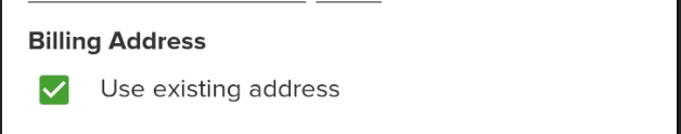
<components:Checkbox CheckedCommandParameter="{Binding .}" IsChecked="{Binding UseExistingAddress}" VerticalOptions="Center" OutlineColor="{DynamicResource PrimaryTextColor}" CheckedOutlineColor="{DynamicResource PrimaryTextColor}" CheckColor="{DynamicResource PrimaryColor}" WidthRequest="{StaticResource CheckboxSize}" HeightRequest="{StaticResource CheckboxSize}"/>
<Label Text="Use existing address" VerticalOptions="Center" Style="{DynamicResource BodySecondary}"/>
</StackLayout>
...
See how good it looks?
iOS with empty fill:


Android with fill:

If you like what you see, don’t forget to follow me on twitter @Suave_Pirate, check out my GitHub, and subscribe to my blog to learn more mobile developer tips and tricks!
Interested in sponsoring developer content? Message @Suave_Pirate on twitter for details.


 Alex Dunn