Xamarin.Tips – Android Bar Background Images in Xamarin.Forms

In a previous post, we talked about the iOS side of setting background images for both NavigationBars and TabBars. Beyond that, we looked at setting them so that we can simulate having transparent bars that show a background image behind the entire Page. That looked like this:

Simulator Screen Shot Apr 7, 2017, 11.23.33 AM

So now let’s do the same thing in Android!

Android

So Android handles images very differently compared to iOS, and also gives us a few easy ways to do what we want here. Rather than having to create custom renderers, we need to create Drawables for our images, and apply them in our Android Layouts for our Toolbar and TabBar. This approach is going to be more similar to Morgan Skinner’s approach for iOS here: http://www.morganskinner.com/2015/01/xamarin-formsusing-background-images-on.html

So we will need to crop our image where our Toolbar and Tabbar will be. If you are planning to also support landscape views, be sure to also crop the image separately for landscape and include those images in your appropriate drawables folders such as drawables-land-hdpi.

Another thing to consider is that, unlike in iOS, Android tabs are placed below the toolbar rather than at the bottom of the entire view. Because of this, you made need to use a different background for your pages that have a TabBar versus the pages that don’t. Here are some examples of how you might need to crop your images:

Portrait with no tabs

crop_portrait

Portrait with tabs

crop_portrait_tabs

Landscape with no tabs

crop_landscape

Landscape with tabs

crop_landscape_tabs

Be sure that you name the individual images the same, but place them in the appropriate resource folder as explained before. In this example we will call them:

  • toolbar_background.png
  • tabbar_background.png
  • page_background.png
  • tab_page_background.png

Unlike our iOS implementation, we do NOT need any custom renderers. Instead, we will set the background drawable of our layout files for our bars, and then in our xaml page, add an image to be the background.

Toolbar.axml

<?xml version="1.0" encoding="utf-8"?>
<android.support.v7.widget.Toolbar 
    xmlns:android="http://schemas.android.com/apk/res/android"
    xmlns:app="http://schemas.android.com/apk/res-auto"
    android:id="@+id/toolbar"
    android:layout_width="match_parent"
    android:layout_height="?attr/actionBarSize"
    android:minHeight="?attr/actionBarSize"
    android:background="@drawable/toolbar_background"
    android:theme="@style/ThemeOverlay.AppCompat.Dark.ActionBar"
    app:popupTheme="@style/ThemeOverlay.AppCompat.Light"
    app:layout_scrollFlags="scroll|enterAlways" /> 

Tabbar.axml

<?xml version="1.0" encoding="utf-8"?>
<android.support.design.widget.TabLayout         
    xmlns:android="http://schemas.android.com/apk/res/android"              
    xmlns:app="http://schemas.android.com/apk/res-auto"              
    android:id="@+id/sliding_tabs"     
    android:layout_width="match_parent"        
    android:layout_height="wrap_content"          
    android:background="@drawable/tabbar_background"          
    android:theme="@style/ThemeOverlay.AppCompat.Dark.ActionBar"          
    app:tabIndicatorColor="@android:color/white"
    app:tabGravity="fill"      
    app:tabMode="fixed" />

Then be sure to set the resources before starting Xamarin.Forms in your MainActivity:

MainActivity.cs

    public class MainActivity : global::Xamarin.Forms.Platform.Android.FormsAppCompatActivity
    {
        protected override void OnCreate(Bundle bundle)
        {
            TabLayoutResource = Resource.Layout.Tabbar;
            ToolbarResource = Resource.Layout.Toolbar;

            base.OnCreate(bundle);

            global::Xamarin.Forms.Forms.Init(this, bundle);
            LoadApplication(new App());

        }
    }

With all those things set, you can now use your background images on pages with or without tabs:

ContentPageWithTabs.xaml

<ContentPage ...>
    <Grid ...>
        <Image Source="tab_page_background.png" .../>
        <!-- The rest of your content on top of the image -->
    </Grid>
</ContentPage>

ContentPageWithNoTabs.xaml

<ContentPage ...>
    <Grid ...>
        <Image Source="page_background.png" .../>
        <!-- The rest of your content on top of the image -->
    </Grid>
</ContentPage>


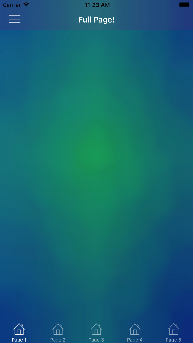
You can see an example result here (with a rushed crop job):

Screenshot_2017-04-18-14-20-08


If you like what you see, don’t forget to follow me on twitter @Suave_Pirate, check out my GitHub, and subscribe to my blog to learn more mobile developer tips and tricks!

Interested in sponsoring developer content? Message @Suave_Pirate on twitter for details.

Xamarin.Tips – MVVM Light Set Expressions Explained

I recently published a post about creating some Visual Studio code snippets for shorcutting the overhead of writing bindable properties and commands with MvvmLight. Xamarin.Tips – Visual Studio Code Templates/Snippets for MVVM Light

This post sparked some people who may or may not have used  Mvvm Light in the past to ask me about how it works underneath, and specifically the Set call made. For example:

private string _myText;

public string MyText
{
    get
    {
        return _myText;
    }
    set
    {
        // This is where the questions are.
        Set(() => MyText, ref _myText, value);
    }
}

I figured I would make another post to dissect this and explain what it is and how it is used!


First off, why are we doing this at all? What does this really do for us?

We use MvvmLight in order to create two-way or one-way bindings to our views whether that is in WPF, UWP, or Xamarin.Forms. The way these bindings are handled is by implementing INotifyPropertyChanged. When we implement INotifyPropertyChanged, we create a public event called PropertyChanged. PropertyChanged takes a custom EventArgs that includes the name of the property that was changed as a string. You would invoke that like this:

PropertyChanged?.Invoke(new PropertyChangedEventArgs("MyText"));

We can then have an event handler attached to this:

myViewModel.PropertyChanged += (sender, args) =>
{
    Console.WriteLine(args.PropertyName); // "MyText"
};

However, platforms such as WPF, UWP, and Xamarin give us the ability to use XAML to create these bindings like this (in Xamarin.Forms):

<Label Text="{Binding MyText}"/>

Setting bindings like this creates event handlers in the background if the BindingContext (or DataContext if you’re in UWP/WPF) implements INotifyPropertyChanged.

So now we can create auto-updating views with our bindings and calling PropertyChanged, but that’s a pain to do for every single property. That’s where libraries like MvvmLight come into play. They help handle a lot of the manual calls and ugly code. So now let’s look at what MvvmLight is really doing under the covers.

First, we need to look at the ViewModelBase class that MvvmLight ships and that contains the Set method we are talking about. ViewModelBase inherits from ObservableObject (another class MvvmLight), and ObservableObject is what is implementing INotifyPropertyChanged! We found it!

So how are ViewModelBase.Set and ObservableObject.Set making their way to calling PropertyChanged?

Let’s dissect the three parameters for the Set method used in the templates I created:

Set(() => MyText, ref _myText, value);
  1. The first is of type Expression<Func>. It is an expression that is returning the property that is calling it? This is where the fun stuff is really happening, so more on that later.
  2. The second is the underlying field that needs to be updated, passed in as a reference type rather than by value.
  3. The third is the new value that it is being set to.

The last two seem to make sense right away: what field are we updating, and what is the value we are setting it to? We need to pass the field in as a ref so that when we update it, it updates in the original model that passed it in rather than simply passing the value of the field into the method.

So what is that Expression?

The only thing left in order to call PropertyChanged is the name of the property being updated, so that must be what the property expression is for. Without decompiling the MvvmLight dlls and looking at the source code, we can infer how we might be able to pull the property name out of that Expression.

First, we need to get the Body of the Expression as a System.Linq.Expression.MemberExpression. The MemberExpression has a Member property which we can then pull property info from. We can cast that Member as a System.Reflection.PropertyInfo, and with that PropertyInfo, we can take the name of the property.

Expression<Func<string>> myTextExpression = () => MyText;
var body = myTextExpression.Body as MemberExpression;
var member = body.Member as PropertyInfo;
var finalPropertyName = member.Name; // we have it!

Then the final step is to finally invoke PropertyChanged with that property name.

I do also want to point out that although I use this particular Set method from MvvmLight, the ObservableObject and ViewModelBase do come with multiple overloads of Set that might work better for your preferred practices. For example, you can call Set without the property expression, and just pass the name of the property in directly. For example:

private string _myText;

public string MyText
{
    get
    {
        return _myText;
    }
    set
    {
        Set("MyText", ref _myText, value); 
    }
}

OR to be even more optimized, you can use nameof to get the name of the property without having to have string-literals floating around in your code:

private string _myText;

public string MyText
{
    get
    {
        return _myText;
    }
    set
    {
        Set(nameof(MyText), ref _myText, value); 
    }
}

Here are all the overloads available to use:

ViewModelBase.cs

protected bool Set<T>(Expression<Func<T>> propertyExpression, ref T field, T newValue, bool broadcast);
protected bool Set<T>(string propertyName, ref T field, T newValue = default(T), bool broadcast = false);
protected bool Set<T>(ref T field, T newValue = default(T), bool broadcast = false, [CallerMemberName] string propertyName = null);

ObservableObject.cs

// THIS IS THE ONE WE WERE USING
protected bool Set<T>(Expression<Func<T>> propertyExpression, ref T field, T newValue);
protected bool Set<T>(string propertyName, ref T field, T newValue);
protected bool Set<T>(ref T field, T newValue, [CallerMemberName] string propertyName = null);

If you happen to have any other questions about how this works, or about breaking down Expressions like we did, feel free to drop a comment on this post, or mention me on Twitter @Suave_Pirate.


And as always:


If you like what you see, don’t forget to follow me on twitter @Suave_Pirate, check out my GitHub, and subscribe to my blog to learn more mobile developer tips and tricks!

Interested in sponsoring your developer content? Message me on twitter @Suave_Pirate for details.

Xamarin.Tips – Removing the Bottom Border of Your iOS Navigation Bars

iOS UINavigationBars by default ship with a bottom border. If you want to remove it, all you need to do is update the ShadowImage of your UINavigationBar. Setting it to new UIImage() will do the trick. This might not be a universal solution. If you are doing more custom work or for certain layouts, you might need to take some additional steps including setting ClipsToBounds to true and setting the BackgroundImage of the UINavigationBar to a new UIImage() as well.

Here’s all of that together:

...
NavigationBar.ShadowImage = new UIImage();
NavigationBar.ClipsToBounds = true(); // optional
NavigationBar.BackgroundImage = new UIImage(); // optional
...

Of course, we are also going to talk about applying this in Xamarin.Forms!

If you want to apply this globally, you can create a custom renderer for NavigationPage. If you only want it in some situations, then you will need to create a new subclass of ContentPage and create a custom renderer for that page that will apply the same changes as below for our universal solution:

CustomNavigationRenderer.cs

[assembly: ExportRenderer(typeof(NavigationPage), typeof(CustomNavigationRenderer))]
namespace YOUR_IOS_NAMESPACE
{
    public class CustomNavigationRenderer : NavigationRenderer
    {
        public override void ViewDidLoad()
        {
            base.ViewDidLoad();

            NavigationBar.ShadowImage = new UIImage();
            NavigationBar.ClipsToBounds = true(); // optional
            NavigationBar.BackgroundImage = new UIImage(); // optional
        }

    }
}

One other way to do this is by using the Appearance API and apply it universally!

...
UINavigationBar.Appearance.ShadowImage = new UIImage();
...

Lastly, here’s is how this would look in Swift if you’ve landed here but aren’t using Xamarin and C#:

UINavigationBar.appearance().setBackgroundImage(
    UIImage(),
    forBarPosition: .Any,
    barMetrics: .Default)

UINavigationBar.appearance().shadowImage = UIImage()

or if you are for some reason in love with Obj-C:

[[UINavigationBar appearance] setBackgroundImage:[[UIImage alloc] init]
                                  forBarPosition:UIBarPositionAny
                                      barMetrics:UIBarMetricsDefault];

[[UINavigationBar appearance] setShadowImage:[[UIImage alloc] init]];


transnavbar


If you like what you see, don’t forget to follow me on twitter @Suave_Pirate, check out my GitHub, and subscribe to my blog to learn more mobile developer tips and tricks!

Xamarin.Tips – iOS Bar Background Images in Xamarin.Forms

Xamarin.Forms doesn’t ship with any way to provide images as your background of either NavigationBars or TabBars. So in order to do this, we will have to build some custom renderers.

iOS

Morgan skinner has a great post here about an approach that he took to apply background images to his NavigationBars: http://www.morganskinner.com/2015/01/xamarin-formsusing-background-images-on.html

The give you the synopsis, you take your entire background image, crop it, and apply the cropped piece as the background of the bar in your renderer.

Here’s a look at how he cropped his image:
Original Marked Up_thumb[5]

I want to take a different approach here and do this programmatically so that you can be EXACT in the background of the bar so that it can match the background of your image.

Although we are approaching this as if you are applying the background image to be the same as your page background image, the same principle applies if you just want to set any image.

Here’s a renderer to use for a NavigationBar:

BackgroundImageNavigationRenderer.cs

[assembly: ExportRenderer(typeof(NavigationPage), typeof(BackgroundImageNavigationRenderer))]
namespace YOUR_IOS_NAMESPACE
{
    public class BackgroundImageNavigationRenderer : NavigationRenderer
    {
        public override void ViewDidLoad()
        {
            base.ViewDidLoad();

            View.BackgroundColor = UIColor.Clear;
            NavigationBar.BackgroundColor = UIColor.Clear;
            var image = UIImage.FromBundle("YOUR_PAGE_BACKGROUND_IMAGE.png");
            image = image.Crop(0,
                (int)(image.CGImage.Height - NavigationBar.Frame.Height),
                (int)image.CGImage.Width,
                (int)NavigationBar.Frame.Height);
            image = image.Scale(new CGSize(NavigationBar.Frame.Width, NavigationBar.Frame.Height));
            NavigationBar.BarTintColor = UIColor.FromPatternImage(image);
            NavigationBar.ShadowImage = new UIImage();
        }

    }
}

Breaking it down, we are taking the image that we use as the background for our entire page, then opening cropping it to the size of the NavigationBar itself.

I’ve also created an extension method called Crop so that we can reuse it here and for our UITabBar:

ImageExtensions.cs

    public static class ImageExtensions
    {
        public static UIImage Crop(this UIImage image, int x, int y, int width, int height)
        {
            var imgSize = image.Size;

            UIGraphics.BeginImageContext(new SizeF(width, height));
            var imgToCrop = UIGraphics.GetCurrentContext();

            var croppingRectangle = new CGRect(0, 0, width, height);
            imgToCrop.ClipToRect(croppingRectangle);

            var drawRectangle = new CGRect(-x, -y, imgSize.Width, imgSize.Height);

            image.Draw(drawRectangle);
            var croppedImg = UIGraphics.GetImageFromCurrentImageContext();

            UIGraphics.EndImageContext();
            return croppedImg;
        }

    }

Now, if you are not doing this to have a full background image, and just want some image for your UINavigationBar only, you can do so like this:

BackgroundImageNavigationRenderer.cs

[assembly: ExportRenderer(typeof(NavigationPage), typeof(BackgroundImageNavigationRenderer))]
namespace YOUR_IOS_NAMESPACE
{
    public class BackgroundImageNavigationRenderer : NavigationRenderer
    {
        public override void ViewDidLoad()
        {
            base.ViewDidLoad();

            View.BackgroundColor = UIColor.Clear;
            NavigationBar.BackgroundColor = UIColor.Clear;
            var image = UIImage.FromBundle("YOUR_BAR_BACKGROUND_IMAGE.png");

            image = image.Scale(new CGSize(NavigationBar.Frame.Width, NavigationBar.Frame.Height));
            NavigationBar.BarTintColor = UIColor.FromPatternImage(image);
            NavigationBar.ShadowImage = new UIImage();
        }

    }
}

Essentially just cutting out the cropping process.

Also note that I set the NavigationBar.ShadowImage to a new UIImage();. Doing this gets rid of the line below your UINavigationBar. If you don’t want to remove the line, just don’t set the ShadowImage.

Now that we’ve done this for our UINavigationBar, we can apply the same thing to our UITabBars. So let’s create another custom renderer for that!

BackgroundImageTabbedPageRenderer.cs


[assembly: ExportRenderer(typeof(TabbedPage), typeof(BackgroundImageTabbedPageRenderer))]
namespace YOUR_IOS_NAMESPACE
{
    public class BackgroundImageTabbedPageRenderer : TabbedRenderer
    {
        public override void ViewWillLayoutSubviews()
        {
            base.ViewWillLayoutSubviews();

            var image = UIImage.FromBundle("YOUR_PAGE_BACKGROUND_IMAGE.jpg");
            image =image.Crop(0,
                (int)(image.CGImage.Height - TabBar.Frame.Height),
                (int)image.CGImage.Width,
                (int)TabBar.Frame.Height);
            image = image.Scale(new CGSize(TabBar.Frame.Width, TabBar.Frame.Height));
            TabBar.BackgroundImage = image;
            TabBar.UnselectedItemTintColor = UIColor.FromRGBA(255, 255, 255, 150);
            TabBar.ShadowImage = new UIImage();
        }

    }
}

just as we did with our UINavigationBar, we crop the page background image to the location and dimensions of our UITabBar, and set the background image there. The same thing also applies with removing the ShadowImage.

And if you are not using a full background image, and just want an image for your bar, take this:

BackgroundImageTabbedPageRenderer.cs


[assembly: ExportRenderer(typeof(TabbedPage), typeof(BackgroundImageTabbedPageRenderer))]
namespace YOUR_IOS_NAMESPACE
{
    public class BackgroundImageTabbedPageRenderer : TabbedRenderer
    {
        public override void ViewWillLayoutSubviews()
        {
            base.ViewWillLayoutSubviews();

            var image = UIImage.FromBundle("YOUR_PAGE_BACKGROUND_IMAGE.jpg");

            image = image.Scale(new CGSize(TabBar.Frame.Width, TabBar.Frame.Height));
            TabBar.BackgroundImage = image;
            TabBar.UnselectedItemTintColor = UIColor.FromRGBA(255, 255, 255, 150);
            TabBar.ShadowImage = new UIImage();
        }

    }
}

And now you can use full page images over your NavigationBars and TabBars, or just set an image as the background for your bars!


Simulator Screen Shot Apr 7, 2017, 11.23.33 AM

If you like what you see, don’t forget to follow me on twitter @Suave_Pirate, check out my GitHub, and subscribe to my blog to learn more mobile developer tips and tricks!

Xamarin.Tips – Restrict the Length of Your Entry Text

Here’s a quick one on how to restrict the number of characters a user can enter in an Entry. Basically, we are going to create a custom Behavior and then apply it to our Entry.

EntryLengthValidatorBehavior.cs

 /// <summary>
    /// Behavior that restricts the length of an entry
    /// </summary>
    public class EntryLengthValidatorBehavior : Behavior<Entry>
    {
        public int MaxLength { get; set; }

        protected override void OnAttachedTo(Entry bindable)
        {
            base.OnAttachedTo(bindable);
            bindable.TextChanged += OnEntryTextChanged;
        }

        protected override void OnDetachingFrom(Entry bindable)
        {
            base.OnDetachingFrom(bindable);
            bindable.TextChanged -= OnEntryTextChanged;
        }

        void OnEntryTextChanged(object sender, TextChangedEventArgs e)
        {
            var entry = (Entry)sender;

            if (entry.Text.Length > this.MaxLength)
            {
                string entryText = entry.Text;
                entry.TextChanged -= OnEntryTextChanged;
                entry.Text = e.OldTextValue;
                entry.TextChanged += OnEntryTextChanged;
            }
        }
    }

Now we can apply it in our Xaml:

<Entry x:Name="Pin1" TextColor="White">
    <Entry.Behaviors>
        <behaviors:EntryLengthValidatorBehavior MaxLength="4"/>
    </Entry.Behaviors>
</Entry>

If you like what you see, don’t forget to follow me on twitter @Suave_Pirate, check out my GitHub, and subscribe to my blog to learn more mobile developer tips and tricks!

Xamarin.Tips – Create Your Own Star Wars Intro Text!

Here’s a fun one – let’s make a Xamarin.Forms page that looks like the Star Wars intro scrolling text! I also put the source up here: https://github.com/SuavePirate/StarWarsPage

Here’s the XAML for the page:

StarWarsPage.xaml

<?xml version="1.0" encoding="utf-8" ?>
<ContentPage xmlns="http://xamarin.com/schemas/2014/forms"              xmlns:x="http://schemas.microsoft.com/winfx/2009/xaml"              xmlns:local="clr-namespace:StarWarsPage"              x:Class="StarWarsPage.MainPage">
    <Grid>
        <Image Source="starwarsintrobg.jpg" Aspect="AspectFill" HorizontalOptions="Fill" VerticalOptions="Fill"/>
        <ScrollView x:Name="TextScrollView" Orientation="Vertical" RotationX="24" Padding="16,800">
            <Label x:Name="Text" Text="{StaticResource StarWarsText}" TextColor="Yellow" FontAttributes="Bold" FontSize="30" HorizontalOptions="Fill"/>
        </ScrollView>
    </Grid>
    <ContentPage.Resources>
        <ResourceDictionary>
            <x:String x:Key="StarWarsText">
                It is a period of civil war.
Rebel spaceships, striking
from a hidden base, have won
their first victory against
the evil Galactic Empire.

During the battle, Rebel
spies managed to steal secret
plans to the Empire's
ultimate weapon, the DEATH
STAR, an armored space
station with enough power
to destroy an entire planet.

Pursued by the Empire's
sinister agents, Princess
Leia races home aboard her
starship, custodian of the
stolen plans that can save her
people and restore
freedom to the galaxy....

            </x:String>
        </ResourceDictionary>
    </ContentPage.Resources>
</ContentPage>

The important part here is the RotationX value on the ScrollView. This is going to set the backwards tilt of the scroll. To break down the other parts that make this up – We have a static String resource to use as the text for the intro. In this case I’m using the crawl text from A New Hope. We also wrap the whole thing in a Grid so that we can set up the background Image element.

Now we get a cool view that the user can scroll through at their own reading pace!

StarWars

If you like what you see, don’t forget to follow me on twitter @Suave_Pirate, check out my GitHub, and subscribe to my blog to learn more mobile developer tips and tricks!

Xamarin.Tips – Xamarin.Forms iOS ListView Refresh Spinner Color

Here’s a quick freebie. If you want to change the color of your ListView Refreshing spinner, we can do that with a quick custom renderer!

Here it is as a renderer:

ColoredRefreshListViewRenderer.cs

    ///<summary>
    /// Custom renderer for all list views to use the custom loader color
    /// </summary>

    public class ColoredRefreshListViewRenderer : ListViewRenderer
    {
        ///<summary>
        /// Set the loader color to your custom color
        /// </summary>
        protected override void OnElementChanged(ElementChangedEventArgs<ListView> e)
        {
            base.OnElementChanged(e);
            var vc = ((UITableViewController)ViewController);

            // Set the color!
            if (vc?.RefreshControl != null)
                vc.RefreshControl.TintColor = UIColor.FromRGB(135, 200, 21);
        }
    }

Now we get something looking awesome like this:
 

loading_apple_green

If you like what you see, don’t forget to follow me on twitter @Suave_Pirate, check out my GitHub, and subscribe to my blog to learn more mobile developer tips and tricks!

Xamarin.Tips – Changing a TableView’s Separator Color

In previous posts, I talked about the misfortunes of the Xamarin.Forms TableView. In this post, we will look at changing the separator color with a custom renderer.

For some other Xamarin.Tips on upgrading your TableView, check out these two posts on customizing the Section Titles!

Android: Xamarin.Tips – Xamarin.Forms Android Custom TableView Section Titles
iOS: Xamarin.Tips – Xamarin.Forms iOS Custom TableView Section Titles

Let’s get started with a custom view that inherits the TableView and adds a BindableProperty for our SeparatorColor:

ColoredTableView.cs

    public partial class ColoredTableView : TableView
    {
        public static BindableProperty SeparatorColorProperty = BindableProperty.Create("SeparatorColor", typeof(Color), typeof(ColoredTableView), Color.White);
        public Color SeparatorColor
        {
            get
            {
                return (Color)GetValue(SeparatorColorProperty);
            }
            set
            {
                SetValue(SeparatorColorProperty, value);
            }
        }
        public ColoredTableView()
        {
            InitializeComponent();
        }
    }

Now let’s take this view and create our renderers!

Let’s start with Android:

ColoredTableViewRenderer.cs

[assembly: ExportRenderer(typeof(ColoredTableView), typeof(ColoredTableViewRenderer))]
namespace YOUR_ANDROID_NAMESPACE
{
    public class ColoredTableViewRenderer : TableViewRenderer
    {
        protected override void OnElementChanged(ElementChangedEventArgs<TableView> e)
        {
            base.OnElementChanged(e);
            if (Control == null)
                return;

            var listView = Control as Android.Widget.ListView;
            var coloredTableView = (ColoredTableView)Element;
            listView.Divider = new ColorDrawable(coloredTableView.SeparatorColor.ToAndroid());
            listView.DividerHeight = 3;
        }

        protected override void OnElementPropertyChanged(object sender, PropertyChangedEventArgs e)
        {
            base.OnElementPropertyChanged(sender, e);
            if(e.PropertyName == "SeparatorColor")
            {
                var listView = Control as Android.Widget.ListView;
                var coloredTableView = (ColoredTableView)Element;
                listView.Divider = new ColorDrawable(coloredTableView.SeparatorColor.ToAndroid());
            }
        }
    }
}

Basically, we take the color and apply it as a ColorDrawable, including updating when the property changes from our Forms code.

Now let’s write up our iOS renderer:

ColoredTableViewRenderer.cs

[assembly: ExportRenderer(typeof(ColoredTableView), typeof(ColoredTableViewRenderer))]
namespace YOUR_IOS_NAMESPACE
{
    public class ColoredTableViewRenderer : TableViewRenderer
    {
        protected override void OnElementChanged(ElementChangedEventArgs<TableView> e)
        {
            base.OnElementChanged(e);
            if (Control == null)
                return;

            var tableView = Control as UITableView;
            var coloredTableView = Element as ColoredTableView;
            tableView.SeparatorColor = coloredTableView.SeparatorColor.ToUIColor();
        }

        protected override void OnElementPropertyChanged(object sender, PropertyChangedEventArgs e)
        {
            base.OnElementPropertyChanged(sender, e);
            if(e.PropertyName == "SeparatorColor")
            {
                var tableView = Control as UITableView;
                var coloredTableView = Element as ColoredTableView;

                tableView.SeparatorColor = coloredTableView.SeparatorColor.ToUIColor();
            }
        }
    }
}

Similarly to our Android implementation, we set the SeparatorColor of our Native UITableView on set up and when the value changes.

If you like what you see, don’t forget to follow me on twitter @Suave_Pirate, check out my GitHub, and subscribe to my blog to learn more mobile developer tips and tricks!

Xamarin.Tips – Android Shadows on Transparent Views

I talked in a previous post about creating box-shadows on iOS UIViews that are transparent that you can find here: Xamarin.Tips – iOS Shadow on Transparent UIView

This is the Android counterpart! Let’s look at putting some shadows around a view with a fully transparent background. Android presented some completely different challenges compared to iOS. In the iOS solution, we ran into issues with Shadow layers requiring something in front of it to draw the drop shadow. With Android, using a CardView from the design support library gives us access to the Elevation and CardElevation properties which CAN indeed give us shadows around our view even though it is transparent. However, that kills any border on the view. Remember that we are looking for a transparent view, with a solid border, and shadows around it.

The general approach for iOS was to draw two new layers with shadows around the right and bottom sides of the UIView. Using layers allowed us to draw outside the actual frame of the view. However, with iOS, we aren’t so lucky.

So here’s the idea:
1. Adjust the margin and padding to allow us to expand the frame of the view
2. Draw a shadow gradient on the right side
3. Draw a shadow gradient on the bottom side
4. Draw a border around what our inner frame was

Here’s what that looks like in a custom renderer (since the origin of this was a custom Xamarin.Forms view):

TransparentFrameRenderer.cs

[assembly: ExportRenderer(typeof(TransparentFrame), typeof(TransparentFrameRenderer))]
namespace YOUR_ANDROID_NAMESPACE
{
    public class TransparentFrameRenderer : Xamarin.Forms.Platform.Android.AppCompat.FrameRenderer
    {
        protected override void OnElementChanged(ElementChangedEventArgs<Frame> e)
        {
            base.OnElementChanged(e);
            if (e.NewElement != null)
            {
                Element.Margin = new Thickness(-5);
                Element.Padding = new Thickness(15);
                Control.CardElevation = 0;
                Control.PreventCornerOverlap = false;
            }
        }

        protected override void OnDraw(Canvas canvas)
        {
            base.OnDraw(canvas);

            // draw border
            var strokePaint = new Paint();
            strokePaint.SetARGB(255, 255, 255, 255);
            strokePaint.SetStyle(Paint.Style.Stroke);
            strokePaint.StrokeWidth = 2;
            var rect = canvas.ClipBounds;
            var outline = new Rect(15, 15, rect.Right - 15, rect.Bottom - 15);

            var bottomPaint = new Paint();
            bottomPaint.SetStyle(Paint.Style.Fill);
            var shadowShader = new LinearGradient(0, 0, 0, 30, new Android.Graphics.Color(0, 0, 0, 100), new Android.Graphics.Color(0, 0, 0, 0), Shader.TileMode.Mirror);
            bottomPaint.SetShader(shadowShader);

            var rightPaint = new Paint();
            rightPaint.SetStyle(Paint.Style.Fill);
            var rightShader = new LinearGradient(0, 0, 20, 0, new Android.Graphics.Color(0, 0, 0, 100), new Android.Graphics.Color(0, 0, 0, 0), Shader.TileMode.Mirror);
            rightPaint.SetShader(rightShader);

            // draw the bottom and right shadows
            canvas.DrawRect(12, rect.Bottom - 12, rect.Right - 12, rect.Bottom + 3, bottomPaint);
            canvas.DrawRect(rect.Right - 12, 14, rect.Right + 3, rect.Bottom, rightPaint);
            canvas.DrawRect(outline, strokePaint);
        }
    }
}

Look at the Draw override. We are setting up 3 different paints. The first is the Paint for our white border. bottomPaint sets up for our bottom shadow using a LinearGradient as the shader, and similarly, rightPaint sets up our shadow for the right side.

Finally, we call DrawRect for both our shadows, then our border. The values in the DrawRect calls for the shadows are just examples to play with padding and size values. You can play with those as you see fit to make your view look best.

I’ve tested this in some large ListViews to test against the classic Android overdraw issue that can happen, but because it consists of 3 pretty simple strokes, I haven’t run into any performance issues. Hopefully this solution works for you!

This is NOT a complete solution, or a real reusable control, but more of a general approach to rendering shadows around a control with a transparent background.

If you like what you see, don’t forget to follow me on twitter @Suave_Pirate, check out my GitHub, and subscribe to my blog to learn more mobile developer tips and tricks!

Xamarin.Tips – Xamarin.Forms Android Custom TableView Section Titles

Xamarin.Forms’ TableView is a really useful control for displaying static content. However, it has some shortfalls. The one we will look at today is customizing the Section Title.

If you are looking for this solution on iOS, check it out here: Xamarin.Tips – Xamarin.Forms iOS Custom TableView Section Titles

Before reading ahead, I would suggest looking at your solution and assessing whether or not your TableView could be easily replaced by a ListView. I want to point this out, because ListViews have more flexibility for GroupHeader and allow you to put any control in there without having to leave your happy place that is XAML.

If that isn’t the case, keep reading; Let’s look at some simple custom renderers that can solve this problem for Android specifically.

First, let’s create a custom view that inherits TableView:

ColoredTableView.cs

 public partial class ColoredTableView : TableView
    {
        public static BindableProperty GroupHeaderColorProperty = BindableProperty.Create("GroupHeaderColor", typeof(Color), typeof(ColoredTableView), Color.White);
        public Color GroupHeaderColor
        {
            get
            {
                return (Color)GetValue(GroupHeaderColorProperty);
            }
            set
            {
                SetValue(GroupHeaderColorProperty, value);
            }
        }

        public ColoredTableView()
        {
            InitializeComponent();
        }
    }

Now we can create our Android renderer:

ColoredTableViewRenderer

[assembly: ExportRenderer(typeof(ColoredTableView), typeof(ColoredTableViewRenderer))]
namespace YOUR_ANDROID_NAMESPACE
{
    public class ColoredTableViewRenderer : TableViewRenderer
    {
       
        protected override TableViewModelRenderer GetModelRenderer(Android.Widget.ListView listView, TableView view)
        {
            return new CustomHeaderTableViewModelRenderer(Context, listView, view);
        }

        private class CustomHeaderTableViewModelRenderer : TableViewModelRenderer
        {
            private readonly ColoredTableView _coloredTableView;

            public CustomHeaderTableViewModelRenderer(Context context, Android.Widget.ListView listView, TableView view) : base(context, listView, view)
            {
                _coloredTableView = view as ColoredTableView;
            }

            public override Android.Views.View GetView(int position, Android.Views.View convertView, ViewGroup parent)
            {
                var view = base.GetView(position, convertView, parent);

                var element = GetCellForPosition(position);

                // section header will be a TextCell
                if (element.GetType() == typeof(TextCell))
                {
                    try
                    {
                        // Get the textView of the actual layout
                        var textView = ((((view as LinearLayout).GetChildAt(0) as LinearLayout).GetChildAt(1) as LinearLayout).GetChildAt(0) as TextView);

                        // get the divider below the header
                        var divider = (view as LinearLayout).GetChildAt(1);

                        // Set the color
                        textView.SetTextColor(_coloredTableView.GroupHeaderColor.ToAndroid());
                        textView.TextAlignment = Android.Views.TextAlignment.Center;
                        textView.Gravity = GravityFlags.CenterHorizontal;
                        divider.SetBackgroundColor(_coloredTableView.GroupHeaderColor.ToAndroid());
                    }
                    catch (Exception) { }
                }

                return view;
            }
        }
    }
}

Similar to the iOS solution, the important part is our override of GetView. What we are doing here is getting a reference to the inner child native views of our section header (why we check against the type and TextCell). Then we get our actual android TextView and the LinearLayout which is the divider below the header. From there we can change the properties of the views however we prefer. The default behavior of these views are to take the AccentColor from the android styles and use them as the BackgroundColor of the divider and the TextColor of the TextView.

If you like what you see, don’t forget to follow me on twitter @Suave_Pirate, check out my GitHub, and subscribe to my blog to learn more mobile developer tips and tricks!