Xamarin.Tips – Bringing Material Design Fonts to iOS

We might as well continue this trend of bringing Material Design to our iOS apps. Be sure to check out my previous posts on Material Frames in Xamarin.Forms iOS and Material Design Buttons in iOS (Native and Xamarin.Forms). Let’s talk about fonts now.

Material Design states that the preferred fonts to use are Roboto and Noto: https://material.io/guidelines/style/typography.html. These fonts ship in Android natively from Android 5.0+ (API Level 2.1) or when using the Android App Compat packages. However, these are not part of the OS in iOS, so if we want to fit a more Material Design standard, we need to bring those into our own apps.

Downloading and Installing the Fonts

First things first, we need to download both of these fonts from Google’s open web fonts.

  1. Roboto: https://fonts.google.com/specimen/Roboto
  2. Noto: https://fonts.google.com/specimen/Noto+Sans

You’ll need to make sure you don’t just download the Regular font files for both of these, but also each of the weights you’ll want to use in your app.

Now that you have all your .ttf files, you’ll need to bring them into your project. Place them in a folder at iOS Project > Resources > Font. Also make sure that each of their BuildActions are set to BundleResources. Do this by going to the Properties of each file and use the Build Action dropdown.
RobotoFontsInVS.PNG

The last step in getting them property installed is to update your Info.plist file to include the fonts. After this step, we’ll be able to start using it.

In Visual Studio, open your Info.plist file with the Generic PList Editor. When you do that, it should look something like this:
infoplistdefault

Scroll down to the bottom and add a new Property. You can use the dropdown to find it, or type it out yourself, but it needs to be Fonts provided by application. Set the type of this new item to Array, then start adding subitems for each of the fonts. For each font, you will need to set the type to String and the value to the path to your font from the Resources folder. So in our case, that will be something like Fonts/Roboto-Black.ttf.

Do this for each of your font files, and it should looks something like this:

infoplistfonts

Now we have our fonts installed into our iOS application, we can start using them!

Using the Font in Xamarin.iOS Native

Now that our application is aware of our font, we can apply it to any UILabel we instantiate in our code:

ExampleViewController.cs

var label = new UILabel(new RectangleF(0,0, width, height /2));
label .Text = "This is a label using Roboto";
label .Font = UIFont.FromName("Roboto-Regular", 20f);
this.Add(label);

Alternatively, we can use the Appearance APIs to apply it to all of our UILabels across our app:

AppDelegate.cs

public class AppDelegate : UIApplicationDelegate
{
    public override bool FinishedLaunching(UIApplication app, NSDictionary options)
    {
        ...

        UILabel.Appearance.Font = UIFont.FromName("Roboto-Regular", 20f);
        ...
        return true;
    }
}

Using the Font in Xamarin.Forms iOS

Of course, we also might need to use this font in Xamarin.Forms! Just like in native iOS, we need to apply our font, by name to any given label we want, or we can use Styles to apply it everywhere.

ExamplePage.xaml

<ContentPage ...>
    <Label FontFamily="Roboto-Regular" FontSize="20" Text="Xamarin.Forms Roboto on iOS"/>
</ContentPage>

or:

App.xaml

<Application ...>
    <Application.Resources>
        <ResourceDictionary>
<Style TargetType="Label">
                <Setter Property="FontFamily" Value="Roboto-Regular"/>
                ...
            </Style>

        </ResourceDictionary>
    </Application.Resources>
</Application>

Results

Now we have our nicer looking fonts from Material Design applied to our iOS apps. Look at this comparison of some default iOS Frames and Fonts versus our new Materialized look and feel:

Old (Defaults)
iOSDefaultFrameAndLabel

New (Custom Frame and Roboto-Regular Font)
iOSMaterialFrameAndLabel

Are there any other controls you’d like to see Materialized on iOS? Let me know in the comments!

If you like what you see, don’t forget to follow me on twitter @Suave_Pirate, check out my GitHub, and subscribe to my blog to learn more mobile developer tips and tricks!

Interested in sponsoring developer content? Message @Suave_Pirate on twitter for details.

Xamarin.Tips – Creating a Material Design Button in iOS

As per requests after my last post on creating a more Material looking Xamarin.Forms Frame on iOS, I’ll start talking about bringing a more material design feel to other controls in iOS. This time we’ll look at getting a more material Button control, first to be usable without Xamarin.Forms, then in a custom renderer that we can use everywhere and apply to all our Buttons.

Keep in mind, this does not hit upon all the pieces of a Material Design Button that you might see in Android. For example, it does not show a ripple on tap, and does not raise the elevation on tap. Those topics will come in a different blog post!

Let’s get down to it with a custom UIButton that applies a material-ish shadow to our button.

MaterialButton.cs

    public class MaterialButton : UIButton
    {
        public override void Draw(CGRect rect)
        {
            base.Draw(rect);

            // don't do it on transparent bg buttons
            if (BackgroundColor.CGColor.Alpha == 0)
                return;

            // Update shadow to match better material design standards of elevation
            Layer.ShadowRadius = 2.0f;
            Layer.ShadowColor = UIColor.Gray.CGColor;
            Layer.ShadowOffset = new CGSize(2, 2);
            Layer.ShadowOpacity = 0.80f;
            Layer.ShadowPath = UIBezierPath.FromRect(Layer.Bounds).CGPath;
            Layer.MasksToBounds = false;
        }
    }

You can see that we basically just apply a specific shadow to our base Layer of the control.

Now, let’s interpret this into a custom renderer for Xamarin.Forms:

MaterialButtonRenderer.cs

[assembly: ExportRenderer(typeof(Button), typeof(MaterialButtonRenderer))]
namespace YOUR_IOS_NAMESPACE
{
    public class MaterialButtonRenderer : ButtonRenderer
    {
        public override void Draw(CGRect rect)
        {
            base.Draw(rect);

            // don't do it on transparent bg buttons
            if (Element.BackgroundColor.A == 0)
                return;

            // Update shadow to match better material design standards of elevation
            Layer.ShadowRadius = 2.0f;
            Layer.ShadowColor = UIColor.Gray.CGColor;
            Layer.ShadowOffset = new CGSize(2, 2);
            Layer.ShadowOpacity = 0.80f;
            Layer.ShadowPath = UIBezierPath.FromRect(Layer.Bounds).CGPath;
            Layer.MasksToBounds = false;

        }
    }
}

This will apply the shadow to any regular Button Element. If you want to create a whole new Element that will allow you to use it in specific places, you could either create an Effect, or you can create a new class that subclasses Xamarin.Forms.Button, and then update the renderer to fit that class:

MaterialButton.xaml.cs

public partial class MaterialButton : Button
{
    // we don't need to do anything special here since we do all the custom work in the iOS Renderer
}

and of course our updated renderer

MaterialButtonRenderer.cs

[assembly: ExportRenderer(typeof(MaterialButton), typeof(MaterialButtonRenderer))]
namespace YOUR_IOS_NAMESPACE
{
    public class MaterialButtonRenderer : ButtonRenderer
    {
        public override void Draw(CGRect rect)
        {
            base.Draw(rect);

            // don't do it on transparent bg buttons
            if (Element.BackgroundColor.A == 0)
                return;

            // Update shadow to match better material design standards of elevation
            Layer.ShadowRadius = 2.0f;
            Layer.ShadowColor = UIColor.Gray.CGColor;
            Layer.ShadowOffset = new CGSize(2, 2);
            Layer.ShadowOpacity = 0.80f;
            Layer.ShadowPath = UIBezierPath.FromRect(Layer.Bounds).CGPath;
            Layer.MasksToBounds = false;

        }
    }
}

Now your control should go from this:

iOSRegularButton

To this:

iOSMaterialButton

Make sure to stay tuned for more Material Design styled controls brought to iOS, and adding some advanced features like rippled clicks and elevation changes/settings.

If you like what you see, don’t forget to follow me on twitter @Suave_Pirate, check out my GitHub, and subscribe to my blog to learn more mobile developer tips and tricks!

Interested in sponsoring developer content? Message @Suave_Pirate on twitter for details.

Xamarin.Tips – Making Your iOS Frame Shadows More Material

If you’ve used the Xamarin.Forms Frame element on iOS and have HasShadow set to true, then you might notice that on iOS, the shadow is quite abrasive and overwhelming.

We can update just the iOS FrameRenderer to create some better shadows, so we can go from this:

DefaultiOSFrameShadow

to this:

iOSMaterialShadow

In order to override all Frame elements, we will need to create our custom renderer and also set it to export to the default Frame. If you do not want it to apply to all Frames, then you can create a custom control that inherits from frame and then apply the renderer to that new element type. We’ll example both here:

MaterialFrameRenderer.cs


[assembly: ExportRenderer(typeof(Frame), typeof(MaterialFrameRenderer))]
namespace YOU_IOS_NAMESPACE
{
    /// <summary>
    /// Renderer to update all frames with better shadows matching material design standards
    /// </summary>

    public class MaterialFrameRenderer : FrameRenderer
    {
        public override void Draw(CGRect rect)
        {
            base.Draw(rect);

            // Update shadow to match better material design standards of elevation
            Layer.ShadowRadius = 2.0f;
            Layer.ShadowColor = UIColor.Gray.CGColor;
            Layer.ShadowOffset = new CGSize(2, 2);
            Layer.ShadowOpacity = 0.80f;
            Layer.ShadowPath = UIBezierPath.FromRect(Layer.Bounds).CGPath;
            Layer.MasksToBounds = false;
        }
    }
}

That’s all you need in your iOS project in order to apply it everywhere. Now, if you want to apply it to a new custom Element, we can create it and apply it like so:

MaterialFrame.xaml.cs


namespace YOUR_PCL_NAMESPACE
{
    public class MaterialFrame : Frame
    {
        // no other code needs to go here unless you want more customizable properties.
    }
}

Then create your renderer and export it for you new Element:

MaterialFrameRenderer.cs


[assembly: ExportRenderer(typeof(MaterialFrame), typeof(MaterialFrameRenderer))]
namespace YOU_IOS_NAMESPACE
{
    /// <summary>
    /// Renderer to update all frames with better shadows matching material design standards
    /// </summary>

    public class MaterialFrameRenderer : FrameRenderer
    {
        public override void Draw(CGRect rect)
        {
            base.Draw(rect);

            // Update shadow to match better material design standards of elevation
            Layer.ShadowRadius = 2.0f;
            Layer.ShadowColor = UIColor.Gray.CGColor;
            Layer.ShadowOffset = new CGSize(2, 2);
            Layer.ShadowOpacity = 0.80f;
            Layer.ShadowPath = UIBezierPath.FromRect(Layer.Bounds).CGPath;
            Layer.MasksToBounds = false;
        }
    }
}

And now your frames can look much nicer~

iOSMaterialShadow


If you like what you see, don’t forget to follow me on twitter @Suave_Pirate, check out my GitHub, and subscribe to my blog to learn more mobile developer tips and tricks!

Interested in sponsoring developer content? Message @Suave_Pirate on twitter for details.

Xamarin.Controls – Xamarin.Forms FloatingActionButton (including iOS!)

You did actually read that title correctly – we have a FloatingActionButton to use in Xamarin.Forms that works in both Android and iOS!

I’ve put the source code up for this here: https://github.com/SuavePirate/Xamarin.Forms.Controls.FloatingActionButton

It’s rudimentary and has room for some more fun properties, but it is fully functional! If you would like to contribute to the repository, see the TODO: list at the bottom of the README and start forking and making pull requests!

To breakdown the steps to create your own Floating Action Button in Xamarin.Forms, you’ll need:

  1. A custom Xamarin.Forms `Element`
  2. An Android Custom renderer to use the native `Android.Compat.Design.Widgets.FloatingActionButton`
  3. An iOS Custom renderer to create a button that looks like a FAB.

So let’s go in that order.

In Xamarin.Forms PCL

FloatingActionButton.xaml.cs

  public partial class FloatingActionButton : Button
    {
        public static BindableProperty ButtonColorProperty = BindableProperty.Create(nameof(ButtonColor), typeof(Color), typeof(FloatingActionButton), Color.Accent);
        public Color ButtonColor
        {
            get
            {
                return (Color)GetValue(ButtonColorProperty);
            }
            set
            {
                SetValue(ButtonColorProperty, value);
            }
        }
        public FloatingActionButton()
        {
            InitializeComponent();
        }
    }

We added a new BindableProperty for the ButtonColor. This is done because setting the BackgroundColor will mess up the Android renderer and apply the background behind the FAB. We want to inherit from Button so that we can utilize some of the already useful properties that come with it – namely the Image property that consumes a FileImageSource. We can use this to set the icon for our FAB.

In Android

FloatingActionButtonRenderer.cs

using FAB = Android.Support.Design.Widget.FloatingActionButton;

[assembly: ExportRenderer(typeof(SuaveControls.Views.FloatingActionButton), typeof(FloatingActionButtonRenderer))]
namespace SuaveControls.FloatingActionButton.Droid.Renderers
{
    public class FloatingActionButtonRenderer : Xamarin.Forms.Platform.Android.AppCompat.ViewRenderer<SuaveControls.Views.FloatingActionButton, FAB>
    {
        protected override void OnElementChanged(ElementChangedEventArgs<SuaveControls.Views.FloatingActionButton> e)
        {
            base.OnElementChanged(e);

            if (e.NewElement == null)
                return;

            var fab = new FAB(Context);
            // set the bg
            fab.BackgroundTintList = ColorStateList.ValueOf(Element.ButtonColor.ToAndroid());

            // set the icon
            var elementImage = Element.Image;
            var imageFile = elementImage?.File;

            if (imageFile != null)
            {
                fab.SetImageDrawable(Context.Resources.GetDrawable(imageFile));
            }
            fab.Click += Fab_Click;
            SetNativeControl(fab);

        }
        protected override void OnLayout(bool changed, int l, int t, int r, int b)
        {
            base.OnLayout(changed, l, t, r, b);
            Control.BringToFront();
        }

        protected override void OnElementPropertyChanged(object sender, PropertyChangedEventArgs e)
        {
            var fab = (FAB)Control;
            if (e.PropertyName == nameof(Element.ButtonColor))
            {
                fab.BackgroundTintList = ColorStateList.ValueOf(Element.ButtonColor.ToAndroid());
            }
            if (e.PropertyName == nameof(Element.Image))
            {
                var elementImage = Element.Image;
                var imageFile = elementImage?.File;

                if (imageFile != null)
                {
                    fab.SetImageDrawable(Context.Resources.GetDrawable(imageFile));
                }
            }
            base.OnElementPropertyChanged(sender, e);

        }

        private void Fab_Click(object sender, EventArgs e)
        {
            // proxy the click to the element
            ((IButtonController)Element).SendClicked();
        }
    }
}

A few important things to point out:

  • We add the additional using statement `using FAB = Android.Support.Design.Widget.FloatingActionButton;` to help us distinguish between our Xamarin.Forms element and the built in Android control.
  • We are NOT using a `ButtonRenderer` as our base class, but instead using a basic `ViewRenderer`. This is because the underlying control will not be a native Android `Button`, but the native Android `FloatingActionButton`.
  • Because we replace the `ButtonRenderer`, we need to make sure we still propagate click events up to the Xamarin.Forms element.

Now let’s look at iOS, which can utilize more of the built in pieces from Xamarin.Forms since it supports the BorderRadius property on Buttons.

In iOS

FloatingActionButtonRenderer.cs

[assembly: ExportRenderer(typeof(SuaveControls.Views.FloatingActionButton), typeof(FloatingActionButtonRenderer))]
namespace SuaveControls.FloatingActionButton.iOS.Renderers
{
    [Preserve]
    public class FloatingActionButtonRenderer : ButtonRenderer
    {
        public static void InitRenderer()
        {
        }
        public FloatingActionButtonRenderer()
        {
        }
        protected override void OnElementChanged(ElementChangedEventArgs<Button> e)
        {
            base.OnElementChanged(e);

            if (e.NewElement == null)
                return;

            // remove text from button and set the width/height/radius
            Element.WidthRequest = 50;
            Element.HeightRequest = 50;
            Element.BorderRadius = 25;
            Element.BorderWidth = 0;
            Element.Text = null;

            // set background
            Control.BackgroundColor = ((SuaveControls.Views.FloatingActionButton)Element).ButtonColor.ToUIColor();
        }
        public override void Draw(CGRect rect)
        {
            base.Draw(rect);
            // add shadow
            Layer.ShadowRadius = 2.0f;
            Layer.ShadowColor = UIColor.Black.CGColor;
            Layer.ShadowOffset = new CGSize(1, 1);
            Layer.ShadowOpacity = 0.80f;
            Layer.ShadowPath = UIBezierPath.FromOval(Layer.Bounds).CGPath;
            Layer.MasksToBounds = false;

        }
        protected override void OnElementPropertyChanged(object sender, PropertyChangedEventArgs e)
        {
            base.OnElementPropertyChanged(sender, e);

            if (e.PropertyName == "ButtonColor")
            {
                Control.BackgroundColor = ((SuaveControls.Views.FloatingActionButton)Element).ButtonColor.ToUIColor();
            }
        }
    }
}

We set an explicit WidthRequest, HeightRequest, and BorderRadius to get ourselves a circle. I’m not a big fan of doing it here, since it’s better suited as a calculation, but for now it works.

Lastly in our Draw override, we set up the drop shadow behind out button, and make sure that our ShadowPath is actually built from an oval so that it rounds off with the Button.
Also note that we take the ButtonColor property and apply it as the BackgroundColor of the UIButton to override the color from Xamarin.Forms. Don’t forget to set Text to null so that we can’t add text to the button and mess it up.

As a side note, iOS might try to link our your custom renderer if you are using it in an iOS Class Library. In order to avoid this, make sure to call a static InitRenderer method in your AppDelegate.cs as it will prevent it from being linked out.

Using the FloatingActionButton

Now that we have our renderers registered for our new Element, we can use it in our XAML or C# of our PCL or Shared Project:

MainPage.xaml

<?xml version="1.0" encoding="utf-8" ?>
<ContentPage xmlns="http://xamarin.com/schemas/2014/forms"              xmlns:x="http://schemas.microsoft.com/winfx/2009/xaml"              xmlns:local="clr-namespace:SuaveControls.FabExample"              xmlns:controls="clr-namespace:SuaveControls.Views;assembly=SuaveControls.FloatingActionButton"              x:Class="SuaveControls.FabExample.MainPage">
    <StackLayout Margin="32">
        <Label Text="This is a Floating Action Button!"             VerticalOptions="Center"             HorizontalOptions="Center"/>

        <controls:FloatingActionButton x:Name="FAB" HorizontalOptions="CenterAndExpand" WidthRequest="50" HeightRequest="50"  VerticalOptions="CenterAndExpand" Image="ic_add_white.png" ButtonColor="#03A9F4" Clicked="Button_Clicked"/>
    </StackLayout>
</ContentPage>

and our code behind:

MainPage.xaml.cs

namespace SuaveControls.FabExample
{
    public partial class MainPage : ContentPage
    {
        public MainPage()
        {
            InitializeComponent();

        }

        private async void Button_Clicked(object sender, EventArgs e)
        {
            await DisplayAlert("FAB Clicked!", "Congrats on creating your FAB!", "Thanks!");
        }
    }
}

Then we get these results in our Android and iOS apps:

Android

Screenshot_1493173400

iOS

2017-04-25_10-38-38-PM

If you want to just pull down the control I built on GitHub, the steps are straight forward:

  1. Clone the repository
  2. Reference the PCL in your PCL/Shared Lib
  3. Reference the PCL and native projects in your respective native project
  4. Pull the namespace into your XAML (or C#)
  5. Start using it!

The repository also contains an example app that references the source libraries.

If you like what you see, don’t forget to follow me on twitter @Suave_Pirate, check out my GitHub, and subscribe to my blog to learn more mobile developer tips and tricks!

Interested in sponsoring developer content? Message @Suave_Pirate on twitter for details.

Xamarin.Controls – Android ArcLayout

Here’s a quick and fun new control to play with. It’s called the ArcLayout, and if the name isn’t descriptive enough, it allows you to layout your Views in the layout based on arcs, degrees, radii, etc. rather than using existing LinearLayouts, RelativeLayouts, or FrameLayouts.

The control is originally from OgacleJapan and you can find his native Android repository here: https://github.com/ogaclejapan/ArcLayout.

I’ve simply provided a Xamarin Android Binding Project to wrap it which you can find here: https://github.com/SuavePirate/ArcLayout. I haven’t created a nuget package for it yet, since the binding project could use some clean up first. However, here is an easy way to get started using it right away.

  1. Clone the Xamarin Binding Library (it includes the native project .jar/.aar in it, so you can clone and start right away).
  2. Copy the project to your solution, and add it as a reference in your Xamarin Android project.
  3. Start adding it to your layouts!
<com.ogaclejapan.arclayout.ArcLayout         
         android:id="@id/arc_layout"
         android:layout_width="match_parent"
         android:layout_height="match_parent"
         app:arc_origin="bottom"
         app:arc_color="#4D000000"
         app:arc_radius="168dp"
         app:arc_axisRadius="120dp"
         app:arc_freeAngle="false"
         app:arc_reverseAngle="false">

    <Button
         android:layout_width="48dp"
         android:layout_height="48dp"
         android:gravity="center"
         android:text="A"
         android:textColor="#FFFFFF"
         android:background="#03A9F4"
         app:arc_origin="center"/>

    <Button
         android:layout_width="48dp"
         android:layout_height="48dp"
         android:gravity="center"
         android:text="B"
         android:textColor="#FFFFFF" 
         android:background="#00BCD4"
         app:arc_origin="center"/>

    <Button
         android:layout_width="48dp"
         android:layout_height="48dp"
         android:gravity="center"
         android:text="C"
         android:textColor="#FFFFFF"
         android:background="#009688"
         app:arc_origin="center"/>

</com.ogaclejapan.arclayout.ArcLayout>

Now we can dissect the new attributes and properties we get from ArcLayout:
attrs

Properties of the ArcLayout

attr description
arc_origin Center of the arc on layout. All of patterns that can be specified, see the demo app.
arc_color Arc Shaped color
arc_radius Radius of the layout
arc_axisRadius Radius the axis of the child views
arc_freeAngle If set to true, each child view can set the free angle, default false
arc_reverseAngle If set to true, reverse the order of the child, default false. Note: If arc_freeAngle set to true does not work


Properties of the ArcLayout Child Views

arc_origin Set the origin point of arc_axisRadius as well as layout_gravity, default center
arc_angle If arc_freeAngle set to true, layout the specified angle

Here’s a good example to get you started including a full circle layout and two semicircles:

arc_layout_full_example.axml

<?xml version="1.0" encoding="utf-8"?>
<RelativeLayout xmlns:android="http://schemas.android.com/apk/res/android"
                     xmlns:app="http://schemas.android.com/apk/res-auto"
                 android:id="@+id/MainLayout"
     android:layout_width="match_parent"
     android:layout_height="match_parent">
  <com.ogaclejapan.arclayout.ArcLayout
         android:id="@+id/arc_layout_top"
         android:layout_width="match_parent"
         android:layout_height="match_parent"
         app:arc_origin="top"
         app:arc_color="#321321"
         app:arc_radius="168dp"
         app:arc_axisRadius="120dp"
         app:arc_freeAngle="false"
         app:arc_reverseAngle="false">

    <Button
         android:layout_width="48dp"
         android:layout_height="48dp"
         android:gravity="center"
         android:text="A"
         android:textColor="#FFFFFF"
         android:background="#03A9F4"
         app:arc_origin="center"/>

    <Button
         android:layout_width="48dp"
         android:layout_height="48dp"
         android:gravity="center"
         android:text="B"
         android:textColor="#FFFFFF"
         android:background="#00BCD4"
         app:arc_origin="center"/>

    <Button
         android:layout_width="48dp"
         android:layout_height="48dp"
         android:gravity="center"
         android:text="C"
         android:textColor="#FFFFFF"
         android:background="#009688"
         app:arc_origin="center"/>

</com.ogaclejapan.arclayout.ArcLayout>
<com.ogaclejapan.arclayout.ArcLayout
         android:id="@+id/arc_layout"
         android:layout_width="match_parent"
         android:layout_height="match_parent"
         app:arc_origin="bottom"
         app:arc_color="#03a9f4"
         app:arc_radius="168dp"
         app:arc_axisRadius="120dp"
         app:arc_freeAngle="false"
         app:arc_reverseAngle="false">

    <Button
         android:layout_width="48dp"
         android:layout_height="48dp"
         android:gravity="center"
         android:text="A"
         android:textColor="#FFFFFF"
         android:background="#03A9F4"
         app:arc_origin="center"/>

    <Button
         android:layout_width="48dp"
         android:layout_height="48dp"
         android:gravity="center"
         android:text="B"
         android:textColor="#FFFFFF"
         android:background="#00BCD4"
         app:arc_origin="center"/>

    <Button
         android:layout_width="48dp"
         android:layout_height="48dp"
         android:gravity="center"
         android:text="C"
         android:textColor="#FFFFFF"
         android:background="#009688"
         app:arc_origin="center"/>

</com.ogaclejapan.arclayout.ArcLayout>
<com.ogaclejapan.arclayout.ArcLayout
         android:id="@+id/arc_layout_center"
         android:layout_width="match_parent"
         android:layout_height="match_parent"
         app:arc_origin="center"
         app:arc_color="#4D123123"
         app:arc_radius="50dp"
         app:arc_axisRadius="50dp"
         app:arc_freeAngle="false"
         app:arc_reverseAngle="false">

    <Button
         android:layout_width="48dp"
         android:layout_height="48dp"
         android:gravity="center"
         android:text="A"
         android:textColor="#FFFFFF"
         android:background="#03A9F4"
         app:arc_origin="center"/>

    <Button
         android:layout_width="48dp"
         android:layout_height="48dp"
         android:gravity="center"
         android:text="B"
         android:textColor="#FFFFFF"
         android:background="#00BCD4"
         app:arc_origin="center"/>

    <Button
         android:layout_width="48dp"
         android:layout_height="48dp"
         android:gravity="center"
         android:text="C"
         android:textColor="#FFFFFF"
         android:background="#009688"
         app:arc_origin="center"/>

    <Button
         android:layout_width="48dp"
         android:layout_height="48dp"
         android:gravity="center"
         android:text="D"
         android:textColor="#FFFFFF"
         android:background="#009688"
         app:arc_origin="center"/>
</com.ogaclejapan.arclayout.ArcLayout>
</RelativeLayout>

arclayout

Feel free to contribute to the Xamarin Android Bindings Library repository mentioned above, I’m happy to field pull requests that can help clean it up for a real release.

If you like what you see, don’t forget to follow me on twitter @Suave_Pirate, check out my GitHub, and subscribe to my blog to learn more mobile developer tips and tricks!

Interested in sponsoring developer content? Message @Suave_Pirate on twitter for details.

Xamarin.Tips – Android Bar Background Images in Xamarin.Forms

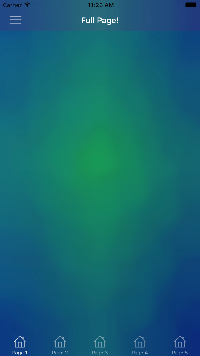
In a previous post, we talked about the iOS side of setting background images for both NavigationBars and TabBars. Beyond that, we looked at setting them so that we can simulate having transparent bars that show a background image behind the entire Page. That looked like this:

Simulator Screen Shot Apr 7, 2017, 11.23.33 AM

So now let’s do the same thing in Android!

Android

So Android handles images very differently compared to iOS, and also gives us a few easy ways to do what we want here. Rather than having to create custom renderers, we need to create Drawables for our images, and apply them in our Android Layouts for our Toolbar and TabBar. This approach is going to be more similar to Morgan Skinner’s approach for iOS here: http://www.morganskinner.com/2015/01/xamarin-formsusing-background-images-on.html

So we will need to crop our image where our Toolbar and Tabbar will be. If you are planning to also support landscape views, be sure to also crop the image separately for landscape and include those images in your appropriate drawables folders such as drawables-land-hdpi.

Another thing to consider is that, unlike in iOS, Android tabs are placed below the toolbar rather than at the bottom of the entire view. Because of this, you made need to use a different background for your pages that have a TabBar versus the pages that don’t. Here are some examples of how you might need to crop your images:

Portrait with no tabs

crop_portrait

Portrait with tabs

crop_portrait_tabs

Landscape with no tabs

crop_landscape

Landscape with tabs

crop_landscape_tabs

Be sure that you name the individual images the same, but place them in the appropriate resource folder as explained before. In this example we will call them:

  • toolbar_background.png
  • tabbar_background.png
  • page_background.png
  • tab_page_background.png

Unlike our iOS implementation, we do NOT need any custom renderers. Instead, we will set the background drawable of our layout files for our bars, and then in our xaml page, add an image to be the background.

Toolbar.axml

<?xml version="1.0" encoding="utf-8"?>
<android.support.v7.widget.Toolbar 
    xmlns:android="http://schemas.android.com/apk/res/android"
    xmlns:app="http://schemas.android.com/apk/res-auto"
    android:id="@+id/toolbar"
    android:layout_width="match_parent"
    android:layout_height="?attr/actionBarSize"
    android:minHeight="?attr/actionBarSize"
    android:background="@drawable/toolbar_background"
    android:theme="@style/ThemeOverlay.AppCompat.Dark.ActionBar"
    app:popupTheme="@style/ThemeOverlay.AppCompat.Light"
    app:layout_scrollFlags="scroll|enterAlways" /> 

Tabbar.axml

<?xml version="1.0" encoding="utf-8"?>
<android.support.design.widget.TabLayout         
    xmlns:android="http://schemas.android.com/apk/res/android"              
    xmlns:app="http://schemas.android.com/apk/res-auto"              
    android:id="@+id/sliding_tabs"     
    android:layout_width="match_parent"        
    android:layout_height="wrap_content"          
    android:background="@drawable/tabbar_background"          
    android:theme="@style/ThemeOverlay.AppCompat.Dark.ActionBar"          
    app:tabIndicatorColor="@android:color/white"
    app:tabGravity="fill"      
    app:tabMode="fixed" />

Then be sure to set the resources before starting Xamarin.Forms in your MainActivity:

MainActivity.cs

    public class MainActivity : global::Xamarin.Forms.Platform.Android.FormsAppCompatActivity
    {
        protected override void OnCreate(Bundle bundle)
        {
            TabLayoutResource = Resource.Layout.Tabbar;
            ToolbarResource = Resource.Layout.Toolbar;

            base.OnCreate(bundle);

            global::Xamarin.Forms.Forms.Init(this, bundle);
            LoadApplication(new App());

        }
    }

With all those things set, you can now use your background images on pages with or without tabs:

ContentPageWithTabs.xaml

<ContentPage ...>
    <Grid ...>
        <Image Source="tab_page_background.png" .../>
        <!-- The rest of your content on top of the image -->
    </Grid>
</ContentPage>

ContentPageWithNoTabs.xaml

<ContentPage ...>
    <Grid ...>
        <Image Source="page_background.png" .../>
        <!-- The rest of your content on top of the image -->
    </Grid>
</ContentPage>


You can see an example result here (with a rushed crop job):

Screenshot_2017-04-18-14-20-08


If you like what you see, don’t forget to follow me on twitter @Suave_Pirate, check out my GitHub, and subscribe to my blog to learn more mobile developer tips and tricks!

Interested in sponsoring developer content? Message @Suave_Pirate on twitter for details.

Xamarin.Tips – Removing the Bottom Border of Your iOS Navigation Bars

iOS UINavigationBars by default ship with a bottom border. If you want to remove it, all you need to do is update the ShadowImage of your UINavigationBar. Setting it to new UIImage() will do the trick. This might not be a universal solution. If you are doing more custom work or for certain layouts, you might need to take some additional steps including setting ClipsToBounds to true and setting the BackgroundImage of the UINavigationBar to a new UIImage() as well.

Here’s all of that together:

...
NavigationBar.ShadowImage = new UIImage();
NavigationBar.ClipsToBounds = true(); // optional
NavigationBar.BackgroundImage = new UIImage(); // optional
...

Of course, we are also going to talk about applying this in Xamarin.Forms!

If you want to apply this globally, you can create a custom renderer for NavigationPage. If you only want it in some situations, then you will need to create a new subclass of ContentPage and create a custom renderer for that page that will apply the same changes as below for our universal solution:

CustomNavigationRenderer.cs

[assembly: ExportRenderer(typeof(NavigationPage), typeof(CustomNavigationRenderer))]
namespace YOUR_IOS_NAMESPACE
{
    public class CustomNavigationRenderer : NavigationRenderer
    {
        public override void ViewDidLoad()
        {
            base.ViewDidLoad();

            NavigationBar.ShadowImage = new UIImage();
            NavigationBar.ClipsToBounds = true(); // optional
            NavigationBar.BackgroundImage = new UIImage(); // optional
        }

    }
}

One other way to do this is by using the Appearance API and apply it universally!

...
UINavigationBar.Appearance.ShadowImage = new UIImage();
...

Lastly, here’s is how this would look in Swift if you’ve landed here but aren’t using Xamarin and C#:

UINavigationBar.appearance().setBackgroundImage(
    UIImage(),
    forBarPosition: .Any,
    barMetrics: .Default)

UINavigationBar.appearance().shadowImage = UIImage()

or if you are for some reason in love with Obj-C:

[[UINavigationBar appearance] setBackgroundImage:[[UIImage alloc] init]
                                  forBarPosition:UIBarPositionAny
                                      barMetrics:UIBarMetricsDefault];

[[UINavigationBar appearance] setShadowImage:[[UIImage alloc] init]];


transnavbar


If you like what you see, don’t forget to follow me on twitter @Suave_Pirate, check out my GitHub, and subscribe to my blog to learn more mobile developer tips and tricks!

Xamarin.Tips – iOS Bar Background Images in Xamarin.Forms

Xamarin.Forms doesn’t ship with any way to provide images as your background of either NavigationBars or TabBars. So in order to do this, we will have to build some custom renderers.

iOS

Morgan skinner has a great post here about an approach that he took to apply background images to his NavigationBars: http://www.morganskinner.com/2015/01/xamarin-formsusing-background-images-on.html

The give you the synopsis, you take your entire background image, crop it, and apply the cropped piece as the background of the bar in your renderer.

Here’s a look at how he cropped his image:
Original Marked Up_thumb[5]

I want to take a different approach here and do this programmatically so that you can be EXACT in the background of the bar so that it can match the background of your image.

Although we are approaching this as if you are applying the background image to be the same as your page background image, the same principle applies if you just want to set any image.

Here’s a renderer to use for a NavigationBar:

BackgroundImageNavigationRenderer.cs

[assembly: ExportRenderer(typeof(NavigationPage), typeof(BackgroundImageNavigationRenderer))]
namespace YOUR_IOS_NAMESPACE
{
    public class BackgroundImageNavigationRenderer : NavigationRenderer
    {
        public override void ViewDidLoad()
        {
            base.ViewDidLoad();

            View.BackgroundColor = UIColor.Clear;
            NavigationBar.BackgroundColor = UIColor.Clear;
            var image = UIImage.FromBundle("YOUR_PAGE_BACKGROUND_IMAGE.png");
            image = image.Crop(0,
                (int)(image.CGImage.Height - NavigationBar.Frame.Height),
                (int)image.CGImage.Width,
                (int)NavigationBar.Frame.Height);
            image = image.Scale(new CGSize(NavigationBar.Frame.Width, NavigationBar.Frame.Height));
            NavigationBar.BarTintColor = UIColor.FromPatternImage(image);
            NavigationBar.ShadowImage = new UIImage();
        }

    }
}

Breaking it down, we are taking the image that we use as the background for our entire page, then opening cropping it to the size of the NavigationBar itself.

I’ve also created an extension method called Crop so that we can reuse it here and for our UITabBar:

ImageExtensions.cs

    public static class ImageExtensions
    {
        public static UIImage Crop(this UIImage image, int x, int y, int width, int height)
        {
            var imgSize = image.Size;

            UIGraphics.BeginImageContext(new SizeF(width, height));
            var imgToCrop = UIGraphics.GetCurrentContext();

            var croppingRectangle = new CGRect(0, 0, width, height);
            imgToCrop.ClipToRect(croppingRectangle);

            var drawRectangle = new CGRect(-x, -y, imgSize.Width, imgSize.Height);

            image.Draw(drawRectangle);
            var croppedImg = UIGraphics.GetImageFromCurrentImageContext();

            UIGraphics.EndImageContext();
            return croppedImg;
        }

    }

Now, if you are not doing this to have a full background image, and just want some image for your UINavigationBar only, you can do so like this:

BackgroundImageNavigationRenderer.cs

[assembly: ExportRenderer(typeof(NavigationPage), typeof(BackgroundImageNavigationRenderer))]
namespace YOUR_IOS_NAMESPACE
{
    public class BackgroundImageNavigationRenderer : NavigationRenderer
    {
        public override void ViewDidLoad()
        {
            base.ViewDidLoad();

            View.BackgroundColor = UIColor.Clear;
            NavigationBar.BackgroundColor = UIColor.Clear;
            var image = UIImage.FromBundle("YOUR_BAR_BACKGROUND_IMAGE.png");

            image = image.Scale(new CGSize(NavigationBar.Frame.Width, NavigationBar.Frame.Height));
            NavigationBar.BarTintColor = UIColor.FromPatternImage(image);
            NavigationBar.ShadowImage = new UIImage();
        }

    }
}

Essentially just cutting out the cropping process.

Also note that I set the NavigationBar.ShadowImage to a new UIImage();. Doing this gets rid of the line below your UINavigationBar. If you don’t want to remove the line, just don’t set the ShadowImage.

Now that we’ve done this for our UINavigationBar, we can apply the same thing to our UITabBars. So let’s create another custom renderer for that!

BackgroundImageTabbedPageRenderer.cs


[assembly: ExportRenderer(typeof(TabbedPage), typeof(BackgroundImageTabbedPageRenderer))]
namespace YOUR_IOS_NAMESPACE
{
    public class BackgroundImageTabbedPageRenderer : TabbedRenderer
    {
        public override void ViewWillLayoutSubviews()
        {
            base.ViewWillLayoutSubviews();

            var image = UIImage.FromBundle("YOUR_PAGE_BACKGROUND_IMAGE.jpg");
            image =image.Crop(0,
                (int)(image.CGImage.Height - TabBar.Frame.Height),
                (int)image.CGImage.Width,
                (int)TabBar.Frame.Height);
            image = image.Scale(new CGSize(TabBar.Frame.Width, TabBar.Frame.Height));
            TabBar.BackgroundImage = image;
            TabBar.UnselectedItemTintColor = UIColor.FromRGBA(255, 255, 255, 150);
            TabBar.ShadowImage = new UIImage();
        }

    }
}

just as we did with our UINavigationBar, we crop the page background image to the location and dimensions of our UITabBar, and set the background image there. The same thing also applies with removing the ShadowImage.

And if you are not using a full background image, and just want an image for your bar, take this:

BackgroundImageTabbedPageRenderer.cs


[assembly: ExportRenderer(typeof(TabbedPage), typeof(BackgroundImageTabbedPageRenderer))]
namespace YOUR_IOS_NAMESPACE
{
    public class BackgroundImageTabbedPageRenderer : TabbedRenderer
    {
        public override void ViewWillLayoutSubviews()
        {
            base.ViewWillLayoutSubviews();

            var image = UIImage.FromBundle("YOUR_PAGE_BACKGROUND_IMAGE.jpg");

            image = image.Scale(new CGSize(TabBar.Frame.Width, TabBar.Frame.Height));
            TabBar.BackgroundImage = image;
            TabBar.UnselectedItemTintColor = UIColor.FromRGBA(255, 255, 255, 150);
            TabBar.ShadowImage = new UIImage();
        }

    }
}

And now you can use full page images over your NavigationBars and TabBars, or just set an image as the background for your bars!


Simulator Screen Shot Apr 7, 2017, 11.23.33 AM

If you like what you see, don’t forget to follow me on twitter @Suave_Pirate, check out my GitHub, and subscribe to my blog to learn more mobile developer tips and tricks!

Xamarin.Tips – Restrict the Length of Your Entry Text

Here’s a quick one on how to restrict the number of characters a user can enter in an Entry. Basically, we are going to create a custom Behavior and then apply it to our Entry.

EntryLengthValidatorBehavior.cs

 /// <summary>
    /// Behavior that restricts the length of an entry
    /// </summary>
    public class EntryLengthValidatorBehavior : Behavior<Entry>
    {
        public int MaxLength { get; set; }

        protected override void OnAttachedTo(Entry bindable)
        {
            base.OnAttachedTo(bindable);
            bindable.TextChanged += OnEntryTextChanged;
        }

        protected override void OnDetachingFrom(Entry bindable)
        {
            base.OnDetachingFrom(bindable);
            bindable.TextChanged -= OnEntryTextChanged;
        }

        void OnEntryTextChanged(object sender, TextChangedEventArgs e)
        {
            var entry = (Entry)sender;

            if (entry.Text.Length > this.MaxLength)
            {
                string entryText = entry.Text;
                entry.TextChanged -= OnEntryTextChanged;
                entry.Text = e.OldTextValue;
                entry.TextChanged += OnEntryTextChanged;
            }
        }
    }

Now we can apply it in our Xaml:

<Entry x:Name="Pin1" TextColor="White">
    <Entry.Behaviors>
        <behaviors:EntryLengthValidatorBehavior MaxLength="4"/>
    </Entry.Behaviors>
</Entry>

If you like what you see, don’t forget to follow me on twitter @Suave_Pirate, check out my GitHub, and subscribe to my blog to learn more mobile developer tips and tricks!

Xamarin.Tips – Create Your Own Star Wars Intro Text!

Here’s a fun one – let’s make a Xamarin.Forms page that looks like the Star Wars intro scrolling text! I also put the source up here: https://github.com/SuavePirate/StarWarsPage

Here’s the XAML for the page:

StarWarsPage.xaml

<?xml version="1.0" encoding="utf-8" ?>
<ContentPage xmlns="http://xamarin.com/schemas/2014/forms"              xmlns:x="http://schemas.microsoft.com/winfx/2009/xaml"              xmlns:local="clr-namespace:StarWarsPage"              x:Class="StarWarsPage.MainPage">
    <Grid>
        <Image Source="starwarsintrobg.jpg" Aspect="AspectFill" HorizontalOptions="Fill" VerticalOptions="Fill"/>
        <ScrollView x:Name="TextScrollView" Orientation="Vertical" RotationX="24" Padding="16,800">
            <Label x:Name="Text" Text="{StaticResource StarWarsText}" TextColor="Yellow" FontAttributes="Bold" FontSize="30" HorizontalOptions="Fill"/>
        </ScrollView>
    </Grid>
    <ContentPage.Resources>
        <ResourceDictionary>
            <x:String x:Key="StarWarsText">
                It is a period of civil war.
Rebel spaceships, striking
from a hidden base, have won
their first victory against
the evil Galactic Empire.

During the battle, Rebel
spies managed to steal secret
plans to the Empire's
ultimate weapon, the DEATH
STAR, an armored space
station with enough power
to destroy an entire planet.

Pursued by the Empire's
sinister agents, Princess
Leia races home aboard her
starship, custodian of the
stolen plans that can save her
people and restore
freedom to the galaxy....

            </x:String>
        </ResourceDictionary>
    </ContentPage.Resources>
</ContentPage>

The important part here is the RotationX value on the ScrollView. This is going to set the backwards tilt of the scroll. To break down the other parts that make this up – We have a static String resource to use as the text for the intro. In this case I’m using the crawl text from A New Hope. We also wrap the whole thing in a Grid so that we can set up the background Image element.

Now we get a cool view that the user can scroll through at their own reading pace!

StarWars

If you like what you see, don’t forget to follow me on twitter @Suave_Pirate, check out my GitHub, and subscribe to my blog to learn more mobile developer tips and tricks!