Xamarin.Tip – Updating a Xamarin.Forms Button Style When Disabled

Ever wanted to change the way the Xamarin.Forms disabled button looks? For example, changing the background color and text color, or the shape?

Here’s a quick tip with no custom renderers to build a Xamarin.Forms Button that can have its style updated when the IsEnabled is set to false. The concept is basically to create a class that inherits from Button, and keep track of the original Style property, then add a BindableProperty for the style to apply when disabled, and flip between the two when IsEnabled changes.

Here is what that class looks like:

DisablingButton.cs

/// <summary>
/// Xamarin.Forms Button that allows for applying a different style when enabled.
/// </summary>
public class DisablingButton : Button
{
    private Style _normalStyle;

    public static readonly BindableProperty DisabledStyleProperty =
        BindableProperty.Create(nameof(DisabledStyle), typeof(Style), typeof(DisablingButton), null, BindingMode.TwoWay, null, (obj, oldValue, newValue) => { });

    public Style DisabledStyle
    {
        get { return (Style)GetValue(DisabledStyleProperty); }
        set { SetValue(DisabledStyleProperty, value); }
    }

    public DisablingButton()
    {
        _normalStyle = Style;

        PropertyChanged += ExtendedButton_PropertyChanged;

    }

    private void ExtendedButton_PropertyChanged(object sender, System.ComponentModel.PropertyChangedEventArgs e)
    {
        if (e.PropertyName == nameof(IsEnabled) && DisabledStyle != null)
        {
            if (IsEnabled)
                Style = _normalStyle;
            else
                Style = DisabledStyle;
        }
    }
}

So now we can use this with two different styles, and bind it all in our XAML. For example –

Styles.xaml

...
<Style x:Key="StickyBlueButton" TargetType="Button">
    <Setter Property="HeightRequest" Value="50"/>
    <Setter Property="BackgroundColor" Value="{DynamicResource BlueAccentColor}"/>
    <Setter Property="TextColor" Value="White"/>
    <Setter Property="BorderRadius" Value="0"/>
    <Setter Property="FontSize" Value="16"/>
    <Setter Property="FontAttributes" Value="Bold"/>
    <Setter Property="Margin" Value="0"/>
    <Setter Property="HorizontalOptions" Value="FillAndExpand"/>
    <Setter Property="FontFamily" Value="{StaticResource ProximaNovaBold}"/>
    <Setter Property="VerticalOptions" Value="End"/>
</Style>
<Style x:Key="StickyBlueButtonDisabled" TargetType="Button">
    <Setter Property="HeightRequest" Value="50"/>
    <Setter Property="BackgroundColor" Value="{DynamicResource LightGray}"/>
    <Setter Property="TextColor" Value="White"/>
    <Setter Property="BorderRadius" Value="0"/>
    <Setter Property="FontSize" Value="16"/>
    <Setter Property="FontAttributes" Value="Bold"/>
    <Setter Property="Margin" Value="0"/>
    <Setter Property="HorizontalOptions" Value="FillAndExpand"/>
    <Setter Property="FontFamily" Value="{StaticResource ProximaNovaBold}"/>
    <Setter Property="VerticalOptions" Value="End"/>
</Style>
...

and then use them in the page…

MainPage.xaml

...
<components:DisablingButton 
    IsEnabled="{Binding IsEnabled}"
    Command="{Binding CreateNewItemCommand}" 
    Style="{DynamicResource StickyBlueButton}" 
    DisabledStyle="{DynamicResource StickyBlueButtonDisabled}" 
    Text="Add item" />
...

And here’s what it looks like!

IsEnabled = true
Screen Shot 2018-04-02 at 4.38.07 PM

IsEnabled = false
Screen Shot 2018-04-02 at 4.41.59 PM


If you like what you see, don’t forget to follow me on twitter @Suave_Pirate, check out my GitHub, and subscribe to my blog to learn more mobile developer tips and tricks!

Interested in sponsoring developer content? Message @Suave_Pirate on twitter for details.

Advertisement

Xamarin.Tip – Build Your Own AccordionView in Xamarin.Forms

If you’re like me, you probably tried to find some decent “Accordion” style view for your Xamarin.Forms app. You probably found some on NuGet that aren’t supported anymore or some old GitHub repositories. Here’s my advice – give up the search and just give in and build your own. But you don’t have to do it alone! Here is a guide to build a simple but flexible and reusable AccordionView. If enough people like it, maybe we’ll put it up on NuGet for consumption.

Here’s the approach we are taking – We need a list of “sections”. Each Section has a header and the body content. For the sake of the simple example, we’ll do it with just a label body, but this could easily be done with a DataTemplate or more complicated view (I use the HtmlLabel for this irl https://github.com/matteobortolazzo/HtmlLabelPlugin).

Let’s create a view called AccordionSectionView:

AccordionSectionView.xaml

<?xml version="1.0" encoding="UTF-8"?>
<ContentView xmlns="http://xamarin.com/schemas/2014/forms" xmlns:x="http://schemas.microsoft.com/winfx/2009/xaml" x:Class="YourNamespace.AccordionSectionView">
    <ContentView.Content>
        <StackLayout Orientation="Vertical" Spacing="0">
            <Grid x:Name="HeaderView">
                <Grid.ColumnDefinitions>
                    <ColumnDefinition Width="*"/>
                    <ColumnDefinition Width="48"/>
                </Grid.ColumnDefinitions>
                <Label x:Name="HeaderLabel"  VerticalOptions="Center" Margin="16" LineBreakMode="WordWrap" />
                <Label x:Name="IndicatorLabel" Style="{DynamicResource BodySecondaryBold}"  FontSize="32" VerticalOptions="Center" HorizontalOptions="Center" HorizontalTextAlignment="Center" VerticalTextAlignment="Center" Margin="0,16,16,16" Grid.Column="1"/>
                <Grid.GestureRecognizers>
                    <TapGestureRecognizer Tapped="Handle_Tapped"/>
                </Grid.GestureRecognizers>
            </Grid>
            <Grid x:Name="BodyView">
                <Label x:Name="BodyLabel" Style="{DynamicResource Body}" FontSize="16" Margin="16"/>
            </Grid>
        </StackLayout>
    </ContentView.Content>
</ContentView>

So we have a StackLayout with a container Grid for the header and our header has a TapGestureRecognizer.

Now let’s look at how the code behind wires it all up.

AccordionSectionView.xaml.cs

/// <summary>
/// Accordion section view.
/// </summary>
public partial class AccordionSectionView : ContentView
{
    #region Bindable Properties
    public static BindableProperty HeaderBackgroundColorProperty = 
        BindableProperty.Create(nameof(HeaderBackgroundColor),                                                                                                      
            typeof(Color),                                                                                                  
            typeof(AccordionSectionView),                                                                                              
            defaultValue: Color.Transparent,                                                                                               
            propertyChanged: (bindable, oldVal, newVal) =>                                                                                                       
            {                                                                                                    
                ((AccordionSectionView)bindable).UpdateHeaderBackgroundColor();                                                                                                
            });

        public static BindableProperty HeaderOpenedBackgroundColorProperty = 
            BindableProperty.Create(nameof(HeaderOpenedBackgroundColor),                                                                                                  
                typeof(Color),                                                                                                       
                typeof(AccordionSectionView),
                defaultValue: Color.Transparent,                                                                                                   
                propertyChanged: (bindable, oldVal, newVal) =>                                                                                               
                {                                                                                                  
                    ((AccordionSectionView)bindable).UpdateHeaderBackgroundColor();                                                                                              
                });

        public static BindableProperty HeaderTextColorProperty =
            BindableProperty.Create(nameof(HeaderTextColor),                                                                                        
                typeof(Color),                                                                                                 
                typeof(AccordionSectionView),                                                                                        
                defaultValue: Color.Black,                                                                                          
                propertyChanged: (bindable, oldVal, newVal) =>                                                                                         
                {                                                                                             
                    ((AccordionSectionView)bindable).UpdateHeaderTextColor((Color)newVal);                                                                                         
                });

        public static BindableProperty HeaderTextProperty =
            BindableProperty.Create(nameof(HeaderTextProperty),                                                                                    
                typeof(string),                                                                                    
                typeof(AccordionSectionView),                                                                                   
                propertyChanged: (bindable, oldVal, newVal) =>                                                                                   
                {                                                                                      
                    ((AccordionSectionView)bindable).UpdateHeaderText((string)newVal);                                                                                   
                });

        public static BindableProperty BodyTextColorProperty =
            BindableProperty.Create(nameof(BodyTextColor),                                                                                      
                typeof(Color),                                                                                      
                typeof(AccordionSectionView),                                                                                       
                defaultValue: Color.Black,                                                                                       
                propertyChanged: (bindable, oldVal, newVal) =>                                                                                       
                {                                                                                         
                    ((AccordionSectionView)bindable).UpdateBodyTextColor((Color)newVal)                                                                                     
                });

        public static BindableProperty BodyTextProperty = 
            BindableProperty.Create(nameof(BodyText),                                                                                 
                typeof(string),                                                                                  
                typeof(AccordionSectionView),                                                                                  
                propertyChanged: (bindable, oldVal, newVal) =>                                                                                  
                {                                                                                      
                    ((AccordionSectionView)bindable).UpdateBodyText((string)newVal);                                                                                 
                });


        public static BindableProperty IsBodyVisibleProperty = 
            BindableProperty.Create(nameof(IsBodyVisible),                                                                                             
                typeof(bool),                                                                                       
                typeof(AccordionSectionView),                                                                                      
                defaultValue: true,
                propertyChanged: (bindable, oldVal, newVal) =>                                                                                       
                {                                                                                           
                    ((AccordionSectionView)bindable).UpdateBodyVisibility((bool)newVal);                                                                                          
                });
    #endregion

    #region Public Properties
    public Color HeaderBackgroundColor
    {
        get
        {
            return (Color)GetValue(HeaderBackgroundColorProperty);
        }
        set
        {
            SetValue(HeaderBackgroundColorProperty, value);
        }
    }
    public Color HeaderOpenedBackgroundColor
    {
        get
        {
            return (Color)GetValue(HeaderOpenedBackgroundColorProperty);
        }
        set
        {
                SetValue(HeaderOpenedBackgroundColorProperty, value);
        }
    }
    public Color HeaderTextColor
    {
        get
        {
            return (Color)GetValue(HeaderTextColorProperty);
        }
        set
        {
            SetValue(HeaderTextColorProperty, value);
        }
    }
    public string HeaderText
    {
        get
        {
            return (string)GetValue(HeaderTextProperty);
        }
        set
        {
            SetValue(HeaderTextProperty, value);
        }
    }
    public Color BodyTextColor
    {
        get
        {
            return (Color)GetValue(BodyTextColorProperty);
        }
        set
        {
            SetValue(BodyTextColorProperty, value);
        }
    }
    public string BodyText
    {
        get
        {
            return (string)GetValue(BodyTextProperty);
        }
        set
        {
            SetValue(BodyTextProperty, value);
        }
    }

    public bool IsBodyVisible
    {
        get
        {
            return (bool)GetValue(IsBodyVisibleProperty);
        }
        set
        {
            SetValue(IsBodyVisibleProperty, value);
        }
    }

    #endregion


    public AccordionSectionView()
    {
        InitializeComponent();
        IsBodyVisible = false; 
        if (Resources != null)
        {
            Resources.MergedWith = typeof(PrimaryTheme);
        }
        else
        {
            Resources = new ResourceDictionary
            {
                MergedWith = typeof(PrimaryTheme)
            };
        }
    }

    /// <summary>
    /// Updates the color of the header background.
    /// </summary>
    /// <param name="color">Color.</param>
    public void UpdateHeaderBackgroundColor(Color color)
    {
        HeaderView.BackgroundColor = color;
    }

    /// <summary>
    /// Updates the color of the header background.
    /// </summary>
    public void UpdateHeaderBackgroundColor()
    {
        if (IsBodyVisible)
        {
            HeaderView.BackgroundColor = HeaderOpenedBackgroundColor;
            BodyView.BackgroundColor = HeaderOpenedBackgroundColor;
        }
        else
        {
            HeaderView.BackgroundColor = HeaderBackgroundColor;
        }
    }

    /// <summary>
    /// Updates the color of the header text.
    /// </summary>
    /// <param name="color">Color.</param>
    public void UpdateHeaderTextColor(Color color)
    {
        HeaderLabel.TextColor = color;
    }

    /// <summary>
    /// Updates the color of the body text.
    /// </summary>
    /// <param name="color">Color.</param>
    public void UpdateBodyTextColor(Color color)
    {
        BodyLabel.TextColor = color;
    }

    /// <summary>
    /// Updates the header text.
    /// </summary>
    /// <param name="text">Text.</param>
    public void UpdateHeaderText(string text)
    {
        HeaderLabel.Text = text;
    }

    /// <summary>
    /// Updates the body text.
    /// </summary>
    /// <param name="text">Text.</param>
    public void UpdateBodyText(string text)
    {
        BodyLabel.Text = text;
    }

    public void UpdateBodyVisibility(bool isVisible)
    {
        BodyView.IsVisible = isVisible;
        IndicatorLabel.Text = "+";
        if(isVisible)
        {
            IndicatorLabel.RotateTo(45, 100);
        }
        else
        {
            IndicatorLabel.RotateTo(0, 100);
        }
    }

    private void Handle_Tapped(object sender, System.EventArgs e)
    {
        IsBodyVisible = !IsBodyVisible;
        UpdateHeaderBackgroundColor();
    }
}

We start by wiring up some bindable properties for the look and feel of the header and body sections, and then handle animations of the IndicatorLabel when the body is opened and closed. These even lets us update the content when the body is opened or closed.

Now we can use this in our pages. Bonus points when used with me DynamicStackLayout control to create dynamic bindable accordions!

MainPage.xaml

...
 <suave:DynamicStackLayout x:Name="Accordion" Orientation="Vertical" ItemsSource="{Binding Items}" Spacing="1" BackgroundColor="{DynamicResource AlternateBackground}">
    <suave:DynamicStackLayout.ItemTemplate>
        <DataTemplate>
                <components:AccordionSectionView HeaderText="{Binding Title}" IsBodyVisible="False" HeaderBackgroundColor="White" HeaderOpenedBackgroundColor="{DynamicResource AlternateBackground}" HeaderTextColor="Black" BodyTextColor="Black" BodyText="{Binding HtmlContent}" />
        </DataTemplate>
    </suave:DynamicStackLayout.ItemTemplate>
</suave:DynamicStackLayout>
...

Now all together we have something pretty cool!
Screen Shot 2018-03-26 at 4.40.34 PM


Screen Shot 2018-03-26 at 4.40.48 PM

And that’s it! Let me know what you’ve done to build your own Accordions and collapsible views!


If you like what you see, don’t forget to follow me on twitter @Suave_Pirate, check out my GitHub, and subscribe to my blog to learn more mobile developer tips and tricks!

Interested in sponsoring developer content? Message @Suave_Pirate on twitter for details.

Android Kotlin Basics – Passing Data Between Activities

About This Series

This “Android Kotlin Basics” blog series is all about fundamentals. We’ll take a look at the basics of building Android apps with Kotlin from the SUPER basics, to the standard basics, to the not-so-basics. We’ll also be drawing comparisons to how things are done in Kotlin vs. Java and some other programming languages to build Android apps (like C# and Xamarin or JavaScript/TypeScript for Hybrid implementations).

Check Out the Pluralsight Course!

If you like this series, be sure to check out my course on Pluralsight – Building Android Apps with Kotlin: Getting Started where you can learn more while building your own real-world application in Kotlin along the way. You can also join the conversation and test your knowledge throughout the course with learning checks through each module!

Watch it here: https://app.pluralsight.com/library/courses/building-android-apps-kotlin-getting-started/table-of-contents

Passing Data Between Activities

This topic is covered in depth in the course above, but in this post, we’ll quickly go over this basic, but very important concept when developing your Android mobile apps.

Let’s break it down first –

I Have No Idea What an “Activity” Is

Not to worry! Here’s the basic idea – it’s a construct (and a class in your code) that represents an entry point for your app and can be called into by your other Activities. You can think of an Activity as a contextual “page”, and thus your app will likely have multiple Activities.

Activities can do a lot, but for simplicity sake, we’ll only talk about the most common implementation which is this idea of a drawing a window of your application.

Starting an Activity

When you create your application, you’ll have to register your Activities to your Android manifest. Doing this tells the operating system which Activities you have in your app, where to find them, what they can do, and some other information we won’t get into in this topic.

That looks something like this:

AndroidManifest.xml

<manifest xmlns:android="http://schemas.android.com/apk/res/android"
    package="org.alexdunn.wikipedia">
    <uses-permission android:name="android.permission.INTERNET"/>
    <application
        android:name=".WikiApplication"
        android:allowBackup="true"
        android:icon="@mipmap/ic_launcher"
        android:label="@string/app_name"
        android:roundIcon="@mipmap/ic_launcher_round"
        android:supportsRtl="true"
        android:theme="@style/AppTheme.NoActionBar">
        <activity
            android:name=".activities.MainActivity"
            android:label="@string/title_activity_main">
            <intent-filter>
                <action android:name="android.intent.action.MAIN" />

                <category android:name="android.intent.category.LAUNCHER" />
            </intent-filter>
        </activity>
        <activity android:name=".activities.ArticleDetailActivity"></activity>
        <activity android:name=".activities.SearchActivity"></activity>
    </application>

</manifest>

This is a manifest with 3 Activities, MainActivity, SearchActivity, and ArticleDetailActivity.

Once all Activities are registered in the Manifest, we can start any of them from any other.

Let’s look at a quick example where we are in the MainActivity and want to start the SearchActivity on a button click:

MainActivity.kt

class MainActivity : Activity() {
    override fun onCreate(savedInstanceState: Bundle?) {
        my_button.setOnClickListener {
            // create an "Intent"
            val searchIntent = Intent(this, SearchActivity::class.java)

            // start the activity with the intent
            startActivity(searchIntent)
        }
    }
}

So what’s this Intent object?

An Intent in Android is a construct to tell the operating system that your application is trying to execute something that needs to be communicated back to the application or a different application. This is used for many things outside just starting Activities – it can be used for executing Services, Activities, and BroadcastReceivers.

Here’s a quick diagram on how this works at a basic level:
Screen Shot 2018-03-23 at 11.02.59 AM.png

Adding Data to an Intent

So now we know we use Intents to start Activities (and do other things!), but how do we use them to actually send data to another Activity?

The Intent object has a the concept of a Extras . This means we can add different primitive datatypes to the Extras, or add Serializable data.

Here’s what that looks like in Kotlin!

// 1. create an intent from another activity
val intent = Intent(context, AnotherActivity::class.java)

// 2. put key/value data
intent.putExtra("message", "Hello From MainActivity")

// 3. start the activity with the intent
context.startActivity(intent)

The putExtra has many overloads, so play around with all the types of data you can add.

You can also add Bundles of data to group the data being sent up together:

// 1. create an intent from another activity
val intent = Intent(context, AnotherActivity::class.java)

// 2. put key/value data to bundle
val extras = Bundle()
extras.putString(“message”, “Hello from MainActivity”)
intent.putExtras(extras)

// 3. start the activity with the intent
context.startActivity(intent)

Reading Data From the Intent

Now when we use an intent to start an Activity, and add Extras, we need to be able to read those extras on the new Activity.

This works by using the intent property on the Activity. This intent property is set by the Operating System when starting the Activity, and sets it to the Intent that created it.

We usually use this data in the onCreate override, but you can use it wherever you want!

DetailActivity.kt

class DetailActivity : Activity() {
    override fun onCreate(savedInstanceState: Bundle?) {
        // In onCreate get the value from the auto-mapped “intent”
        val message = intent.getStringExtra(“message”)

        // Or get it from the bundle and auto-mapped “extras”
        val message = intent.extras.getString(“message”)

        // now do something with the message value
    }
}

Conclusion

There’s plenty more you can do with these data structures in Android such as sending over full datatypes and reference types, receiving data back from the detail Activity, and so much more. Be sure to check out my course: Building Android Apps with Kotlin: Getting Started to learn so much more!


Also, let me know what else you’d like to learn about with Android and Kotlin! Either drop a comment here or tweet at me @Suave_Pirate!

If you like what you see, don’t forget to follow me on twitter @Suave_Pirate, check out my GitHub, and subscribe to my blog to learn more mobile developer tips and tricks!

Interested in sponsoring developer content? Message @Suave_Pirate on twitter for details.

Android Kotlin Basics – Camel Case Or Underscore Notation

About This Series

This “Android Kotlin Basics” blog series is all about fundamentals. We’ll take a look at the basics of building Android apps with Kotlin from the SUPER basics, to the standard basics, to the not-so-basics. We’ll also be drawing comparisons to how things are done in Kotlin vs. Java and some other programming languages to build Android apps (like C# and Xamarin or JavaScript/TypeScript for Hybrid implementations).

Check Out the Pluralsight Course!

If you like this series, be sure to check out my course on Pluralsight – Building Android Apps with Kotlin: Getting Started where you can learn more while building your own real-world application in Kotlin along the way. You can also join the conversation and test your knowledge throughout the course with learning checks through each module!

Watch it here: https://app.pluralsight.com/library/courses/building-android-apps-kotlin-getting-started/table-of-contents

Camel Case Or Underscore Notation

I get this type of question quite often – “If the Kotlin Android extensions allow for creating Kotlin members in my Activities, should I be using underscore IDs or camel case”?

If this question doesn’t make sense, first take a look at one of my earlier posts in this series: Android Kotlin Basics – Auto-mapping Views. The short version is that Kotlin ships with Android extensions to create properties in your Activity (and more) for your Views within the layout resource applied in the setContentView call in the onCreate override function.

Here’s the predicament – traditional Android development has set a standard for using underscores for Ids and other properties within xml resources (such as the layouts we are talking about). So that looks like this:

res/layout/activity_main.xml

...

...

Doing this would create a usable EditText property in the associated MainActivity whose name is first_name:

MainActivity.kt

class MainActivity : Activity() {
    override fun onCreate(savedInstance: Bundle?) {
        super.onCreate(savedInstance)
        setContentView(R.layout.activity_main)

        first_name.text = "My First Name!"
    }
}

So the underscore seems to look a bit off in your Kotlin code since every other member and function within a class is typically came cased. So the other option is to start camel casing your xml property values:

res/layout/activity_main.xml

...

...

Doing this would create a usable EditText property in the associated MainActivity whose name is firstName:

MainActivity.kt

class MainActivity : Activity() {
    override fun onCreate(savedInstance: Bundle?) {
        super.onCreate(savedInstance)
        setContentView(R.layout.activity_main)

        firstName.text = "My First Name!"
    }
}

Of course these are just semantics, and I’ve seen projects go either way. I personally use the underscore for Android resources simply because it is still habit, but I may find myself moving more toward camel casing. The argument I hear against moving in that direction is also that the file names themselves use the underscore naming convention, and THAT convention stemmed from an actual restriction in Android development where resource files couldn’t have any uppercased letters. That is no longer really enforced, so it should be fine to name your resource files with a camel case convention as well.

My final suggestion is to simply pick one, but stick to it. Meaning, choose up front when you start your project and be consistent throughout – including your file names. If you want to camelCase, do it everywhere. If you want to underscore_case, do it everywhere. This will allow for onboarding developers easily regardless of which you pick. But who knows… maybe this will sprout another tabs vs spaces type of debate.

Let me know which one you personally prefer!


Also, let me know what else you’d like to learn about with Android and Kotlin! Either drop a comment here or tweet at me @Suave_Pirate!

If you like what you see, don’t forget to follow me on twitter @Suave_Pirate, check out my GitHub, and subscribe to my blog to learn more mobile developer tips and tricks!

Interested in sponsoring developer content? Message @Suave_Pirate on twitter for details.

Xamarin.Forms MarkdownTextView NuGet Announcement!

A while back I talked about building your own Markdown Label / TextView to your Xamarin applications including Xamarin Native and Xamarin Forms. I decided to put the control I’ve been working off of over on NuGet so anyone can use its basic form.

Note that this control isn’t final, I am working on some refactoring and enhancements, but if you want something that just works, then give it a shot, or contribute to the repository!

Previous Posts

Down below you can find the documentation as it’s found on the GitHub repo!

MarkdownTextView

alt tag

A Xamarin.Forms component to display markdown text in a TextView

Installation

Now on NuGet!

Install-Package MarkdownTextView.Forms

https://www.nuget.org/packages/MarkdownTextView.Forms

Usage

  • Call Init before calling Xamarin.Forms.Init()
  • iOS: SPControls.MarkdownTextView.iOS.MarkdownTextView.Init();
  • Android: SPControls.MarkdownTextView.Droid.MarkdownTextView.Init();
  • Use the control
  • In Xaml:
<ContentPage ...
             xmlns:spcontrols="clr-namespace:SPControls.Forms;assembly=SPControls.MarkdownTextView"
             ...>
  <spcontrols:MarkdownTextView Markdown="{Binding MarkdownString}" />
</ContentPage>
  • or in C#:
var mdTextView = new MarkdownTextView();
mdTextView.Markdown = "# this is my *header* tag";

TODO

  • Add other properties for updating markdown settings
  • Add text color settings
  • Add UWP Support

Android Kotlin Basics – RecyclerView and Adapters

About This Series

This “Android Kotlin Basics” blog series is all about fundamentals. We’ll take a look at the basics of building Android apps with Kotlin from the SUPER basics, to the standard basics, to the not-so-basics. We’ll also be drawing comparisons to how things are done in Kotlin vs. Java and some other programming languages to build Android apps (like C# and Xamarin or JavaScript/TypeScript for Hybrid implementations).

Check Out the Pluralsight Course!

If you like this series, be sure to check out my course on Pluralsight – Building Android Apps with Kotlin: Getting Started where you can learn more while building your own real-world application in Kotlin along the way. You can also join the conversation and test your knowledge throughout the course with learning checks through each module!

Watch it here: https://app.pluralsight.com/library/courses/building-android-apps-kotlin-getting-started/table-of-contents

RecyclerView and Adapters

RecyclerViews are the latest way to display a dynamic collection of data in Android and are what have begun to replace the ListView control. This is because of their built in pattern to “recycle” views… the name makes sense. It also allows for more flexibility in layout and display which we will also talk about here.

In order to use a RecyclerView, you need at least the 4 main parts
1. The RecyclerView itself
2. The Adapter to control what data is tied to what view in the recycler.
3. The ViewHolder to control what view is being used within the recycler
4. The LayoutManager to determine how to layout each view in the recycler.

Together, this relationship looks like this:
Screen Shot 2018-03-01 at 11.13.38 AM

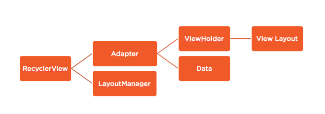
Meaning the RecyclerView needs it’s two root components set – the LayoutManager and Adapter. The adapter then uses the ViewHolder and appropriate data to manipulate the RecyclerView, and the ViewHolder uses an underlying Layout Resource to inflate the view.

In the end the process looks like this:
Screen Shot 2018-03-01 at 11.03.21 AM

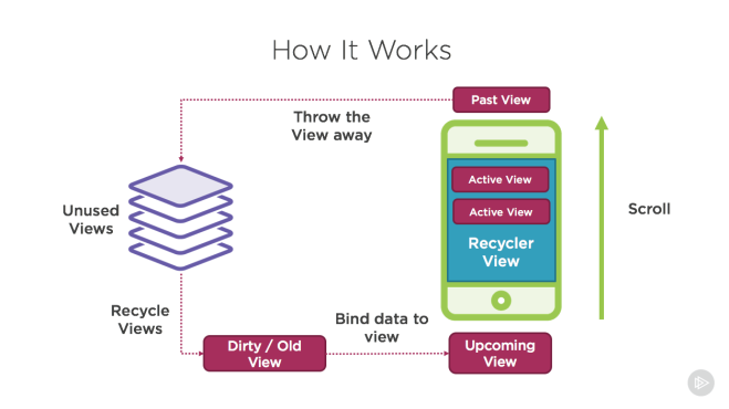
Where a user scrolls the list, and as items fall out the top or bottom, they are recycled, cleaned, then re-hydrated with new data from the adapter.

So let’s break down an example of building one of these in Kotlin!

Create a RecyclerView in Your Activity

Let’s first create a simple layout for our MainActivity:
res/layout/activity_main.xml

    <RelativeLayout
        android:layout_width="match_parent"
        android:layout_height="match_parent">
        <android.support.v7.widget.RecyclerView
            android:id="@+id/article_recycler_view"
            android:layout_width="match_parent"
            android:layout_height="match_parent"/>
    </RelativeLayout>

Then using the Kotlin Android Extensions talked about here: Android Kotlin Basics – Auto-mapping Views we can reference our RecyclerView by its id property.

MainActivity.kt

class MainActivity : Activity() {
     override fun onCreate(savedInstanceState: Bundle?) {
        super.onCreate(savedInstanceState)
        setContentView(R.layout.activity_main)

        article_recycler_view.adapter = ??? // we need to create an adapter!
        article_recycler_view.layoutManager = LinearLayoutManager(context)
        // note that in Java we would have to call .setLayoutManager, but Kotlin auto-maps this to a property
     }
}

We’ll come back to this MainActivity once we’ve created our Adapter. But for now we can use the pre-built LinearLayoutManager which will layout the subsequent recycled views Linearly (vertically by default, but it can be set to Horizontal as well).

Create a CardView and ViewHolder

Let’s create the layout resource for our actual article card items, and the ViewHolder to represent it.

res/layout/article_card_item.xml

<?xml version="1.0" encoding="utf-8"?>
<RelativeLayout xmlns:android="http://schemas.android.com/apk/res/android"
    android:layout_width="match_parent"
    android:layout_height="wrap_content"
    xmlns:app="http://schemas.android.com/apk/res-auto">

    <android.support.v7.widget.CardView
        android:layout_height="wrap_content"
        android:layout_width="match_parent"
        android:layout_margin="16dp"
        android:layout_alignParentTop="true"
        android:layout_centerInParent="true"
        android:background="@android:color/white"
        app:cardElevation="4dp">
        <LinearLayout
            android:orientation="vertical"
            android:layout_width="match_parent"
            android:layout_height="wrap_content"
            android:layout_margin="16dp">
            <ImageView
                android:id="@+id/article_image"
                android:layout_width="match_parent"
                android:layout_height="wrap_content"
                android:src="@drawable/ic_image_black_24dp"/>
            <TextView
                android:id="@+id/article_title"
                android:layout_width="match_parent"
                android:layout_height="wrap_content"
                android:layout_marginTop="8dp"
                android:gravity="center"
                android:textAlignment="center"
                android:text="Hello World!"/>
        </LinearLayout>
    </android.support.v7.widget.CardView>
</RelativeLayout>

This is a simple card with an image and title in it that looks something like this:
Screen Shot 2018-03-01 at 2.40.41 PM

And with our view, we will need to create a ViewHolder that our Adapter will use to stick data in it:

CardHolder.kt

class CardHolder(itemView: View) : RecyclerView.ViewHolder(itemView) {
    private val articleImageView: ImageView = itemView.findViewById<ImageView>(R.id.article_image)
    private val titleTextView: TextView = itemView.findViewById<TextView>(R.id.article_title)

    private var currentPage: WikiPage? = null

    fun updateWithPage(page: WikiPage){
        currentPage = page

        titleTextView.text = page.title

        // load image lazily with picasso
        if(page.thumbnail != null)
            Picasso.with(itemView.context).load(page.thumbnail!!.source).into(articleImageView)
    }
}

So here we create a ViewHolder subclass called CardHolder that references its ImageView and TextView that can be initialized right away by querying the passed in itemView property from the constructor. We also add a convenience function to update the ViewHolder and it’s included views with a given WikiPage model (this model is what represents an article from Wikipedia and looks something like this:

WikiPage.kt

class WikiPage {
    var pageid: Int? = null
    var title: String? = null
    var fullurl: String? = null
    var thumbnail: WikiThumbnail? = null
}

WikiThumbnail

class WikiThumbnail {
    val source: String? = null
}

This model is the datatype our Adapter will reference as well.

Lastly, I added a quick reference the the Picasso Library from Square in order to load an image from the thumbnail url into our ImageView.

Creating an Adapter

Now the last thing we need to do is connect our ViewHolder and Data to our RecyclerView by creating our Adapter. Here’s what that will look like:

ArticleCardRecyclerAdapter.kt

class ArticleCardRecyclerAdapter() : RecyclerView.Adapter<CardHolder>() {
    val currentResults: ArrayList<WikiPage> = ArrayList<WikiPage>()

    override fun getItemCount(): Int {
        return currentResults.size
    }

    override fun onBindViewHolder(holder: CardHolder?, position: Int) {
        var page = currentResults[position]
        holder?.updateWithPage(page)
    }

    override fun onCreateViewHolder(parent: ViewGroup?, viewType: Int): CardHolder {
        var cardItem = LayoutInflater.from(parent?.context).inflate(R.layout.article_card_item, parent, false)
        return CardHolder(cardItem)
    }
}

You can see our ArticleCardRecyclerAdapter inherits from the RecyclerView.Adapter and passes in our CardHolder view holder we just created as the type of ViewHolder. This allows for our required override functions to use that CardHolder as its type.

The adapter requires only 3 functions to be overridden, but there are also other functions available to override.
The three required are:
– getItemCount() to return the number of items the RecyclerView will have within it
– onBindViewHolder() to bind the data of a given position to the CardHolder. Here is where we call that updateWithPage function we created in our CardHolder class.
– onCreateViewHolder() to create the initial view holder by inflating a given layout file (which we use to inflate the article_card_item.xml file.

Now that we have our adapter, we can go and update our MainActivity:

MainActivity.kt

class MainActivity : Activity() {
     override fun onCreate(savedInstanceState: Bundle?) {
        super.onCreate(savedInstanceState)
        setContentView(R.layout.activity_main)
        val adapter = ArticleCardRecyclerAdapter()
        adapter.currentResults = ArrayList<WikiPage>()..... // you should load your cards here! 
        article_recycler_view.adapter = adapter
        article_recycler_view.layoutManager = LinearLayoutManager(context)
        // note that in Java we would have to call .setLayoutManager, but Kotlin auto-maps this to a property
     }
}

Now you should be able to run and see your list of cards if you’ve loaded a collection of WikiPage models into your currentResults property on the adapter.

Now we can also change the layoutManager property of our recycler to something that might fit our smaller cards a bit better such as the StaggeredGridLayoutManager.

article_recycler_view.layoutManager = StaggeredGridLayoutManager(2, StaggeredGridLayoutManager.VERTICAL)

This means we want 2 columns and we want to stack the cards vertically within those columns. If the direction is switched to HORIZONTAL then the number before it will represent the number of rows instead of columns.

Then with that we can have a view like this!

Screen Shot 2018-03-01 at 2.53.02 PM

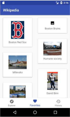
And that’s pretty cool!


Also, let me know what else you’d like to learn about with Android and Kotlin! Either drop a comment here or tweet at me @Suave_Pirate!

If you like what you see, don’t forget to follow me on twitter @Suave_Pirate, check out my GitHub, and subscribe to my blog to learn more mobile developer tips and tricks!

Interested in sponsoring developer content? Message @Suave_Pirate on twitter for details.

Xamarin.Controls – Material Form Control Updates

A while back I put together a GitHub repository for Material Design Controls for form elements (Entry, Picker, etc.) for Xamarin.Forms (iOS, Android, and UWP).
You can find some of the original posts about that here:

And you can find the GitHub repo and NuGet package here:

In this post, I wanted to focus on some of the newer features I’ve added to the latest 2018.1.28-pre1 release.

The gist is:

  • Invalid vs. Valid State
  • Font updates
  • Color flexibility

With these, you can now specify updated default colors, invalid state colors, and the original focused accent colors.
Here’s an example of a Style resource that uses these:

    <!-- Material Entry Styles -->
    <Style x:Key="PrimaryMaterialEntry" TargetType="material:MaterialEntry">
        <Setter Property="AccentColor" Value="{DynamicResource PrimaryColor}"/>
        <Setter Property="DefaultColor" Value="Gray"/>
        <Setter Property="InvalidColor" Value="Red"/>
    </Style>

What does validation state mean? You can attach behaviors to easily add validation to your material form controls. Here is an example behavior on the MaterialEntry that requires a length, and sets the state:

   /// <summary>
    /// Material entry length behavior. Allows for the limitation of the text with a min and max length
    /// </summary>
    public class MaterialEntryLengthValidationBehavior : Behavior<MaterialEntry>
    {
        public int MaxLength { get; set; }
        public int MinLength { get; set; } = 0;

        /// <summary>
        /// Attach events on attachment to view
        /// </summary>
        /// <param name="bindable">Bindable.</param>
        protected override void OnAttachedTo(MaterialEntry bindable)
        {
            base.OnAttachedTo(bindable);
            bindable.TextChanged += OnEntryTextChanged;
            bindable.EntryUnfocused += Bindable_EntryUnfocused;
        }

        /// <summary>
        /// Detach events on detaching from view
        /// </summary>
        /// <param name="bindable">Bindable.</param>
        protected override void OnDetachingFrom(MaterialEntry bindable)
        {
            base.OnDetachingFrom(bindable);
            bindable.TextChanged -= OnEntryTextChanged;
            bindable.EntryUnfocused -= Bindable_EntryUnfocused;
        }

        /// <summary>
        /// Stop text input once max is hit
        /// </summary>
        /// <param name="sender">Sender.</param>
        /// <param name="e">E.</param>
        void OnEntryTextChanged(object sender, TextChangedEventArgs e)
        {
            var entry = (Entry)sender;

            if (entry.Text == null)
                return;

            // if Entry text is longer than valid length
            if (entry.Text.Length > this.MaxLength)
            {
                string entryText = entry.Text;

                entryText = entryText.Remove(entryText.Length - 1); // remove last char

                entry.Text = entryText;
            }


        }

        /// <summary>
        /// Set invalid on unfocus if the min is not met
        /// </summary>
        /// <param name="sender">Sender.</param>
        /// <param name="e">E.</param>
        void Bindable_EntryUnfocused(object sender, FocusEventArgs e)
        {
            var entry = (MaterialEntry)sender;
            if (MinLength > 0)
            {
                if (entry.Text == null || entry.Text.Length < this.MinLength)
                {
                    entry.IsValid = false;
                }
                else
                {
                    entry.IsValid = true;
                }
            }
        }
    }

Then you can attach it to a MaterialEntry

<material:MaterialEntry Placeholder="CVV" Keyboard="Numeric" Text="{Binding CVV}" Style="{DynamicResource PrimaryMaterialEntry}">
    <material:MaterialEntry.Behaviors>
        <behaviors:MaterialEntryLengthValidationBehavior MaxLength="3" MinLength="3"/>
    </material:MaterialEntry.Behaviors>
</material:MaterialEntry>

And then you get:
Screen Shot 2018-02-22 at 4.19.52 PMScreen Shot 2018-02-22 at 4.19.57 PMScreen Shot 2018-02-22 at 4.20.03 PMScreen Shot 2018-02-22 at 4.20.11 PM

These validation states, and updated color properties are available on all the Material Forms controls, so install the preview nuget package and get started!

Install-Package MaterialFormControls -Version 2018.1.28-pre1

If you like what you see, don’t forget to follow me on twitter @Suave_Pirate, check out my GitHub, and subscribe to my blog to learn more mobile developer tips and tricks!

Interested in sponsoring developer content? Message @Suave_Pirate on twitter for details.

Android Kotlin Basics – Auto-mapping Views

About This Series

This “Android Kotlin Basics” blog series is all about fundamentals. We’ll take a look at the basics of building Android apps with Kotlin from the SUPER basics, to the standard basics, to the not-so-basics. We’ll also be drawing comparisons to how things are done in Kotlin vs. Java and some other programming languages to build Android apps (like C# and Xamarin or JavaScript/TypeScript for Hybrid implementations).

Check Out the Pluralsight Course!

If you like this series, be sure to check out my course on Pluralsight – Building Android Apps with Kotlin: Getting Started where you can learn more while building your own real-world application in Kotlin along the way. You can also join the conversation and test your knowledge throughout the course with learning checks through each module!

Watch it here: https://app.pluralsight.com/library/courses/building-android-apps-kotlin-getting-started/table-of-contents

Auto-mapping Views

We’ve talked in previous posts about how awesome Kotlin is and showed off some of the great features of the language on its own, but did you know Kotlin gets even better when building Android apps?

The Problem

Let’s talk about the obnoxious pattern in Android of having to find a view from the associated layout before using it. I’m talking about this:

// java
Button myButton = (Button)findViewById(R.id.myButton);

If you’re totally new to Android development as a whole, this is what you do in your Activities, Fragments, ViewHolders, etc. to get a reference to a control on your page that was created by a layout resource. This means that if you have a page with many controls and views, you will need to execute the above style code for every single one.

What does this mean?

Your code looks gross. You have massive blocks of properties in your class and an equally massive block of findViewById in your onCreate or other lifecycle method. It also means that you query your View Object far more than you should need to. Other platforms like iOS and UWP (or any other windows app) create outlets or partial properties that hide the creation of the view in your code, but allow you to use it, which means your code stays super clean.

Because of this awful practice in Android, people have come out with some seriously helpful projects (I’m looking at you Butterknife!) and libraries that will automatically handle mapping them to properties in your Activity and Fragment classes like this:

// Java with Butterknife
class ExampleActivity extends Activity {
  @BindView(R.id.title) TextView title;
  @BindView(R.id.subtitle) TextView subtitle;
  @BindView(R.id.footer) TextView footer;

  @Override public void onCreate(Bundle savedInstanceState) {
    super.onCreate(savedInstanceState);
    setContentView(R.layout.simple_activity);
    ButterKnife.bind(this);
    // TODO Use fields...
  }
}

That’s a little better, but still a lot of wire up before you can even use the controls in your code.

Kotlin to the Rescue

Kotlin, I cannot thank you enough for doing this…

Kotlin created an Android extension that allows for your Activities to auto-map their layout views by their id in to useable controls!

Here’s how it works: Let’s say you have a layout resource that looks like this:

activity_example.xml


In your Activity, you simply need to import the extension, and your Activity will automatically have a property it can use that will be pulled from the layout file:

import kotlinx.android.synthetic.main.activity_example.*

class ExampleActivity: Activity() {
    override fun onCreate(savedInstance: Bundle?) {
        setContentView(R.layout.activity_example)
        detailTextView.text = "my new text that was set when auto-mapping"
    }
}

Beyond making the code so much cleaner, this Kotlin Android Plugin also uses built in caching of the views it finds in order to avoid re-querying the View Object since it can be cumbersome and slow.

For more details on how to customize this behavior, and use the extension more in depth, check out Kotlin’s documentation on it here: https://kotlinlang.org/docs/tutorials/android-plugin.html

Also, let me know what else you’d like to learn about with Android and Kotlin! Either drop a comment here or tweet at me @Suave_Pirate!

If you like what you see, don’t forget to follow me on twitter @Suave_Pirate, check out my GitHub, and subscribe to my blog to learn more mobile developer tips and tricks!

Interested in sponsoring developer content? Message @Suave_Pirate on twitter for details.

Android Kotlin Basics – Lambdas and Higher Order Functions

About This Series

This “Android Kotlin Basics” blog series is all about fundamentals. We’ll take a look at the basics of building Android apps with Kotlin from the SUPER basics, to the standard basics, to the not-so-basics. We’ll also be drawing comparisons to how things are done in Kotlin vs. Java and some other programming languages to build Android apps (like C# and Xamarin or JavaScript/TypeScript for Hybrid implementations).

Check Out the Pluralsight Course!

If you like this series, be sure to check out my course on Pluralsight – Building Android Apps with Kotlin: Getting Started where you can learn more while building your own real-world application in Kotlin along the way. You can also join the conversation and test your knowledge throughout the course with learning checks through each module!

Watch it here: https://app.pluralsight.com/library/courses/building-android-apps-kotlin-getting-started/table-of-contents

Lambdas and Higher Order Functions

Lambdas and Higher Order Functions are a great tool to use in development to pass logic around between different blocks in our code. This allows us to pass functions into other functions and execute them when we need to, and there are a few different ways to do this, but let’s start with Higher Order Functions in general.

Higher Order Functions

Higher order functions are ones that consume another function as a parameter. This means the higher order function can execute the inner function any number of times. This is commonly used for wrapping function calls, manipulating collections with the given function, or executing a callback function. Here’s an example of what that looks like with a callback function:

fun makeHttpGetRequest(string url, callback: (data: String) -> String) {
    url.httpGet() // using Fuel library as an example
       .responseString { request, response, result ->
      //do something with response
      when (result) {
          is Result.Failure -> {
              error = result.getAs()
              callback(error) // executing the passed in function
          }
          is Result.Success -> {
              data = result.getAs()
              callback(error) // executing the passed in function
          }
    }
}

In this example, we created a wrapper function for making an HTTP GET request that executes the callback function with either the error string or data as a string. Even more, we use another higher order function from the Fuel library responseString that takes in a Triple or a lambda/function with three parameters.

We define our inner function like so:

(<parameters>) -> <return type>

If your inner function does not have a return type, you simply set the return type as the Kotlin Unit – the equivalent of void. If you’re coming from F#, that will look familiar. That means a lambda with no parameters and no return type would be:

() -> Unit

Ways to Use Lambdas and Higher Order Functions

Basically, there are a few different ways you can define a function and pass that in as the parameter of the higher order function.
You could:

  • Define the function ahead of time and pass the definition in
  • Construct a Lambda Expression or Anonymous Function when invoking the higher order function

Let’s look at the first example of predefining a function to pass in. Let’s use the higher order function map that is an extension function on a List:

fun <T, R> List<T>.map(transform: (T) -> R): List<R> {
    val result = arrayListOf<R>()
    for (item in this)
        result.add(transform(item))
    return result
}

This method takes in a transform function to handle how to map the initial List of type T to a new List of type R, and the higher order function uses the transform function to execute against each item in the original list.
If you’re coming from C#, this is like the .Select() LINQ extension method.

Let’s now define our transform method we want to use and pass it in to a map call:

// define some simple classes
class Dog (val breed: String) { }
class Pet(val petType: String, val breed: String){ }

fun createPetFromDog(dog: Dog) : Pet {
    return Pet("dog", dog.breed)
}

var dogs = List<Dog>()
// fill with dogs

var pets = dogs.map(::createPetFromDog);

We use the :: prefix to inform the compiler that this is an existing function or other member.

Now let’s look at creating this same scenario, but using lambda expressions instead. There are even a few ways we can do this too!

// define some simple classes
class Dog (val breed: String) { }
class Pet(val petType: String, val breed: String){ }

var dogs = List<Dog>()
// fill with dogs

// define the transform function as an explicit lambda
var pets1 = dogs.map({dog -> Pet("dog", dog.breed));

// define the transform function, but outside the actual parameters
// this is a shortcut provided by Kotlin to help with readability
// note that the "()" after the map is not required when defining it this way
var pets2 = dogs.map(){ dog ->
    return Pet("dog", dog.breed) // note the return here is not technically required
}

// use the "it" keyword since we only have one parameter.
// the "it" keyword is another shortcut provided by Kotlin
// for lambdas with only 1 parameter
var pets3 = dogs.map { Pet("dog", it.breed) }

Notice how many different ways we can execute the exact same thing in the end. We see this in many places with Kotlin, and it gives us as developers the freedom to define a bit of our own style in the code of our projects, or to use different strategies at different times to help with readability.

Now get out there and start using nested functions!

If you like what you see, don’t forget to follow me on twitter @Suave_Pirate, check out my GitHub, and subscribe to my blog to learn more mobile developer tips and tricks!

Interested in sponsoring developer content? Message @Suave_Pirate on twitter for details.

Android Kotlin Basics – Null Safety and Coalescing

About This Series

This “Android Kotlin Basics” blog series is all about fundamentals. We’ll take a look at the basics of building Android apps with Kotlin from the SUPER basics, to the standard basics, to the not-so-basics. We’ll also be drawing comparisons to how things are done in Kotlin vs. Java and some other programming languages to build Android apps (like C# and Xamarin or JavaScript/TypeScript for Hybrid implementations).

Check Out the Pluralsight Course!

If you like this series, be sure to check out my course on Pluralsight – Building Android Apps with Kotlin: Getting Started where you can learn more while building your own real-world application in Kotlin along the way. You can also join the conversation and test your knowledge throughout the course with learning checks through each module!

Watch it here: https://app.pluralsight.com/library/courses/building-android-apps-kotlin-getting-started/table-of-contents

Kotlin Null Safety

The NullReferenceException and NullPointerException… The bane of many of our lives as developers… say “goodbye” in Kotlin!

Kotlin made the early decision to alleviate the pain of null checks in our code.
In Kotlin, your properties, return types, local variables or values, and everything else needs to be explicitly nullable – not just primitive types, but complex types like your own classes and interfaces too!

Here’s what I mean:

class Dog() {
    val name: String 
    // this won't compile! name is NOT a nullable string, 
    // so it MUST be initialized!
}

...

class Dog() {
    val name: String = null
    // this won't compile! name is NOT a nullable string, 
    // so it MUST be initialized with a non-null value!
}

...

class Dog() {
    val name: String? = null
    // This works! name is a nullable string and is initialized with
    // null
}

...

class Dog() {
    val name: String = "a name"
    // This works because the type is a non-nullable string 
    // and is initialized with a string literal
}

Okay, so now we know that variables and values must be initialized with either an explicit nullable type or a non-nullable value, but what about if we have a nullable type, and try to do something with it? Let’s take a look!

val dog: Dog? = null

println(dog.name) 
// This won't compile! dog is a nullable type, so you need
// access the name property either dangerously or safely with
// null coalescing

...

val dog: Dog? = null
println(dog?.name) // This works! it will print null
println(dog!!.name) // This will compile, but throw an exception!
println(dog?.name?: "a default name") // this works! it will print "a default name"

Kotlin takes null coalescing to the next level by allowing you to provide a default value if anywhere along the chain is null. This is what we do in the above example – this means that if dog or dog.name is null, we use the default provided value notated with the ?: notation.

This also works for invoking functions with null safety!

class Dog() {
    fun bark() {
        println("WOOF!")
    }
}

...

val dog: Dog? = null
dog?.bark() // this works! but nothing will happen since dog is null

...

val dog: Dog? = Dog()
dog?.bark() // this works and prints WOOF!

Those are the basics of handling your nulls in Kotlin! No more ugly code like this:

if(dog != null && dog.name != null) {
    println(dog.name);
}

Shorter – Simpler – Easier to read and follow. Once again, using Kotlin makes our lives so much easier while building our apps.

Coming up in future posts, we’ll start looking outside just the basics of the language, and start implementing them with Android common situations!

If you like what you see, don’t forget to follow me on twitter @Suave_Pirate, check out my GitHub, and subscribe to my blog to learn more mobile developer tips and tricks!

Interested in sponsoring developer content? Message @Suave_Pirate on twitter for details.